The pre-cast brick looks really good in PE's shots.

I was watching an episode of the Brit cyber-thriller "Capture" just before viewing this thread and stumbled across this curvy idea (though not the greatest execution), that doesn't quarantine pre-cast brick or window-wall into straight lines or rectangles.

As I said, not the best execution... but the possibilities are endless.
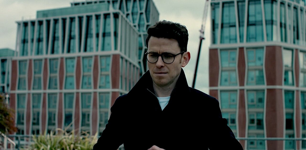
curvy-precasr-windows.jpg


screenshot capture ;-) from Amazon Prime series "Capture"
 
The pre-cast brick looks really good in PE's shots.

I was watching an episode of the Brit cyber-thriller "Capture" just before viewing this thread and stumbled across this curvy idea (though not the greatest execution), that doesn't quarantine pre-cast brick or window-wall into straight lines or rectangles.

As I said, not the best execution... but the possibilities are endless.

View attachment 431215

screenshot capture ;-) from Amazon Prime series "Capture"

I too have been ‘blessed’ with the curse of observing background buildings in everything I watch.

I do wonder what’s the price difference between fancy non-rectangular window wall and plain-Jane curtain wall?
 
They have called this version of the J a mock-up, which suggests it might just be a sample for approval and the actual will be larger.


Edit: Oops. I now see the tweet also says "This is 1:1". Hopefully that part is wrong - why do a 1:1 mock-up? That's just called finishing the J first.
Because we are reserving the right to refuse this mock-up if we don't like it
 
Here's a bit more info on the sign, everyone. This was VERY difficult to get approved. Initially it seemed impossible. The community and Councillor were not initially in favor of it. The above rendering was done in 2018 and we didn't get NOAC for another 2.5 years. The sign, as initially shown, was deemed too big.

This was our design inspiration:

300_cobe_norreport_exterior-5cbf0736b1f10_e0b924fd7f9239b18662ce9eaeed2af2.jpg


This is from our SPA drawings:


Screenshot 2022-10-11 092807.png


The sign also sits above one of our penthouse suites and that needed to be managed.

We'll see how the mockup looks on site. I'll try and share some photos.
 
Here's a bit more info on the sign, everyone. This was VERY difficult to get approved. Initially it seemed impossible. The community and Councillor were not initially in favor of it. The above rendering was done in 2018 and we didn't get NOAC for another 2.5 years. The sign, as initially shown, was deemed too big.

This was our design inspiration:

View attachment 431864

This is from our SPA drawings:


View attachment 431865

The sign also sits above one of our penthouse suites and that needed to be managed.

We'll see how the mockup looks on site. I'll try and share some photos.
thank you for the insight and fighting to getting it approved. Will be revolutionary for Toronto in that case.
 
Bit of the back story here: https://brandondonnelly.com/2022/10/04/placemaking-art/

It's a placemaking device

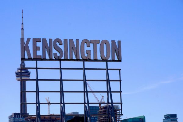
I absolutely love signage like this as place-makers and neighbourhood identifiers. The KENSINGTON signage is not only much-loved by photographers... it literally tells tourists and city newbie visitors how find the market, tucked away behind Spadina.

The TORONTO sign is an enormous hit with locals and tourists alike.

More of this please... the roofs of lots of existing buildings could host "place-maker" signage.

I want to place a Christmas order for a QUEENwest, THEDANFORTH, CABBAGETOWN (perfect view corridor down Carlton to Parliament) and THEBEACH....... And that's just phase one.

And here's hoping "JUNCTION" will be a bit bigger ;)(UT forum members roll your pennies and contact city hall).

kensington-condo-sign-roger-cullman-600x400.jpg

Spacing
 
As aluminum paneling goes, this is among the better products I've seen used in TO -- not as flat as much of what we're subjected to.

6B9FC1B4-A292-4DBF-9BAA-F7192F4A71A5.jpeg
51C4604A-7874-45E0-8A0F-CA6B46B2B272.jpeg
6B5D6803-CAB1-436C-8967-F9E451567B19.jpeg


The angled columns above the first stepback are a nice touch:

CFD4D62B-BACE-47AD-AD65-2191DFD60654.jpeg
86DAECFB-50C7-4F04-9F00-E5D9699E25F8.jpeg
8B8A55E1-856F-4C8D-80B8-B79F512B8F92.jpeg
49DE2A32-8455-4BF5-B1A0-9F29B90478AD.jpeg


Would be interested to hear the back story on how they negotiated the transition to the yellow on the rear here (this is a pretty good example of why 45 degrees is dumb -- this is a ways off from that, just eyeballing it, and it looks totally and completely fine):

E80D3520-AFC9-4675-ADBD-4F6B826C5C85.jpeg
 
I like the scale of this one but I’m not sure the shift in materials to the white panelling above was really necessary. Would have preferred the entire thing be brick, however I realize there is a cost element to that, as well as the city’s preference for material changes when the building steps back.
 
This is from our SPA drawings:


View attachment 431865
Thanks for all of the info re: the sign @brandondonnelly. It's a good fight you've fought, although I wonder if the sign, since it will be much smaller, should come down closer to the road, attached to some of the brick panels… although I assume that would trigger another fight.

Regarding the SPA drawing above, something else that caught my eye was the anti-bird-strike measures on the fly-through corners. I'm not sure I've seen that on other plans before. We see it all the time up to 12 metres, of course, (and beyond when adjacent tree canopy is taller than 12), but I haven't seen that corner use before, maybe I've just missed it. Great idea! (Do you know if you're among the first to do that higher up on the corners before?)

42
 
As aluminum paneling goes, this is among the better products I've seen used in TO -- not as flat as much of what we're subjected to.

View attachment 432304View attachment 432305View attachment 432306

The angled columns above the first stepback are a nice touch:

View attachment 432307View attachment 432308View attachment 432309View attachment 432310

Would be interested to hear the back story on how they negotiated the transition to the yellow on the rear here (this is a pretty good example of why 45 degrees is dumb -- this is a ways off from that, just eyeballing it, and it looks totally and completely fine):

View attachment 432311

There is no yellow to the rear
 

Back
Top