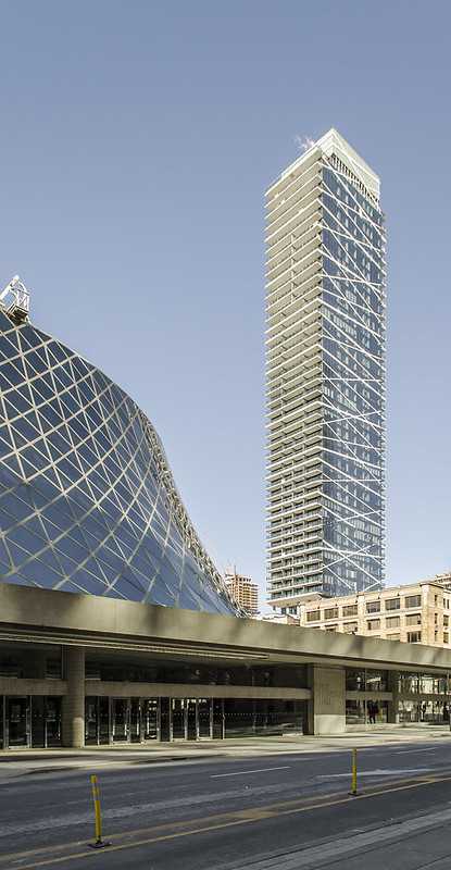
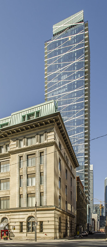
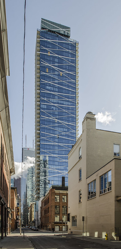
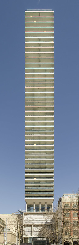
Those realtor photos of exposed concrete on the previous page that everyone's commenting on are stupidly edited in a way that exaggerates the contrast. The colour is not so severely blotchy in real life.

That's not to say that concrete doesn't turn out super ugly in some cases -- go visit some of Freed's or even Lamb's other buildings. It's definitely something to be wary of if you're buying pre-construction.
 
Last edited:
Yea, the realtor photos are tone mapped beyond reason, which attempts to extract any and all detail from every surface. The images look bad because of how they were edited, not because of how the building was built
 
I was just about to post that I love the photo of Theatre Park and Roy Thompson Hall, what a great shot.
 
Great head-on shot there in the last photo, Jimmy! The design and proportions of this skinny tower are awesome, but I'm looking forward to hearing about the owners' personal experiences living there and the more-than-expected deficiencies in a BJL development.
 
attachment.php
 

Attachments

  • IMG_0449.JPG
    IMG_0449.JPG
    436.1 KB · Views: 1,420
So I guess the mechanical glass is here to stay, then?

Sure appears that way, which is too bad as I thought Lamb himself had said that glass would be swapped out for the proper originally intended blue. It doesn't ruin the whole tower or anything, but it certainly is a bit of an eyesore. Also the "fins" or panels or what have you, have been eliminated. Wonder how much more expensive those protruding fins were compared what was actually done up there? It kind of kept the theme going up to the roof, which felt more fluid and looked better in my opinion.
 
It seems like a lot of people on here think it's a minor design issue that they never finished the design the way it was intended with the fins being flush on the mechanical box with the rest of the tower. But I think it's looks really sad up top there. The top looks unresolved. Being that this towers design is very minimalist, a little flare on top would add a lot to the continuity of the design from down below. To me its one of the big design features of this building the that didn't live up to its rendering. I don't read into this thread a lot so I don't know if it's been mentioned as to why they changed it but I would have to think it was some other issue besides the design to make this change. There's no way they chose this final product over the original because they thought it looked better.
 
It seems like a lot of people on here think it's a minor design issue that they never finished the design the way it was intended with the fins being flush on the mechanical box with the rest of the tower. But I think it's looks really sad up top there. The top looks unresolved. Being that this towers design is very minimalist, a little flare on top would add a lot to the continuity of the design from down below. To me its one of the big design features of this building the that didn't live up to its rendering. I don't read into this thread a lot so I don't know if it's been mentioned as to why they changed it but I would have to think it was some other issue besides the design to make this change. There's no way they chose this final product over the original because they thought it looked better.

well said, and I agree. It bothers me as well, especially since Lamb was allegedly quoted in the twitverse to say that the glass would be swapped out for the same colour glass as the rest of the tower. No idea what happened with the fins.
 
If the rendering looked like what we eventually got, there would have been 0 buzz. This really turned out to be a dud.

The vertical and horizontal bands extended out from the glass is what really made the design. Poor execution.

What happened to this:
theatre_park2.JPG
 
Last edited:
So they still haven't replaced the green glass with blue glass on the mechanical box. I guess that's not gonna happen.
 

Back
Top