Lenser
Senior Member
Very Jetsons, that.
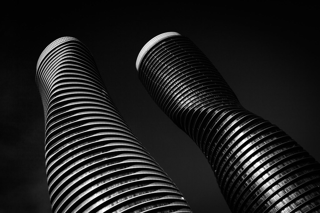
 Absolute World by Marcus Mitanis, on Flickr
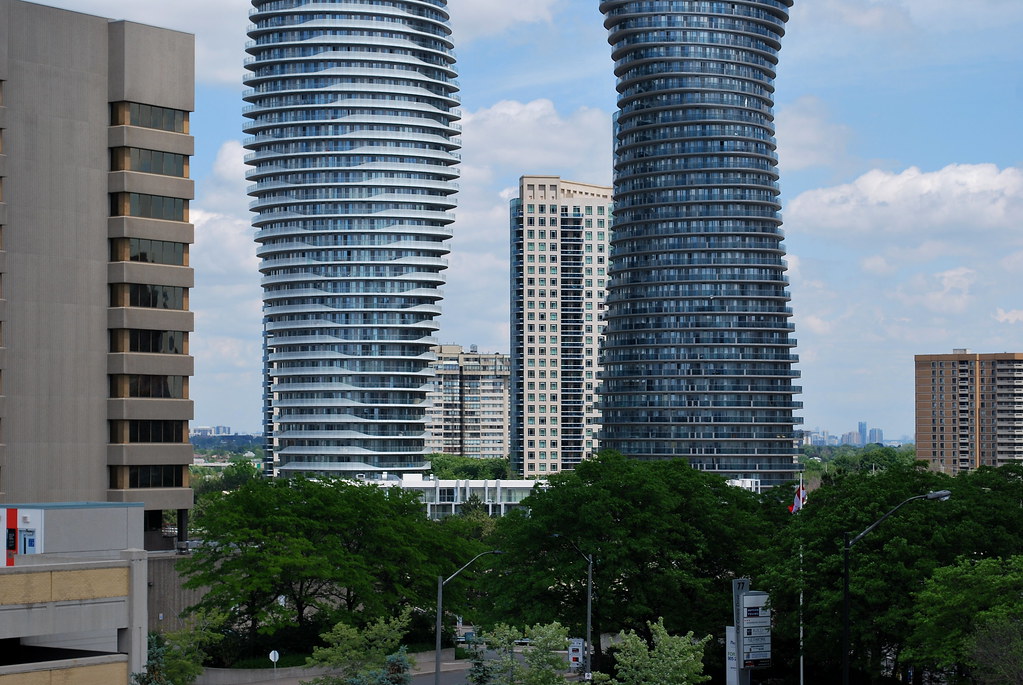 Absolute World by Marcus Mitanis, on Flickr
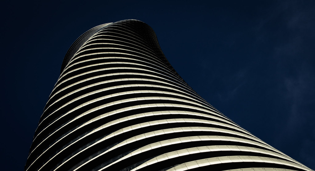
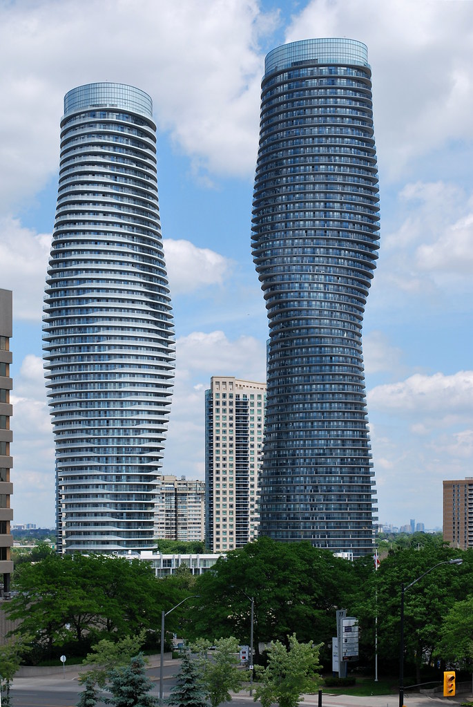 Absolute World by Marcus Mitanis, on Flickr
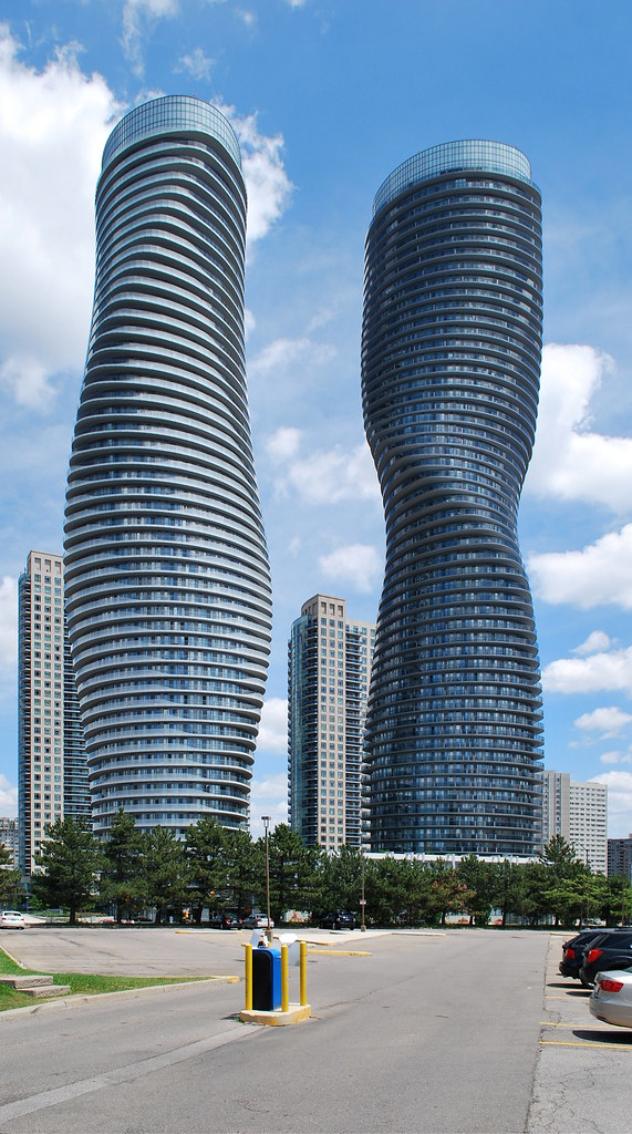 Absolute World by Marcus Mitanis, on Flickr
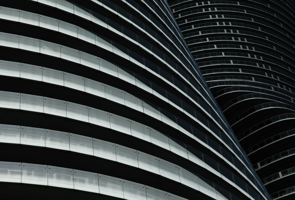
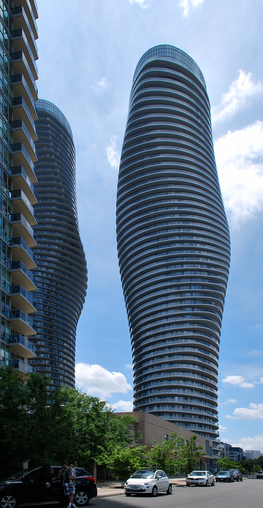 Absolute World by Marcus Mitanis, on Flickr
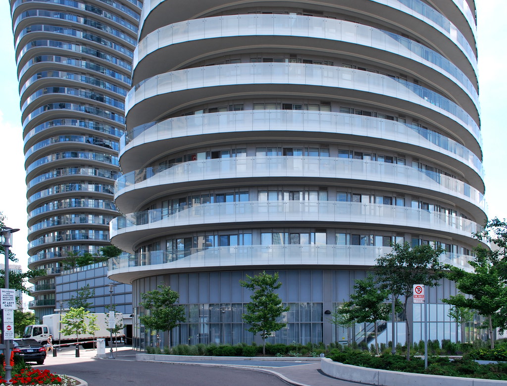 Absolute World by Marcus Mitanis, on Flickr
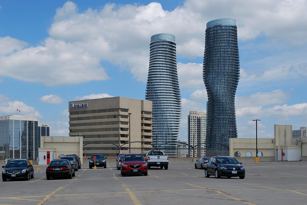
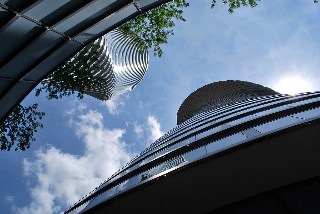 Absolute World by Marcus Mitanis, on Flickr
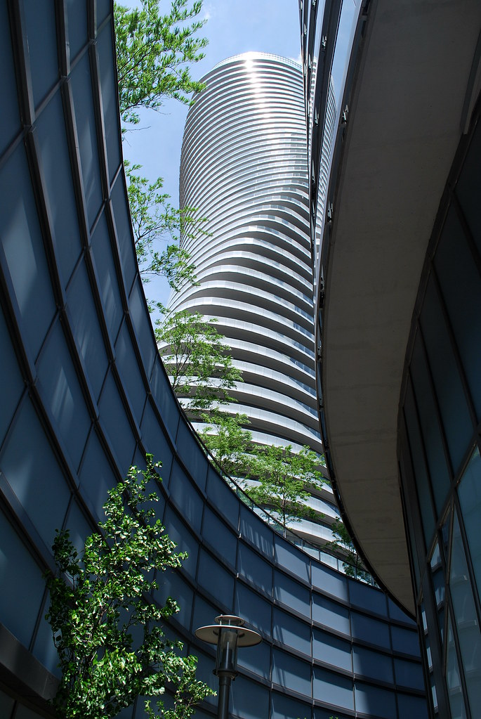 Absolute World by Marcus Mitanis, on Flickr
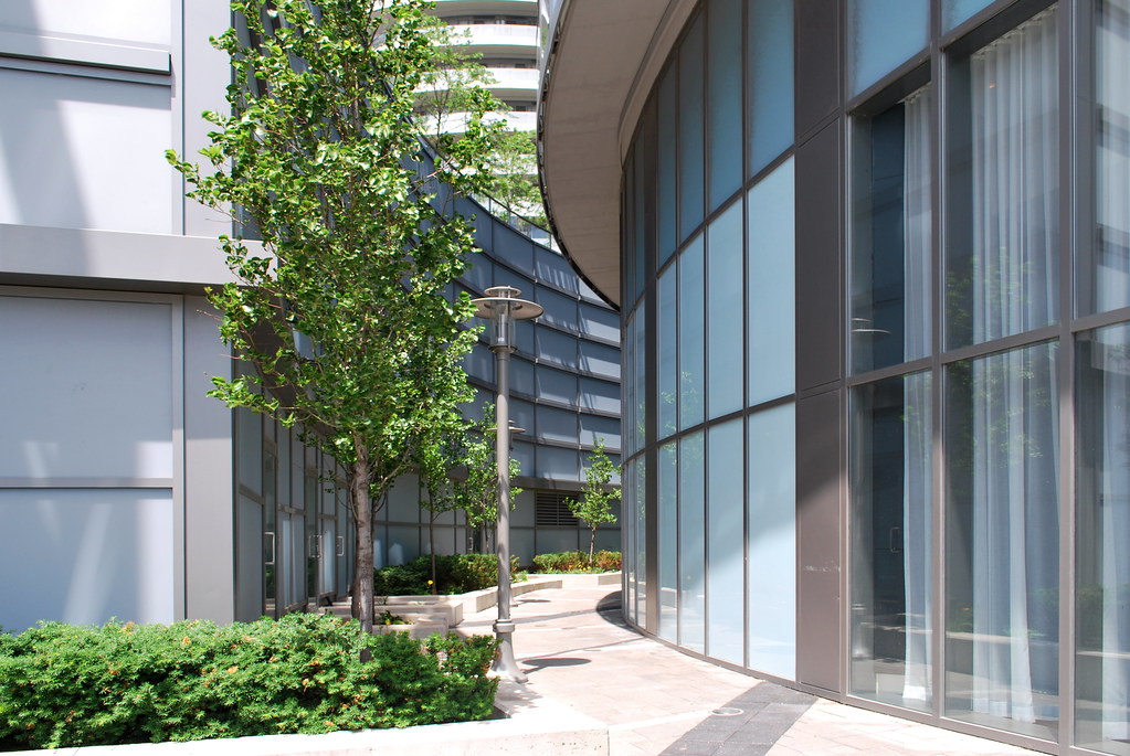 Absolute World by Marcus Mitanis, on Flickr
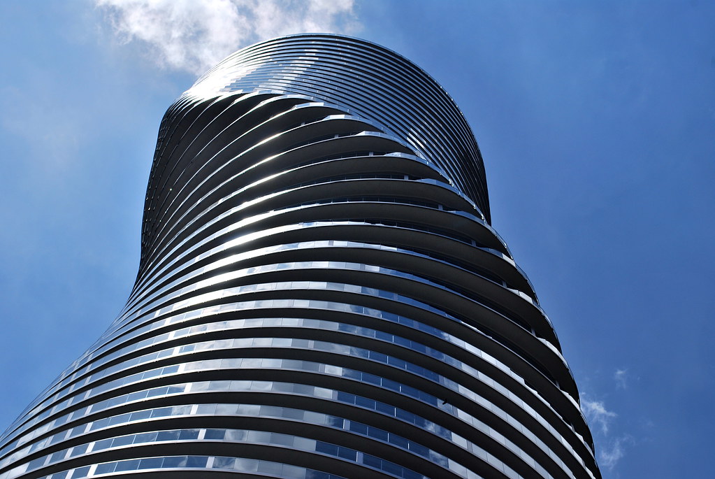 Absolute World by Marcus Mitanis, on Flickr
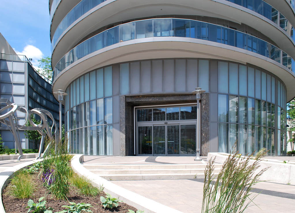 Absolute World by Marcus Mitanis, on Flickr
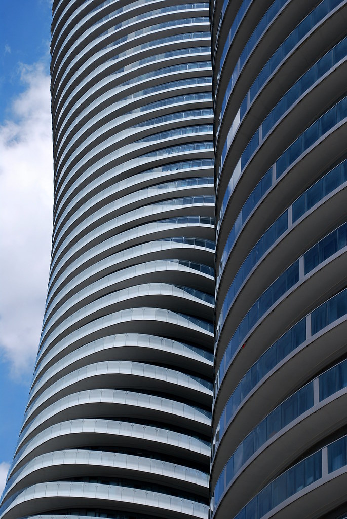 Absolute World by Marcus Mitanis, on Flickr
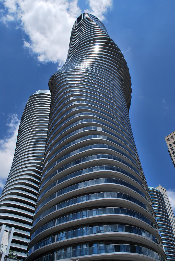 Absolute World by Marcus Mitanis, on Flickr
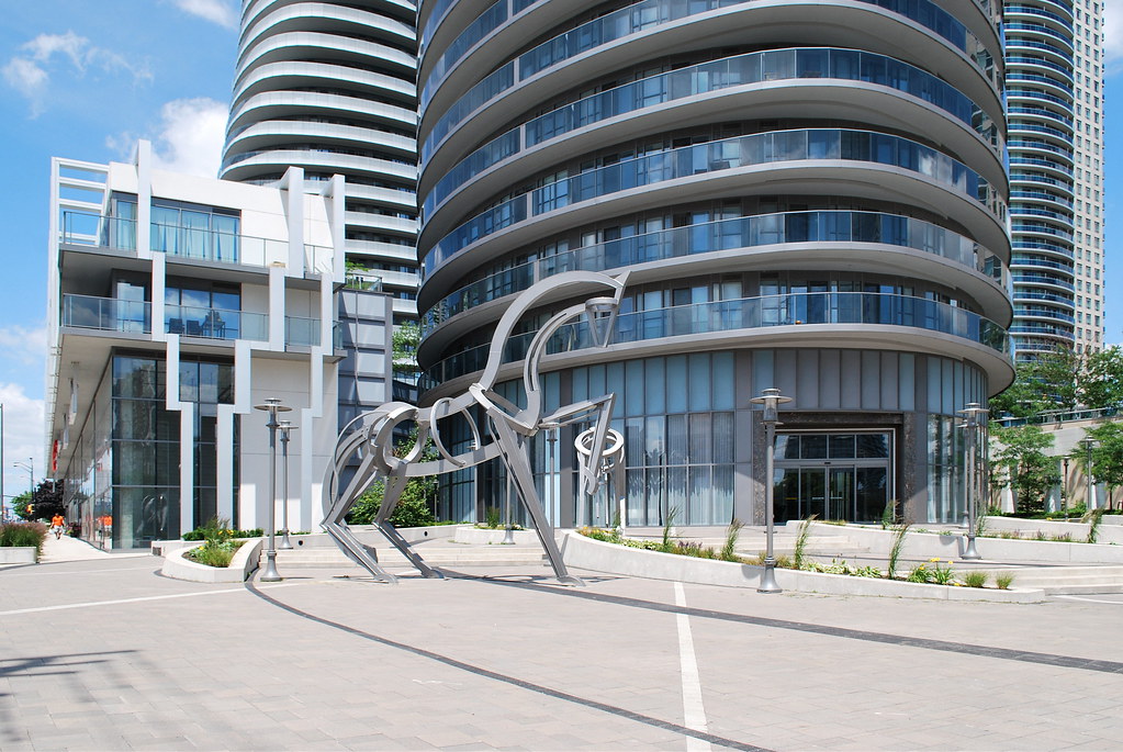 Absolute World by Marcus Mitanis, on Flickr
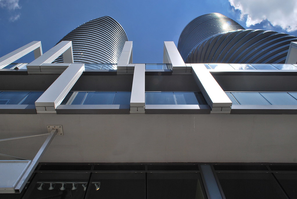 Absolute World by Marcus Mitanis, on Flickr
 Absolute World by Marcus Mitanis, on Flickr
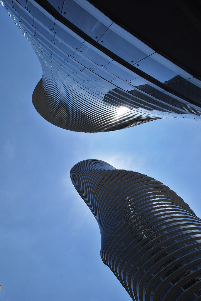 Absolute World by Marcus Mitanis, on Flickr
 , great pics of these beautiful buildings, thanks for sharing
I agree with the amazingness of the towers, and also with most of the gripes (and even more of them, since I live here).These towers are amazing. I don't mind the bottle cap tops at all. Wish Toronto could get something this interesting
![IMG_5640[1].JPG](http://cdn.skyrisecities.com/forum/data/attachments/31/31854-b4d0d4d5a0601c3c3626b6268e6cd465.jpg)
![IMG_5681[1].JPG](http://cdn.skyrisecities.com/forum/data/attachments/31/31855-014c9c34240f748d5d2e43315b3a8c2f.jpg)