MichaelS

Senior Member
Member Bio
Joined
Jul 6, 2016
Messages
3,331
Reaction score
27,975
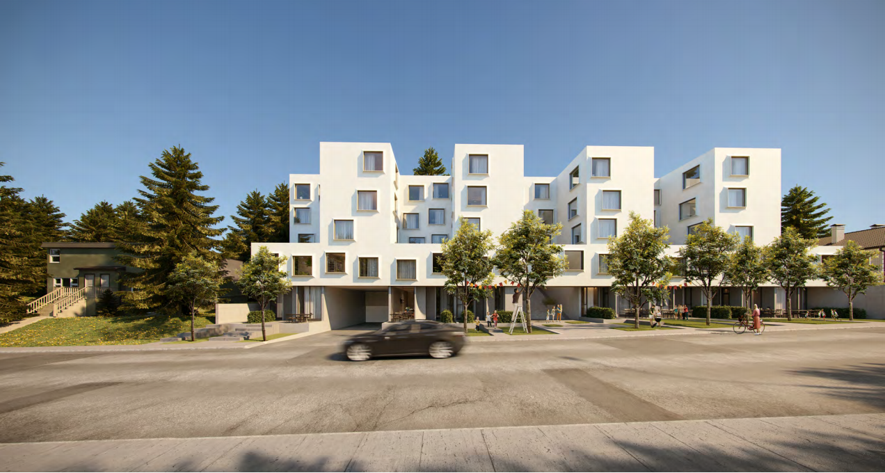
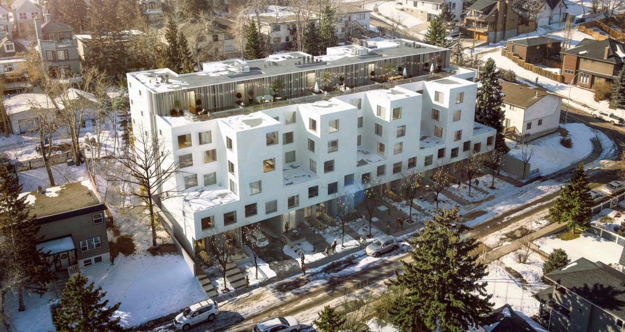
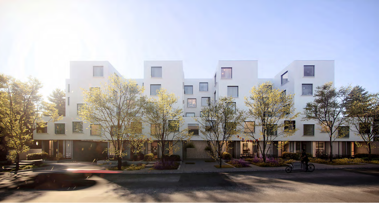
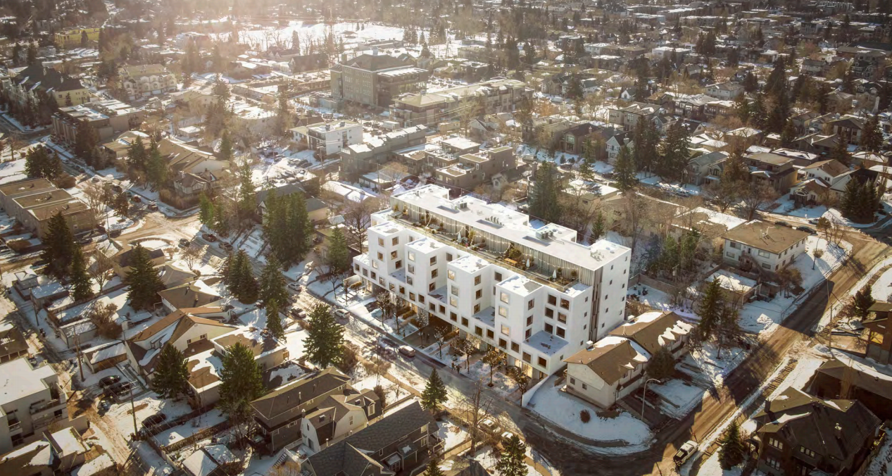
Updating the first post to reflect the new project and ownership.

Aeropark18 by M2SC
1678681555228.png

1678681599385.png

1678681619196.png


Previous project, by RNDSQR called RNDQR Life, shown below:
197347


1564773785711.png


197349


197350
 
Last edited:
Really nice, very happy it is rental as well. I love the simplicity, and the colour of the protruding window casing, it adds needed depth to the very simple building facade. The window depth makes it appear to be made of thicker/more permanent materials than woodframe/EIFS (prob), and feels more European. Interested to see the at grade relationship with the lane as it is graded high compared to the street edge.
 
I like the form - but not digging the driveway crossings/interaction with the street.
That was what i thought at first glance but when you take a closer look it only has one curb cut for vehicular access to the site, the other wider one is to the main entrance, and the others are footpaths to at-grade entrances. Definitely could use some layered landscaping and screening elements to create individual yards, but that is nit picky.
 
There's a steep hill on this property, so the back alley on the south side is probably at least one floor higher than the street level at the north of the building. Makes sense to put the garage entrance on the north side.

I assume the back alley will be lined with entrances to ground floor units just like the north side of the building.
 
I like it. It's too big for its location and in consideration of how underdeveloped the mixed use, main streets are.
 
I like it. It's too big for its location and in consideration of how underdeveloped the mixed use, main streets are.
And not totally unprecedented given that buildings like this and The Edward are nearby.

It's not totally unprecedented. Those other developments still have one fewer floors and are two blocks closer to 14 Street which, hopefully soon, will be lined with mixed use medium rises.

It's a fabulous design and increases density. I prefer a more unified approach to planning. Intensification has been at the developer's whim. Townhouses developments mixed with low rises next to SFHs over a large landscape that will take upwards of 50 years to feel transformed. This impromptu intensification will only encourages NIMBYs.
 
I believe the Edward is 5s.

I don't think it's a bad thing to have townhouses, low rises, and SFHs all mixed together for the next 50 years. A diversity of housing stock is good for the neighbourhood. I agree it would be good to develop the main streets in order to provide sufficient amenities within walking distance, but that's a chicken and egg problem. You need the density to support the amenities and vice versa. Hopefully a project like this will spur more mixed-use development along 14 Street and even 26 Ave. In the meantime, this building is only a couple minutes walk to a bus stop on 26 ave, 10 minutes walk to the heart of the Marda Loop commercial district, and a 15 minute bike downtown. And it's literally around the corner from CSpace.
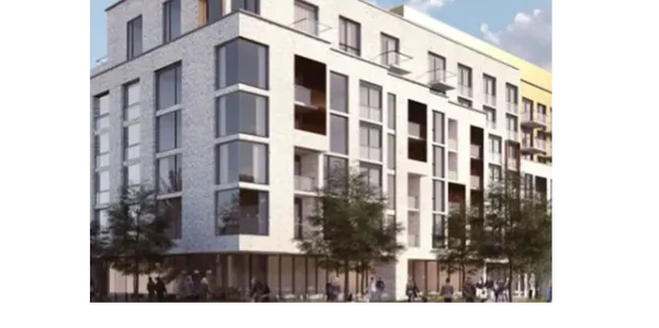
 
I really like the looks of this, we could use dozens of developments like this around the city. It's a bit large for the context, bit I think the neighborhood can survive it, as the main portion of the height is not a broad continuous wall, and the very top floor is set back a ways and not noticeable from the street, only from the back which is a higher elevation. The properties on the other side of the alley are a fair ways away and won't be affected by the height.
 

Back
Top