You are using an out of date browser. It may not display this or other websites correctly.
You should upgrade or use an alternative browser.
You should upgrade or use an alternative browser.
- Thread starter Surrealplaces
- Start date
outoftheice
Active Member
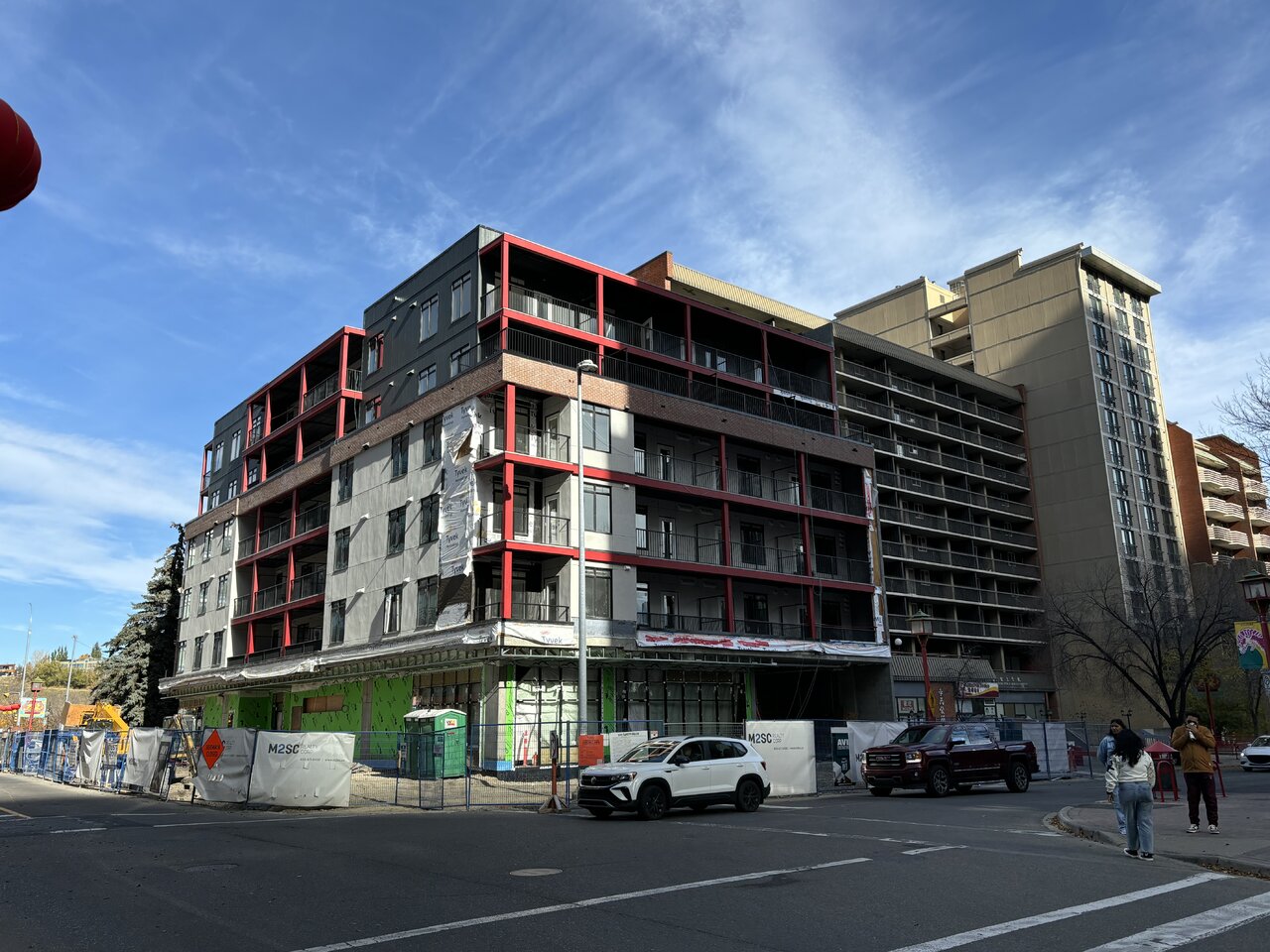
Had they also used brick for the dark gray and white portions it probably would have had a cool Chinatown vibe to it. This just looks underwhelming.
Tothewest
Active Member
holy shit is that ugly...no primary/vertical brick feature....cheap railings vs glass...the red sucks and will age poorly....fronting a park. 3/10
The Familia
Senior Member
This might be the first time I ever say this, but the brick actually makes it look worse. The brown brick does not go with the white and red for some reason. Maybe it’s the colour of the brick, or the use of brick itself, but something is off. Cheap looking building but better than what was there before. 5.5/10.
Tothewest
Active Member
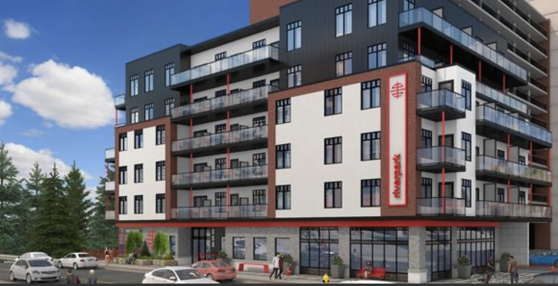
How does this happen?? It looks nothing like the DP rendering...the red steel has become predominant instead of subtle, the railings, the brick locations, the color of the white/grey

Mountain Man
Senior Member
Crazy how Chinatown allows this garbage and opposed the awesome Perkins + Will proposal.
CT_
Active Member
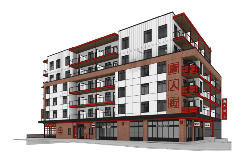
Here is the latest render I've found

Mountain Man
Senior Member
That does look a bit better...
Tothewest
Active Member
they didn't follow that one either...the top is white in the rendering...the railings are different
Mountain Man
Senior Member
The cladding needs to match, not sure they would need an RP (Revised Permit) for the railings. This building is a solid 3/10 currently...
Ramsayite
Active Member
Wow, this is weird and confusing
UrbanWarrior
Senior Member
Lol they followed the newer render even less 
Albertasaurus
Senior Member
Unpopular opinion, but I don't mind the red. I also like the massing. However, the horizontal band of brick looks seriously out of place and they desperately need the vertical strips to tie it together, because without them it will just look weird. I am hoping once it's complete things will tie together a bit better than they do currently, but we will see.
gsunnyg
Senior Member
This development looks old and outdated already.
I’m fine with the red, it fits in with the rest of Chinatown. I’m most happy to see a small lot that wasn’t used now filled with 59 units, and proper street frontage with retail.
