Roaring Flames
Senior Member
It's probably just planned to be built cheap enough to allow for easy renovation.
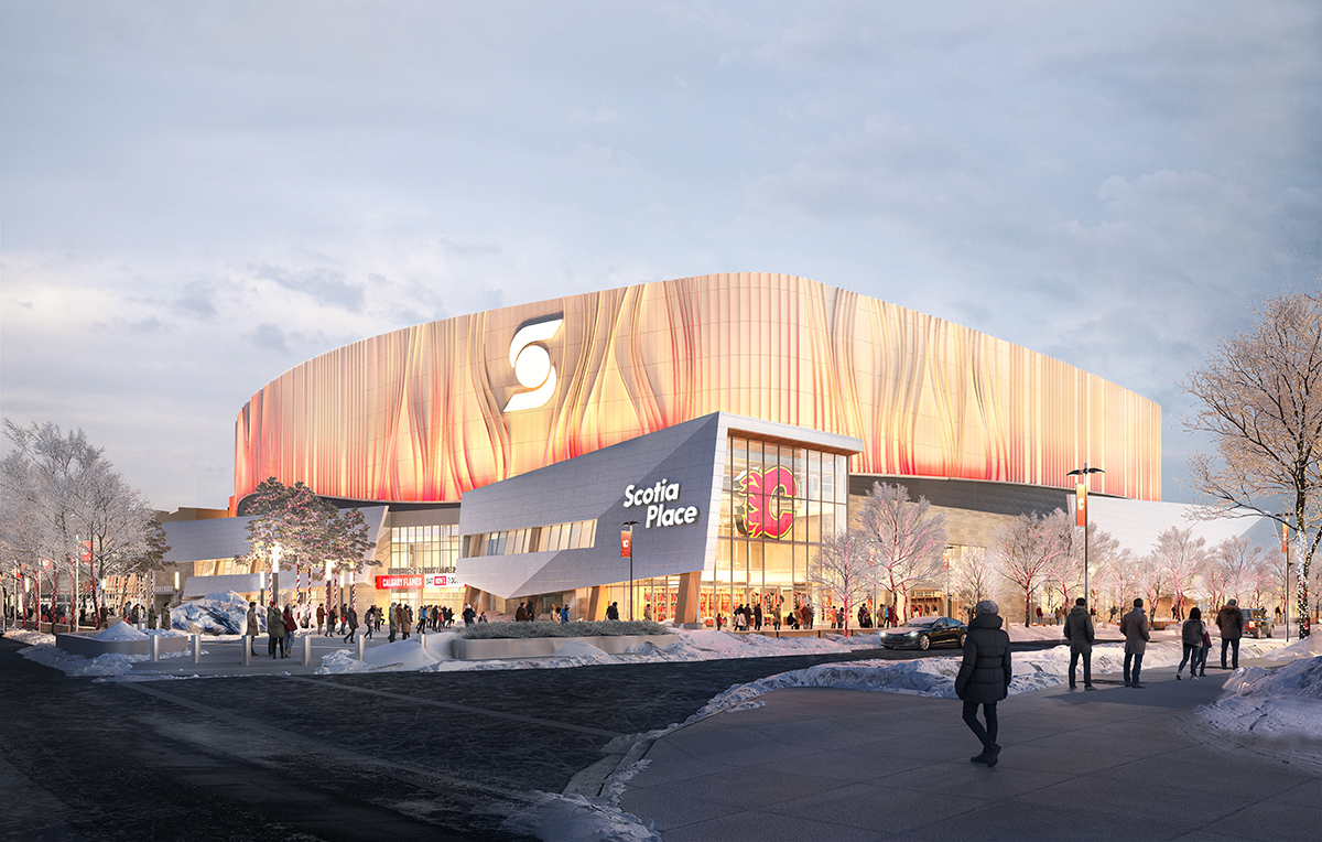
My biggest gripe is when shitty designs are justified due to 'budgetary constraints' when something far more elegant or interesting wouldn't cost more. If anything the 00's movie theatre looking drop panel ceiling 'clouds' cost more than a simple flat ceiling. As I had also mentioned, they could re-use the giant goalie mask from the exterior of the Saddledome. Choices were made and this looks like the lobby of a convention centre or office building. Empty and soulless and borderline liminal space. It also reminds me a bit of hotel convention centres.Bottom line is it's no more or less nice than other recent arenas....it has a very Alberta motif. Wood, fire, ice...they've been pretty consistent with that. If one hates that all arenas look sterile, then there is no pleasing you. And that's fine, I personally never expected it to be an signature piece of architecture. Some big pieces why this one likely costs more, and maybe doesn't have the budget for a significant "wow" factor....
- street facing retail...which closes in the concourse, also limits expansive glass walls
- below grade ice rink...digging is expensive
- 6 programmable levels (event, club/kitchen, main, premium, upper, press)....that simply costs more than 12-15+ years ago when it was 4 or less
- community ice rink
So those all eat into the cost, which can limit some nice to have's....but bring huge benefit to the arena and the streetscape
It is most certainly cost related. This is the render of the space in the public design brief. This wavy flowy roof was considered and then removed in favour of the clouds. Probably also a maintenance thing as these would be a nightmare to clean.My biggest gripe is when shitty designs are justified due to 'budgetary constraints' when something far more elegant or interesting wouldn't cost more. If anything the 00's movie theatre looking drop panel ceiling 'clouds' cost more than a simple flat ceiling. As I had also mentioned, they could re-use the giant goalie mask from the exterior of the Saddledome. Choices were made and this looks like the lobby of a convention centre or office building. Empty and soulless and borderline liminal space. It also reminds me a bit of hotel convention centres.
 www.calgary.ca
Bingo. Arena foyer's aren't supposed to be intimate spaces, they are large/open by design and code. The current design is a significant improvement from your image, what with the bar, backlit wood beams, larger LED screen. If they had drywalled the ceiling with pot lights, that would have been panned for being too sterile. I personally dont mind the dropped ceiling, seemingly a cloud shape. The staggered/random mini pots under the black roof creates a cool sky/stars effect.It is most certainly cost related. This is the render of the space in the public design brief. This wavy flowy roof was considered and then removed in favour of the clouds. Probably also a maintenance thing as these would be a nightmare to clean.
And why do people build convention centres, office building, hotels in this way? Because those spaces have to accommodate large numbers of people that have different aesthetic preferences. While this is primarily a hockey arena, but also hosts concerts and other events.
View attachment 729947
Scotia Place - Frequently asked questions
Find answers to frequently asked questions about the design and construction of Scotia Place.
I feel like underside and interior of the new(ish) library is the closest thing we have to thisOverall my position is it's as exciting as a 2000s-era Cineplex but wanted to give it a little more effort below.
For iconic and important public civic buildings, beyond the functional requirements of the space, two of the main architectural goals are:
Being unique changes from place to place. For Calgary, this lobby really fails the uniqueness test - Calgary does not lack corporate-chic spaces like this. We might have the highest density of 2000s-era corporate lobby event spaces like this. Combine with Cineplex vibes and some design elements/materials found in modern Toyota dealerships it's remarkably underwhelming.
- Try to be unique - rarely does this me in an absolute sense, just locally unique. People should identify the building and space as an important one that's different than the countless other spaces in the city.
- Try to be "timeless" - it's a bit harder to know if you designed it to be timeless until lots of time has passed but the general idea is if this building is important and a new icon for the city, act like it. Use good materials that are durable and have demonstrated long-run popularity, use design restraint to avoid looking like fad architecture. Importantly, don't let the architectural elements overwhelm the function - whatever you make a public building out of, it won't last if it becomes functionally obsolete (e.g. Saddledome).
On the timeless side similar problem - it's timeless in the wrong way. The lobby isn't even built and it seems old, the wrong kind of old. The materials, the design all are trying so hard but from a place of lacking any real inspiration.
An example of what I'd propose is something more like Portland's new airport concourse. Great materials, design restraint, the right balance of curves and straight. This is a space that will age well and doesn't sacrifice the main functionality - have a big, high capacity space to filter people in and out. And borrowing this style would be unique for Calgary - we don't have anything like this.
View attachment 729633
To fix the lobby without redesigning the whole building, just straighten out some of the pointless swoopy bits, replace all that corporate panelling look with more intentional choices of stone, wood or brick and take lighting and the ceiling more seriously. At least cover up all the ducts!
Or just do that - go hard the other way, deliberately choose to make this place fun and silly! Get out of that uncanny design valley - right now it's a space that takes itself too seriously so you can't have an animatronic dragon, but also not interested in actually doing some great unique architecture and space design.