You are using an out of date browser. It may not display this or other websites correctly.
You should upgrade or use an alternative browser.
You should upgrade or use an alternative browser.
- Thread starter Meikkhaell
- Start date
haltcatchfire
Senior Member
I really wish the SW screen was angled more SW and the plaza area bled out and encompassed the whole intersection of Olympic Way & 14th Ave. That way a much larger crowd could watch a playoff game. The streets would get blocked from traffic if there was a playoff crowd anyway.
That southern planting obstructs good standing positions for the rest of the screen’s viewing angle.
That southern planting obstructs good standing positions for the rest of the screen’s viewing angle.
Last edited:
Roaring Flames
Senior Member
Looking North

Looking West

Looking West
Redmile14
New Member
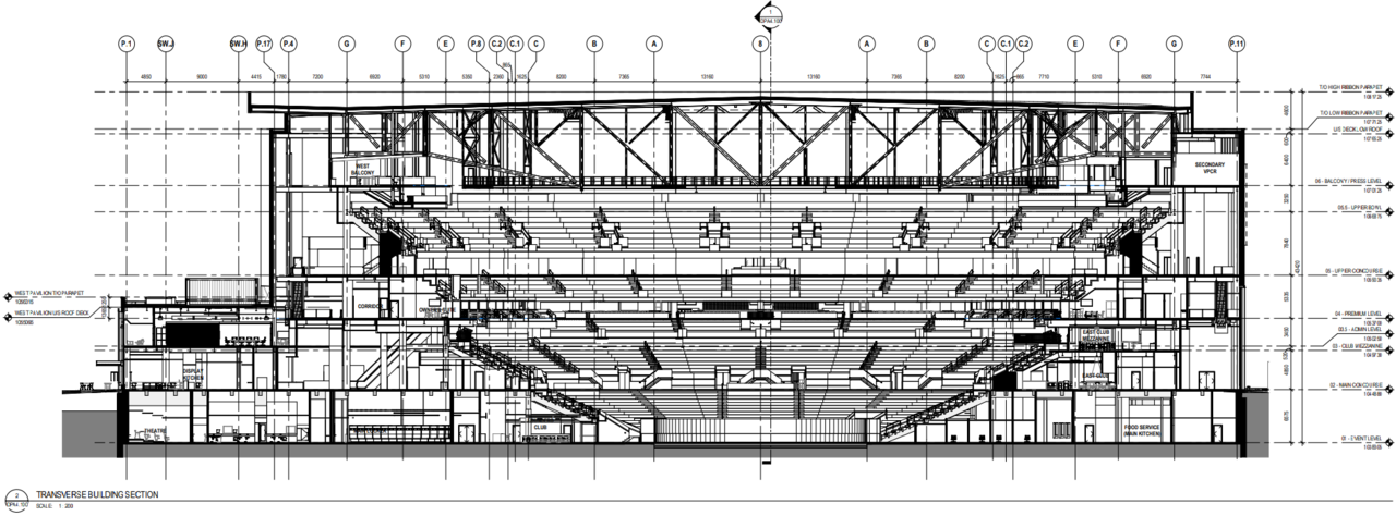
I hope those are not sideways staricases on the interior of the lower bowl.
Roaring Flames
Senior Member
They are ☹I hope those are not sideways staricases on the interior of the lower bowl.
The Familia
Active Member
Lol how is that even a design feature in 2021? Ok I’m back to this arena is garbage and going to suck balls.
I'm anxious to see some interior renderings.
haltcatchfire
Senior Member
I hope those are not sideways staricases on the interior of the lower bowl.
Ugh. This design is hanging by a tread.
adamyyc
Active Member
I hope those are not sideways staricases on the interior of the lower bowl.
YourBoy007
Active Member
They literally spruced up this piece of trash and said good enough. My disappointment with the new arena is immeasurable.
CBBarnett
Senior Member
The Globe's architecture critic is not impressed:
https://www.theglobeandmail.com/can...d-calgary-event-centre-be-too-big-to-succeed/
https://www.theglobeandmail.com/can...d-calgary-event-centre-be-too-big-to-succeed/
MissingMiddle
Active Member
Bozikovic's opinion carries weight.The Globe's architecture critic is not impressed:
https://www.theglobeandmail.com/can...d-calgary-event-centre-be-too-big-to-succeed/
It's a mixed bag for me, I won't bother pointing out the things I don't like, but I will say I really really appreciate the ground level concourse.
Bertie Wooster
New Member
The critique is fair, and a lot of it comes down to the inherent challenges in a building of this type and scale. The limestone comment is interesting. Sandstone is really the only true local and historical building material. Problem is, sandstone is an abysmal building material.
darwink
Senior Member
The extra north side retail is good - Now it is big enough that could break it up into more CRUs over time hopefully. something More interesting, and not a Scotia/other Bank, or Shaw/Freedom/Rogers/ etc please.
adamyyc
Active Member
I agree with the critique that the architect’s comment about the limestone being a nod to sandstone is nonsense, but also think the critic was a bit harsh in the way they dismissed it.The critique is fair, and a lot of it comes down to the inherent challenges in a building of this type and scale. The limestone comment is interesting. Sandstone is really the only true local and historical building material. Problem is, sandstone is an abysmal building material.
They make it seem like Indiana limestone is a weird choice, which it’s not. It’s used on a lot of prominent buildings, has been used on stadiums (Yankee Stadium), and was used to construct the Hotel Madonald.
The limestone is probably one of my favourite parts of the building. It will add some warmth and texture at street level. If this was a billion dollar project, then I’d be all for wrapping the entire facade in limestone, but it’s not. The costs are capped to protect taxpayers, the Flames are not the New York Yankees (or the Toronto Maple Leafs), and the architects have to work within their financial limitations.
The comment about the building being a big slab with a few flashy bits is fair. There is a lot going on. I also agree that the recently added windows to the metal ribbon are awkward, but I think they will improve the inside of the building.
I disagree that floor to ceiling glass walls are inherently boring in real life, and lack visual interest. The banking pavilion at TD Centre in Toronto is floor to ceiling glass and is anything but boring. It’s particularly visually appealing at night, which is when the CEC will see most of it’s activity. The west wall of CEC however, is not the banking pavilion, and the architect is not Mies van der Rohe (I actually don’t know if he designed the pavilion).
Speaking of Toronto, I found it awkward that the critic brought up the detailing of Maple Leaf Gardens, to make a point about the importance of the small stuff, but was kind of dismissive about the idea of including indigenous pictographs. Also, I love Maple Leaf Gardens. It’s a shrine to hockey. But I think we’re idealizing it’s architecture just a bit, and it’s not as if Calgary is going to build an Art Deco arena with ornate detailing on every surface. That’s not something Calgary can pull off, so the CEC will have to be painted with a broader brush.