What do you think of this project?


  • Total voters
    44
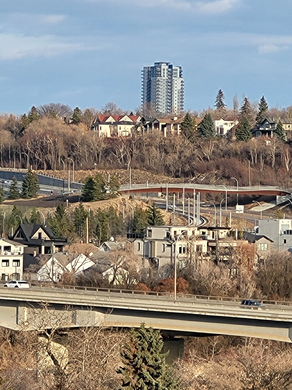
View from the river valley. All I'll say is that I hope this spurs some high-rise TOD development in the Holyrood/Bonnie Doon area.
20230420_191132.jpg
 
They'd probably have an easier time leasing it out if it actually looked like a place anyone would want to live... Sometimes it feels like some developers don't realize that whether it's conscious or unconscious, most people do consider the exterior of the building in some way when renting or buying. Even if most people mostly care about interiors, the exterior creates a first impression that sticks with them.
 
They'd probably have an easier time leasing it out if it actually looked like a place anyone would want to live... Sometimes it feels like some developers don't realize that whether it's conscious or unconscious, most people do consider the exterior of the building in some way when renting or buying. Even if most people mostly care about interiors, the exterior creates a first impression that sticks with them.

I think this will unfortunately lease up. As FUGLY as it is, it's the only new rental product of it's kind in this area, which will appeal to some who want/need to be more centrally located without being Downtown or on/near Whyte Ave, but still close enough to both.
 
Last edited:
I think this will, unfortunately, lease up. As FUGLY as it is, it's the only new rental product of it's kind in this area, which will appeal to some who want/need to be more centrally located without being Downtown or on/near Whyte Ave, but still close enough to both.

Oh yeah I agree that it will lease up. I just think that the business decision to cheap out on materials/design probably doesn't add up in the long run. The additional rent and faster lease up of a nicer looking building probably makes a nicer design worth it. I think The Hat developers have perfected this. They aren't going to win any architectural awards, but they've put just enough money/effort into materials to allow them to demand higher rents that they likely wouldn't be able to get with a grey stucco box.
 
The material and design are not the issue, but the execution is very poorly done. This is more of the architect designer who failed their job. They don't seem to learn from their previous experiences. For me, since the Icon towers, I've come to the conclusion that stucco material or the new panels (stucco as well) don't do well with solid dark colors and need to be light or opaque as much as possible, for they don't have the sheen and shine effects like spandrels or glazings; widows on towers require even symmetry, multiple colors into one scheme is atrocious, and so forth. Everything shouldn't cost more, as all they have to do is sit back and look at what they have done and seek a different approach. With the new stucco panels and starter/finishing trim used now, they can do so much with it. The problem is, we have amateurs that wants to built, and, in doing so, they're attributing to fuggliness...
 
Major Development Permit
Permit ClassNot Available
Permit Date(No value)
StatusIn Progress
Description of DevelopmentTo revise the Height and number of Dwellings to a Multi-unit Housing building (building 2: height reduced from 12 Storeys down to 6, and the number of Dwellings to be reduced from 143 to 83).
Address9109 - 85 STREET NW

They reduced the 2nd tower to a midrise to avoid paying for a crane
 
Some don't know how to properly treat pimples or warts, so scaring is inevitable...
This one left a considerable scaring unfortunately.
 
Major Development Permit
Permit ClassNot Available
Permit Date(No value)
StatusIn Progress
Description of DevelopmentTo revise the Height and number of Dwellings to a Multi-unit Housing building (building 2: height reduced from 12 Storeys down to 6, and the number of Dwellings to be reduced from 143 to 83).
Address9109 - 85 STREET NW

They reduced the 2nd tower to a midrise to avoid paying for a crane
Leases not as expected?
 

Back
Top