Edmontonian
Active Member
Nope thats for a completely separate project I'm now seeing for the first time, no clue if it already has a thread or not but this is it.
 www.linkedin.com
 www.linkedin.com


If it doesn't have a thread could someone create one and move this please, thanks")
JW Developments on LinkedIn: #missingmiddle #infill
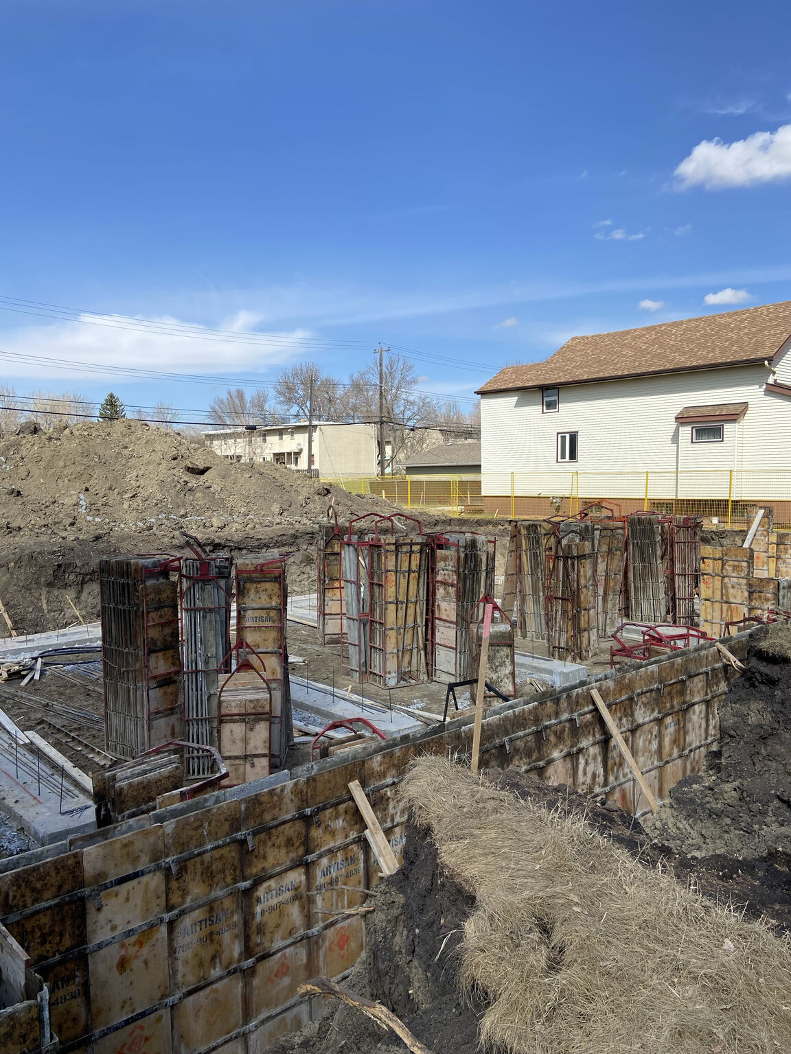
Construction underway at our latest project - Holyrood83 - in Edmonton! Architect: Battlelake | Builder: Alair #missingmiddle #infill
www.linkedin.com
JW Developments on LinkedIn: #design #realestate #realestatedevelopment #project #townhomes
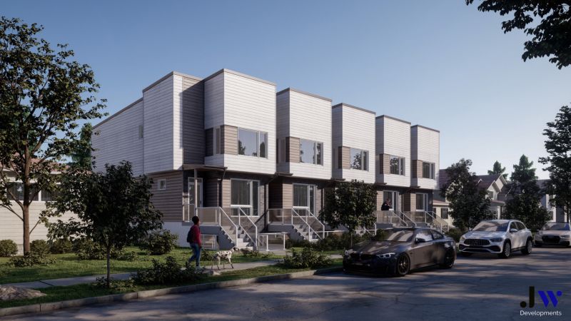
Our latest project: Parkside in Holyrood! Bringing modern townhome design to the beautiful Holyrood neighborhood. Modern urban, convenient living. #design…
www.linkedin.com
If it doesn't have a thread could someone create one and move this please, thanks