DavidCapizzano

Senior Member
Member Bio
Joined
Jan 12, 2017
Messages
2,014
Reaction score
10,510
New academic/residence building @McMaster University. Architect is Diamond Schmitt. To be the tallest building on campus, visible from the highway (yay?)

HjKEPHh.jpg

Source: http://dailynews.mcmaster.ca/articl...aching-building-to-be-named-for-peter-george/
 
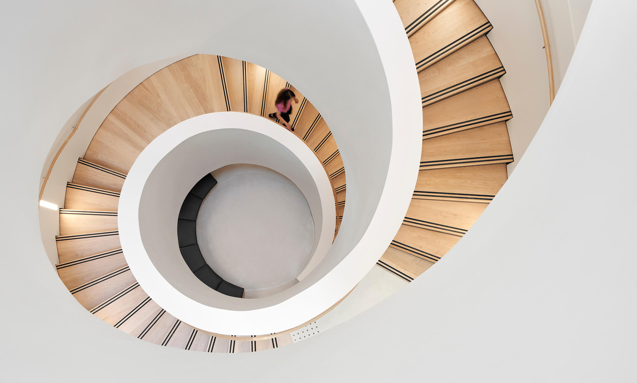
This was completed in 2020. Photos from DSAI's website:


View attachment 361576View attachment 361577View attachment 361578View attachment 361579View attachment 361580

The auditorium space looks nice, of rather large for any class of quality.....

As to the rest...........sigh..........I don't feel like it's a net contributor to that campus.
 
The auditorium space looks nice, of rather large for any class of quality.....

As to the rest...........sigh..........I don't feel like it's a net contributor to that campus.
I'll have to disagree with you on this one. This building provides Mac with desperately needed residential rooms, large auditodiums (which the campus lacks and relies heavily on a few buildings for this specific purpose), and on-site parking space (which the campus lacks badly).

Now if we were talking about that White Elephant known as the McMaster Student Centre, that's where i'd completely agree with you. That thing is the biggest waste of space, and is just badly designed from head to toe. It needs to be razed and completely re-done.

Also some more pics:


cc027ec4c48d8a4b0ad13be838057df0.jpg


8b2fafdd80b7cfa72f104914643a8d9f.jpg


9b699822540a81a9b1a460d74295fb99.jpg


a4d194b466379cea3679dad5d61d19cf.jpg

I wasn't deriding the functionality of the space, merely the aesthetics.

To me, it feels cold, aloof......that's already an issue on the Mac campus.....
 
I wasn't deriding the functionality of the space, merely the aesthetics.

To me, it feels cold, aloof......that's already an issue on the Mac campus.....
Well you're definitely not wrong there, they couldve used some warmer tones and at least try to somewhat match the colour tones of the surrounding buildings.
 

Back
Top