News   GLOBAL  |  Apr 02, 2020
 8.5K     0 
News   GLOBAL  |  Apr 01, 2020
 39K     0 
News   GLOBAL  |  Apr 01, 2020
 4.7K     0 

A

alklay

Guest
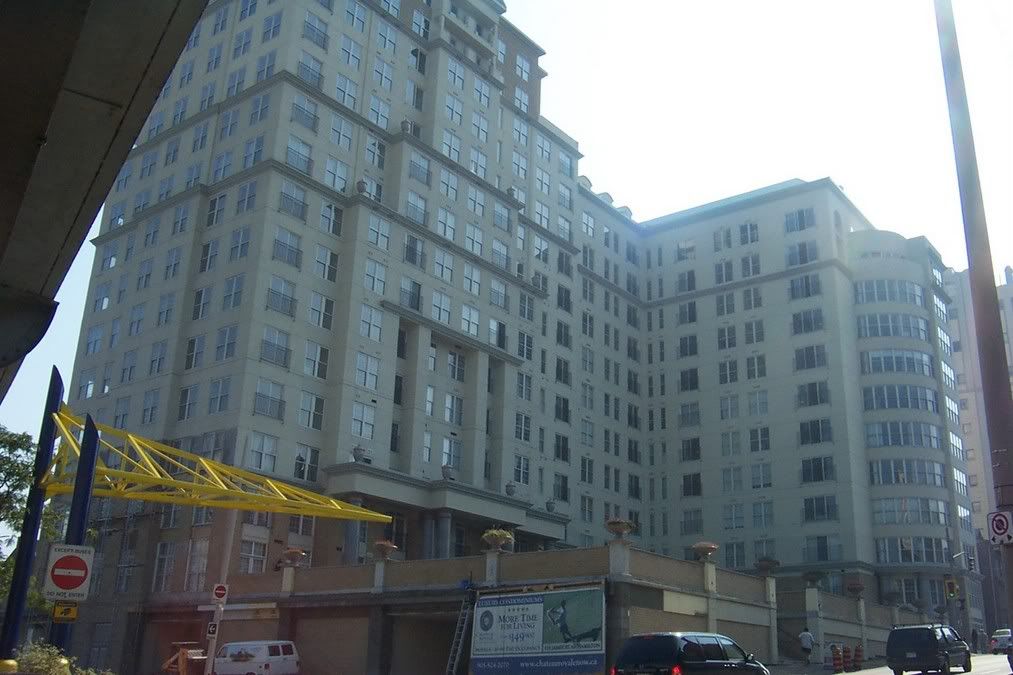
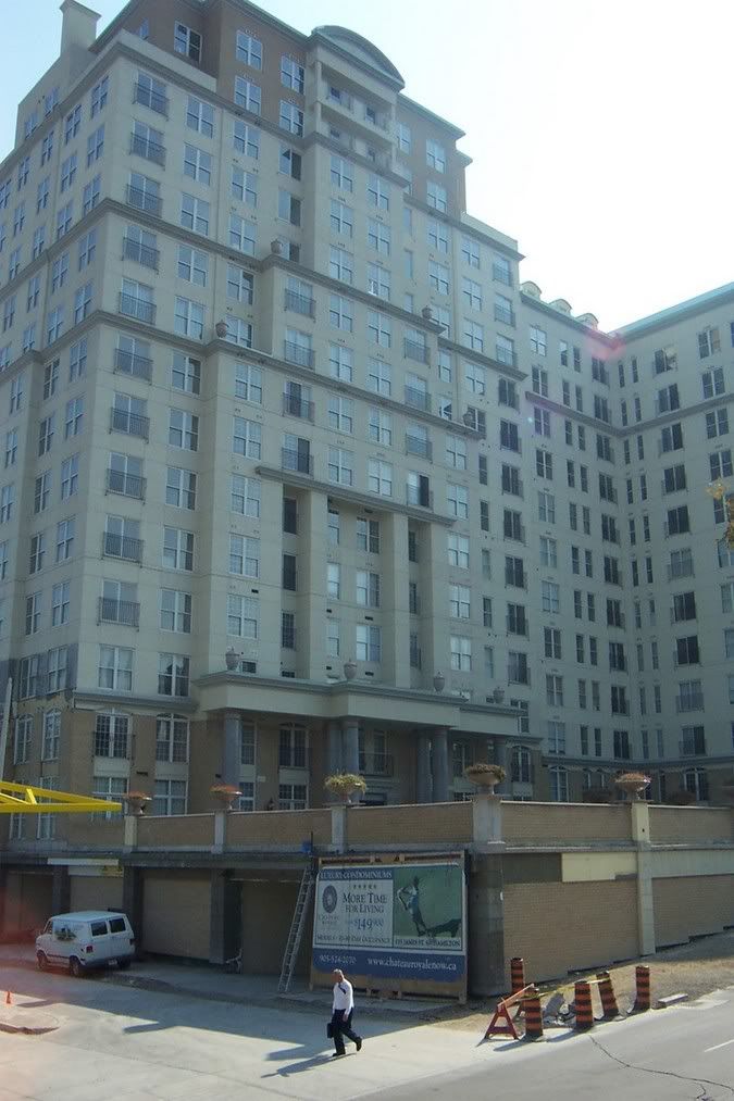
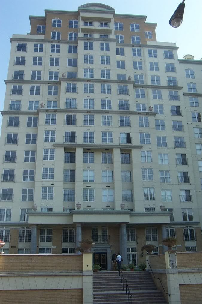
I was just browsing at Skycraperpage forums and was looking at some of the recent Hamilton developments, just to see what is going on in the province. I came across this building and I really could not believe how terrible it is. From the wall at groundlevel, to the faux historic references in the sky, I do not believe there is an uglier building being built in the province, let alone North America. It looks like it has all the aesthetics of a typical 'luxury' Romanian apartment block.

It is called the Chateau Royale and it apparently has been under construction for a few years:

DCP_2030.jpg


DCP_2032.jpg


DCP_2036.jpg


DCP_2037.jpg


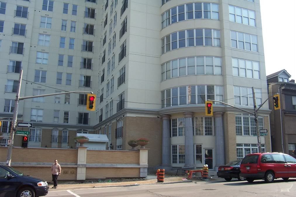
And the punchline: it is a conversion of these relatively graceful office buildings:

cha3.jpg


Simply incredible (the challenge goes out, to find an uglier building, of substance, under construction in the province).


Credit goes to "Steeltown", the original poster and photographer.
 
It's not great, but I don't mind it. Looks a lot better than our French Quarter.
 
I don't mind it that much. It's a bit overdone, but could be worse.

It's right next to the Hamilton GO Centre, and will bring more residents downtown in Hamilton. From a planning/development point of view, it's a good project.
 
I do find it grotesque, but the addition of the office tower photo that it replaced really was the piece de resistance of the post. Much jollity.

I hate French Quarter so much, it's also the building that is most preferred by the masses. I've had no fewer than three people tell me that it's the building they most prefer that's been built recently. Unbelievable.
 
Oh that place. Hideous. Downtown, just along from the Pigott Building if I recall. And they were asking a bomb for apartments there too.

I'd rather live in the little cock fighting pavilion at Dundurn than that monstrosity.
 
I'd be able to forgive the faux-historical stuff if not for that friggin' wall that hugs the sidewalk. That corner would look way better if there was a public space with some pavers and trees there.
 
Yeah, I didn't think it was too bad - my main criticism was the wall at the sidewalk, which was in the original design.
I do prefer the original office building though.
 
I love you all but I can't believe there are those who feel that this is not too bad. The proportions are all wrong, the massing is terrible, the materials cheap (looking), the faux historic badly done (and completely dishonest), the colours are all over the place and everything looks poorly executed. The architect, if there was one involved, should have his/her licence revoked (or at least forced to stare at this mess for the rest of his career).

If this is 'not too bad', what the heck would 'bad' be?

Imagine if the office buildings were reclad in a modern skin. It probably would not have been bad...and certainly a needed aesthetic kick for Hamilton.

The French Quarter, at its worst, is just bad kitsch. This is so much more painful.
 
If any credit's due, the photographs do give it a kind of "woulda looked cheeky and radical in 1985" vibe. Y'know, back when Bofill-esque precast-concrete-classicizing hijinks piqued the imagination. Even the
The proportions are all wrong, the massing is terrible, the materials cheap (looking), the faux historic badly done (and completely dishonest), the colours are all over the place and everything looks poorly executed.
aspect looks like it could be cynically excused on "look, man, we're Postmodern" grounds--that is, if we, too, can pretend it's still 1985.

As it is, it would be Tridel-innocuous somewhere in Downtown North York. But I know the location, and I know what it replaced, which makes it all the more grotesque--especially if one considers that if the old office complex were allowed a few more years, maybe the trickling-down of an indigenously "Stan-Roscoe-vian" retro-Modern sensibility would have allowed a much more sympathetic condo/loft conversion to be plausible/viable. Y'know, Hamilton's own B.C. Electric...
 
Most buildings in Toronto are much uglier than that.
 
I don't find it that ugly. I kinda like it. It's neat that they converted it from commercial space though.
 
I like it.Its the 70s slabs everywhere you look that i find ugly.
 
It looks like postmodern stomped on top of stalinist, which pounced on cheap edwardian kitsch. And we musn't forget those godawful Italianate acorns.
Horrible, horrible, horrible.
I can't imagine that someone actually DESIGNED this - that is, that the above sequence wasn't imposed by history.
This thing is a disaster.
 

Back
Top