Red October
Senior Member
Mods I vote to banAnd slightly on that note, the TTC logo should be updated since it's horrible. I know it won't happen, but I can dream okay?
Mods I vote to banAnd slightly on that note, the TTC logo should be updated since it's horrible. I know it won't happen, but I can dream okay?
I think I'm in the agree to disagree club here as well.And slightly on that note, the TTC logo should be updated since it's horrible. I know it won't happen, but I can dream okay?
Anytime anyone tries to redesign the TTC logo, it always comes out looking terrible.And slightly on that note, the TTC logo should be updated since it's horrible. I know it won't happen, but I can dream okay?
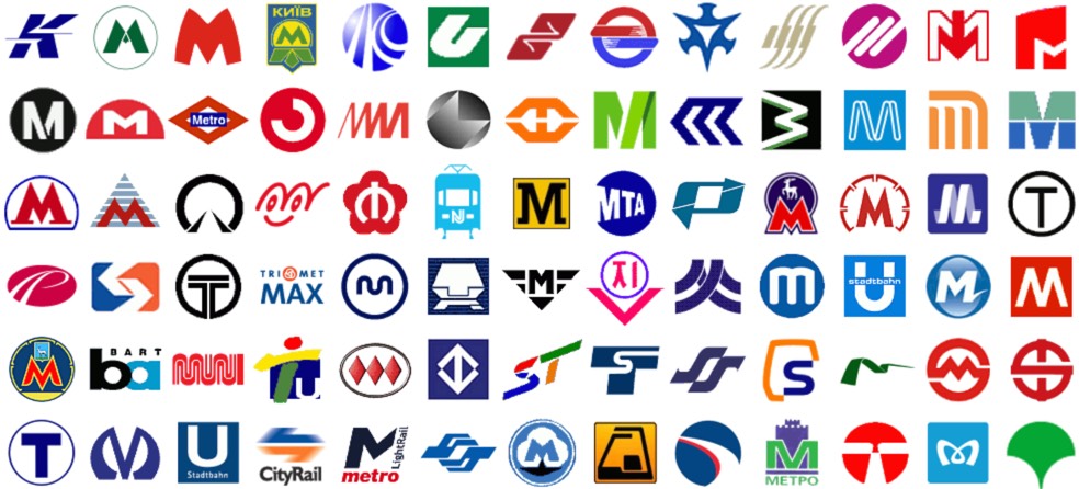
Some logos don't need a change...Anytime anyone tries to redesign the TTC logo, it always comes out looking terrible.
View attachment 388961
View attachment 388962
View attachment 388963
Freezing cold takeAnd slightly on that note, the TTC logo should be updated since it's horrible. I know it won't happen, but I can dream okay?
I've always liked the way TfL does it with a recognizable symbol, colour-coded by mode:We could create a sign like one of the above to identify subway stations while keeping the TTC logo the way it is. Metrolinx could have used their T for just that purpose but they muddied the waters by using it for bus stops.
I've always liked the way TfL does it with a recognizable symbol, colour-coded by mode:
View attachment 389331
However I think we've hit a "point of no return" whereby the current TTC logo is so universally recognized that changing it would cause more confusion than it's worth...
The TTC (or Metrolinx) should hire you. No, seriously.As @W. K. Lis pointed out, the TTC logo lends itself well to display the mode of transportation. Now I know a million people have redesigned the TTC logo before, I only took 15 minutes to mock this up, and I made it without thinking about the context of transit outside Toronto (aka Metrolinx).
But if we really wanted to better discern the mode of transportation while keeping some aspect of the TTC logo we could simplify by removing the TTC type and one of the shields.
Likely? Don't know what else it would be.It'll be a Metrolinx "T" with the operators symbol in it, likely TTC.
As @W. K. Lis pointed out, the TTC logo lends itself well to display the mode of transportation. Now I know a million people have redesigned the TTC logo before, I only took 15 minutes to mock this up, and I made it without thinking about the context of transit outside Toronto (aka Metrolinx).
But if we really wanted to better discern the mode of transportation while keeping some aspect of the TTC logo we could simplify by removing the TTC type and one of the shields.
View attachment 389389
I don't believe the TTC has signed the contract yet to be the operator, as they have with Line 5. But it's the likely outcome. For instance, the Hurontario Line won't be operated by MiWay.Likely? Don't know what else it would be.
I don't believe the TTC has signed the contract yet to be the operator, as they have with Line 5. But it's the likely outcome. For instance, the Hurontario Line won't be operated by MiWay.
/https://www.thestar.com/content/dam/thestar/news/city_hall/2012/02/02/toronto_transit_how_to_pay_for_the_sheppard_subway/ttclogo.jpeg)