A

alklay

Guest
Freed developments is getting Philippe Starck to design (help design?) a new condo. Good for Freed for pushing the design envelope.

I know this is an attempt to not only attract the local market, but to get international attention as well. I am more than curious as to what the building will end up looking like.

seventy5portland.com
 
This news makes me happy!
9.jpg
 
Here is the "YOO" website. I have never heard of them but the website (and their stuff) is damn interesting (and provides a refreshing approach for this city, which seems stuck with the minimalist/modern approach for every single new condo project which aspires to be 'hip' (maybe I have just seen too many Cityplace model suites). Its just nice to see something different.

www.yooarehere.com
 
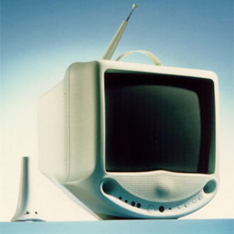
Looks like the folks at YOO also like Phillippe Stark.
TEMPPicture.jpg
 
This is fantastic news. Yoo started up after Mr Starck stopped working with Ian Schrager. I've been following Yoo for a while now only hoping that they would announce a development in Toronto. Great Stuff. Can't wait to see it.

Freed, you've come out of nowhere it seems, but my have you started making a name for yourself.
 
Site

This must be the site of the former Artword theatre, which was recently demolished, as well as the old brick building next to it.
 
Re: Site

There was a full page ad in yesterday's Post. Exciting indeed - that whole district will be super cool in 10 years' time.
 
75 Portland Street

There is a full-page ad in the National Post today (Thursday) for this project. The web site so far is only for pre-registration purposes and does not include any further info.

www.seventy5portland.com

The building is being done by Freed Developments, who also did 66 Portland across the street. They acquired two properties on the east side of Portland in October 2005 and Feb. 2006. Total frontage along the street will be 167 feet.
 
Re: Site

Here's a rendering from the Condo Guide that came out today. I like this, it's similar to many buildings recently built down there, but it mixes it up a little.

75Portland.jpg
 
Re: Site

Modern with some interesting features and quirks...I like it.
 

Back
Top