maestro
Senior Member
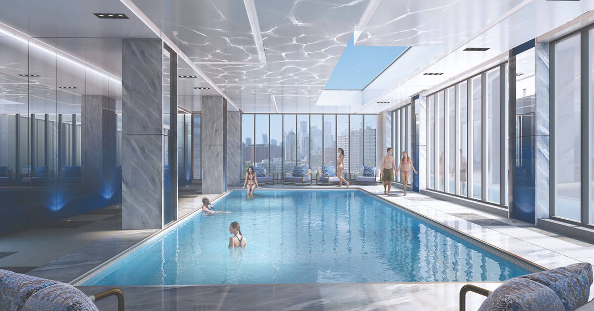
The massing is decent. It's a typically late modernist massing. The cladding is the usual standard window wall. The virtues of it being charcoal coloured vs the more common grey green is too low a bar for me. I couldn't care less about the penthouse. It'll probably be plastered with a by Hilton sign. The main entrance is flagrantly uninviting, jumbled and, oppressive.
Toronto is one of the most expensive cities. We can't use that as an excuse.Our greatest Canadian rival is totally outclassing us on cladding too.
This is a generic glass tower development in Montreal https://forum.agoramtl.com/t/quinzecent-36-etages/187/274?page=15, That's the global standard. Only Toronto/Ontario and Vancouver/British Columbia are fully invested in inferior, ugly window wall.