Dan416
Senior Member
Isn't that odd!
The signs are posted to warn us of something ... but we are not told the meaning of the warnings!
A perfect example of bureaucracy.
It looks to me like a sign to inform snowplow drivers of....something
|
|
|
Isn't that odd!
The signs are posted to warn us of something ... but we are not told the meaning of the warnings!
A perfect example of bureaucracy.
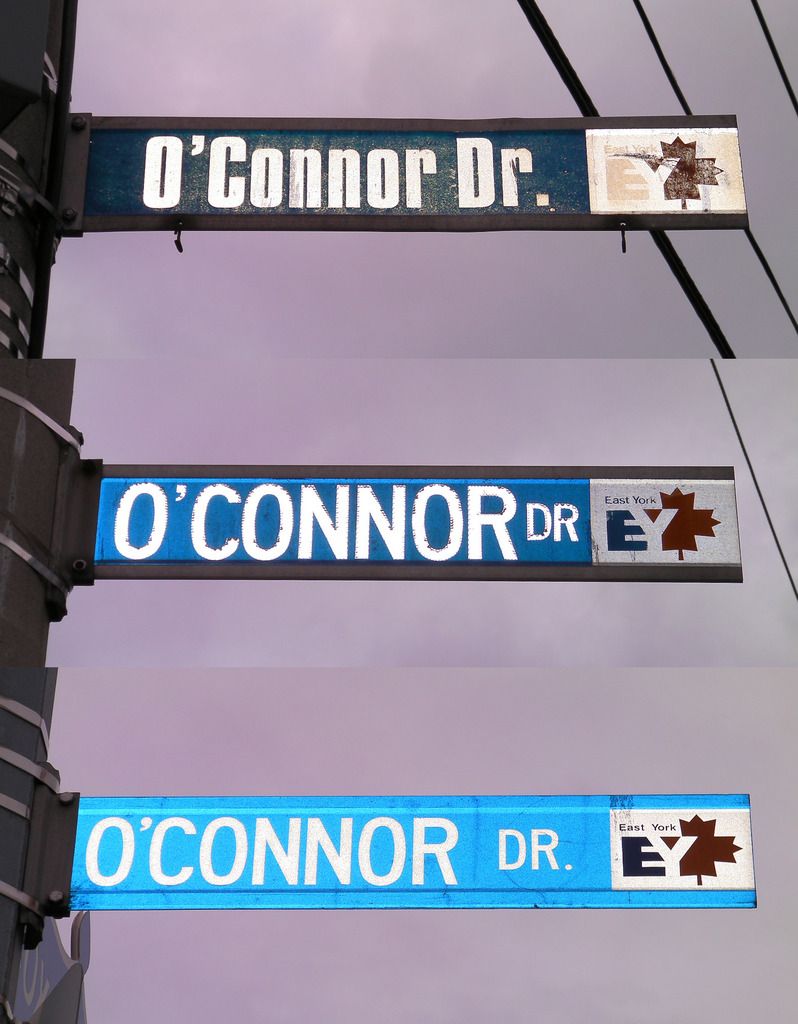
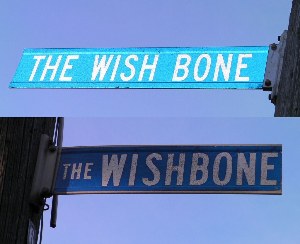
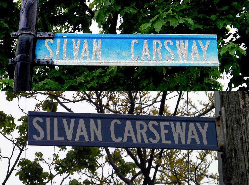
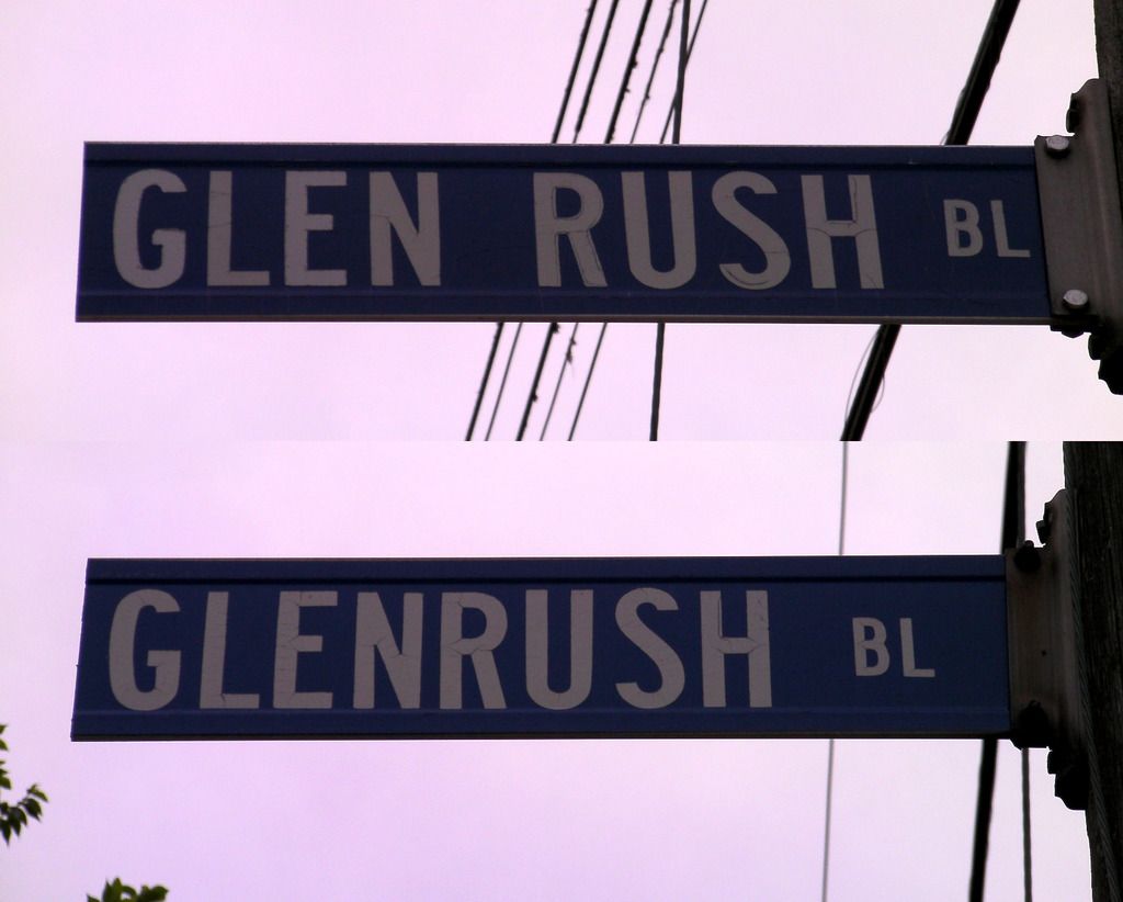
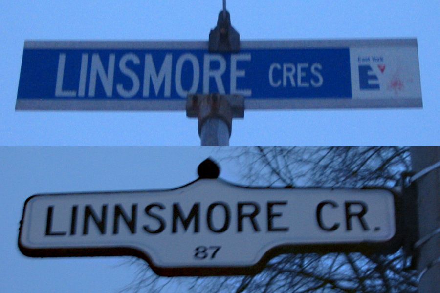
Recycling at work - saving the planet one sign at a time:
Hidden Terrace hiding under Brief Road:

Anchor Drive over Walsh Avenue:

Rustic Street over a very slight outline of Cactus Avenue:

Hermit Court over something that seems to have started with a "B":

...and finally Streamdale Court in a nice Scarborough-style template sign. Only problem - Streamdale is in North York!:

EVCCO: Interesting pictures of street signs here-I find these older blue on white street signs interesting because they are of the exact same color,lettering and size of the signs used where I live here on LI-the Town of Islip used this street sign type from the late 70s into the early 90s at least...in recent years the Village of Islandia has placed newer white on green signs that are noticably different and I was able to obtain the signs from my nearest corner being replaced with the described change-over and they are "recycled" the very same way as these are! Nice observation that definitely caught MY eye...LI MIKE


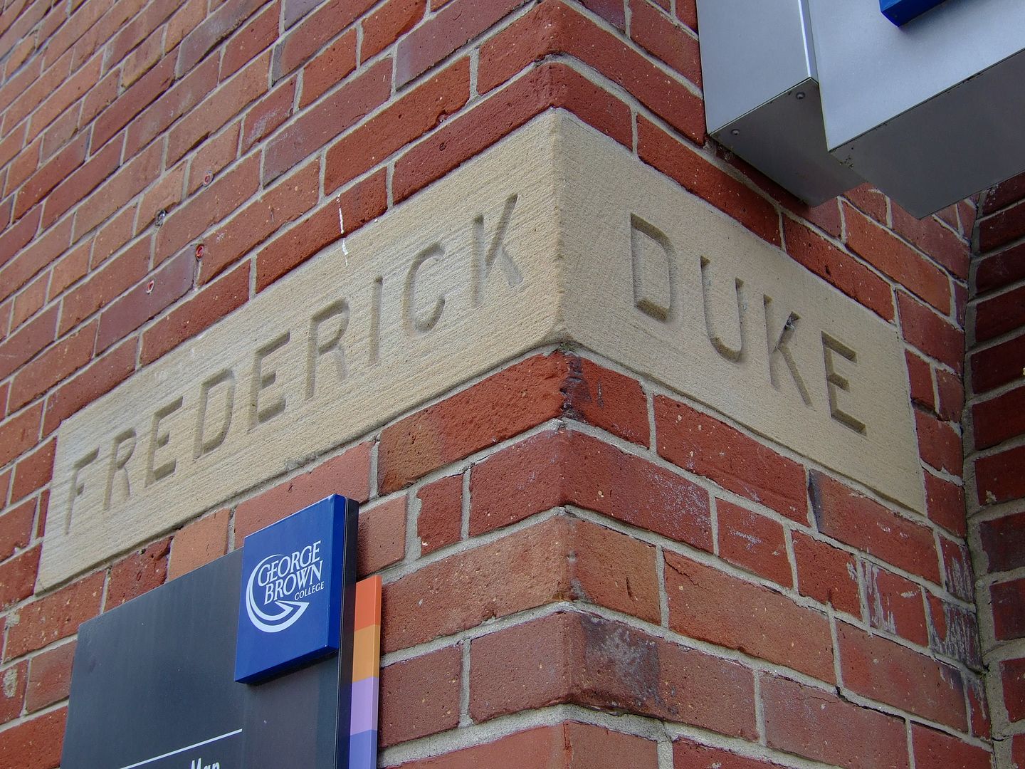
Does anyone know why Duke was renamed? Some sort of continuity thing when streets were widened and joined as one?