News   GLOBAL  |  Apr 02, 2020
 10K     0 
News   GLOBAL  |  Apr 01, 2020
 42K     0 
News   GLOBAL  |  Apr 01, 2020
 6.3K     0 

drum118

Superstar
Member Bio
Joined
Apr 25, 2007
Messages
22,690
Reaction score
29,854
City:
Toronto
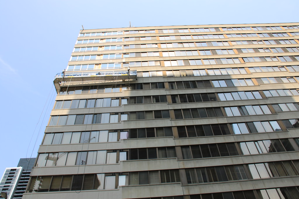
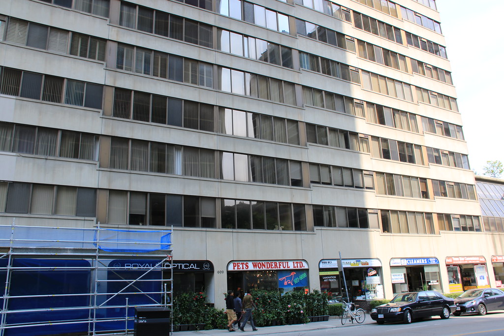
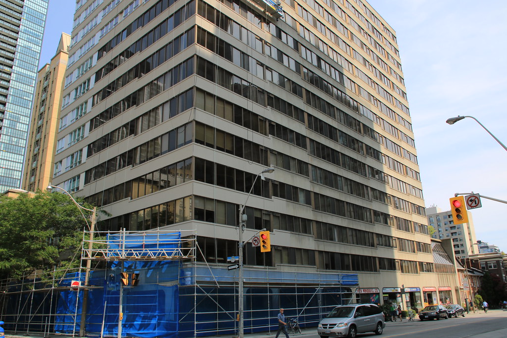
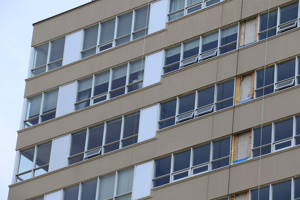
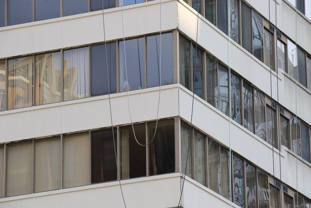
The windows are in the process of being upgraded and replace with colours.

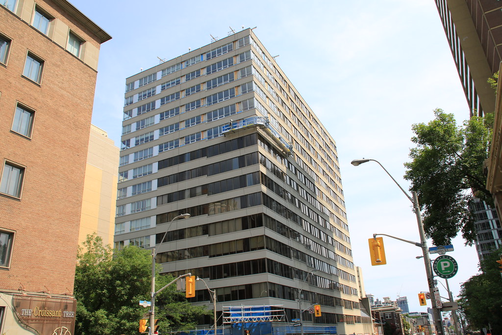
Work is taking place on Charles with some work starting on Church at the north end
 
July 3
18822089304_483694bbde_b.jpg

19438281162_66f8760e54_b.jpg

18823969983_ecda901c7d_b.jpg

19257027178_b4ab29347b_b.jpg

18823974573_e377c9cc20_b.jpg

19257032878_1233b9efac_b.jpg
 
I like the new glass although I think it cheapens the look. This is also the second or third building I've seen lose their original bronze tint for green in the past few years.
 
I like the new glass although I think it cheapens the look. This is also the second or third building I've seen lose their original bronze tint for green in the past few years.

Where do you see green?! It looks great in person, more São Paulo 1950s-60s now than Toronto 1970s-80s. This isn't bad per se but it does undermine the building's design integrity.
 
Where do you see green?! It looks great in person, more São Paulo 1950s-60s now than Toronto 1970s-80s. This isn't bad per se but it does undermine the building's design integrity.

Agreed. Looks better in person. As for 70s-80s brown glazing.... off with its head! Can't think of a single specimen worth saving.
 
Not a fan of this at all. The old brown/bronze glass helped make the detailing of the pre-cast more pronounced. It is now completely invisible with the new windows. I find it really messy now.
 
In a strange way, I like the art-deco "Sao Paulo" (to use a descriptor from above) vibe of this project now. It works surprisingly well. It used to resemble a cheap, anonymous office park block and now it has this vintage character.
 
Palace Pier?

Fair. Strangely enough, had a discussion about Palace Pier this weekend while driving by on the Gardiner. If we do save a specimen, that would be the one. I think its saving grace is the interest created by the cruciform shape of the buildings and the diagonal balconies.
 
Where do you see green?! It looks great in person, more São Paulo 1950s-60s now than Toronto 1970s-80s. This isn't bad per se but it does undermine the building's design integrity.

Sorry, It has that greenish look from the coating in the first photo.
 
Scotia Plaza is a striking 80s tower in brown, though it has a lot of red in it. I'm not a big fan of brown. It doesn't age gracefully.
 

Back
Top