|
|
|
You are using an out of date browser. It may not display this or other websites correctly.
You should upgrade or use an alternative browser.
You should upgrade or use an alternative browser.
- Thread starter flar
- Start date
smuncky
Senior Member
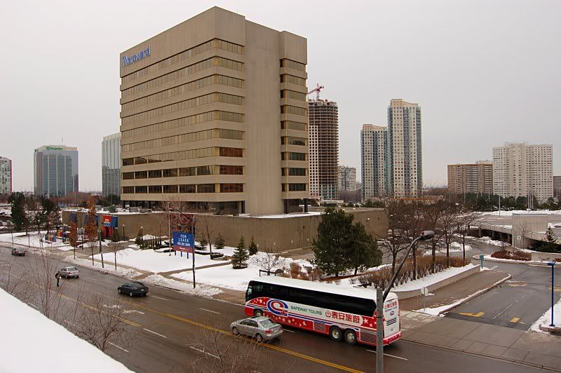
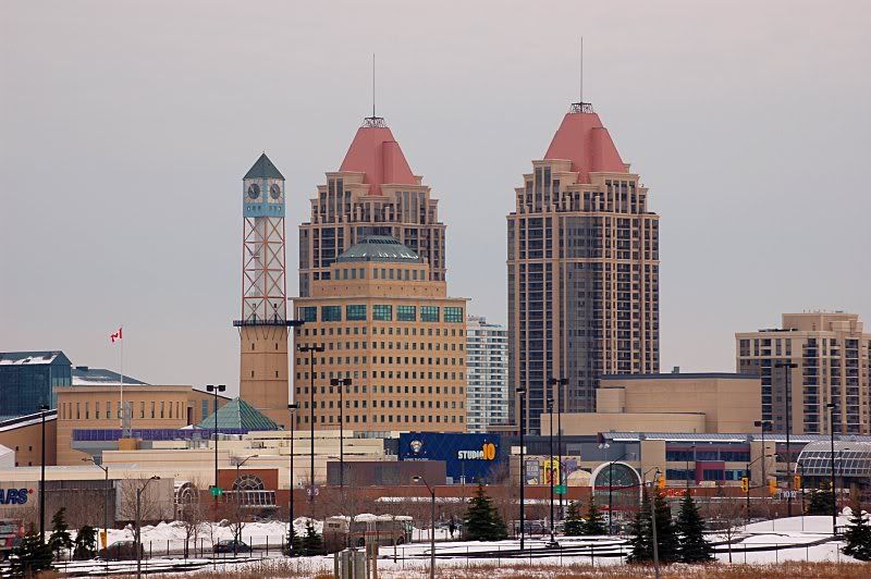
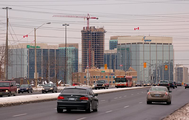
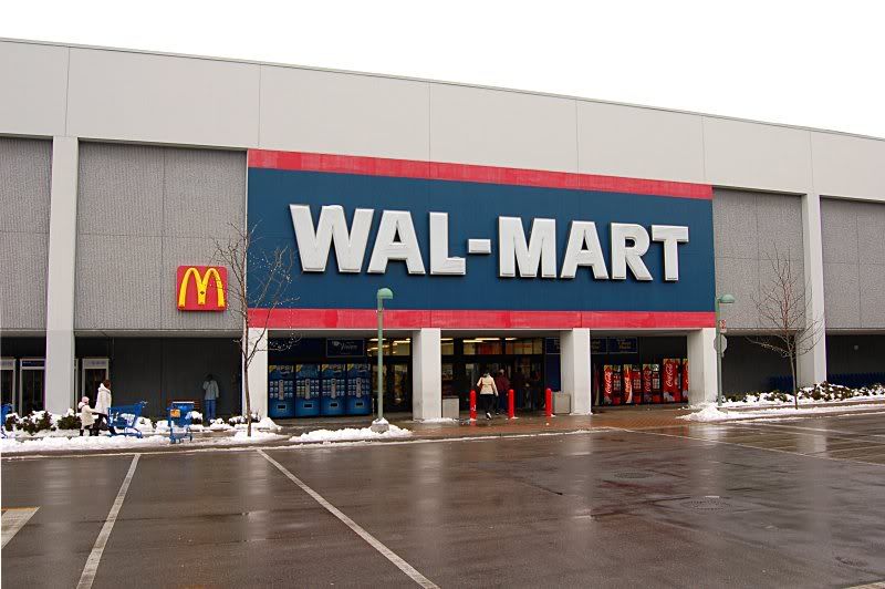
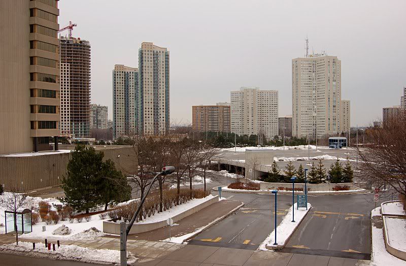
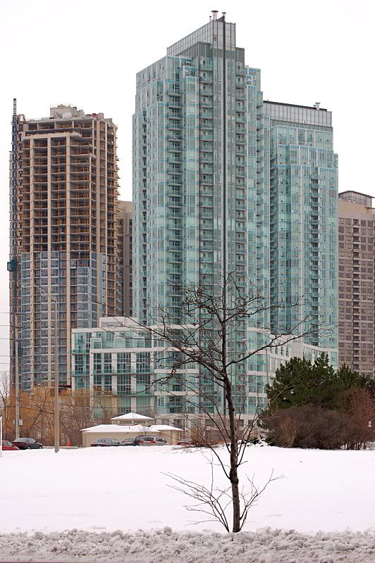
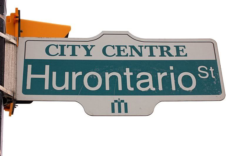
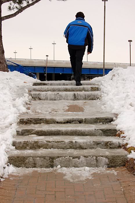
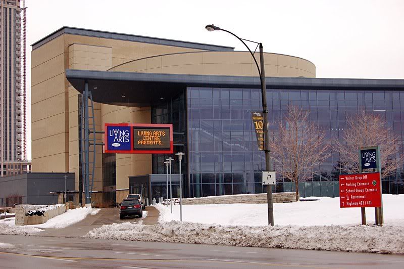
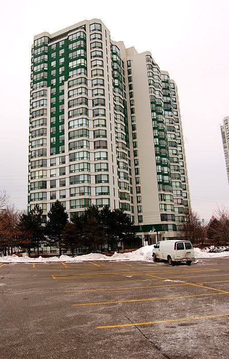
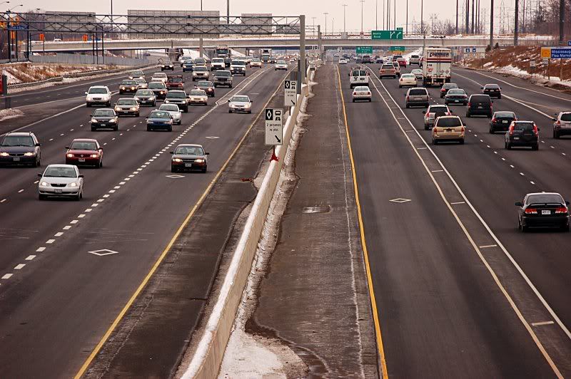
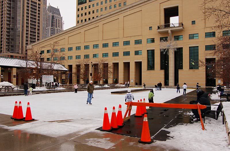
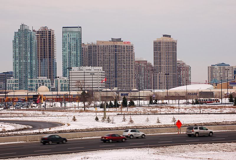
have to say, i love these 2 pictures.




yyzer
Senior Member
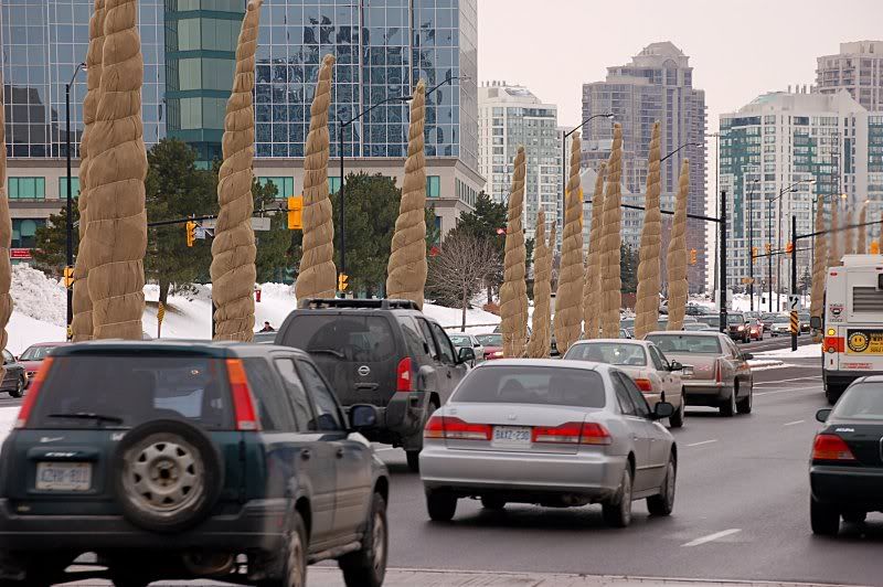
great shots, flar...crystal clear images..
junctionist
Senior Member
have to say, i love these 2 pictures.


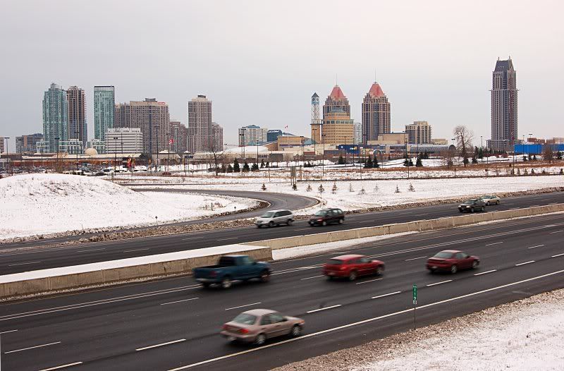
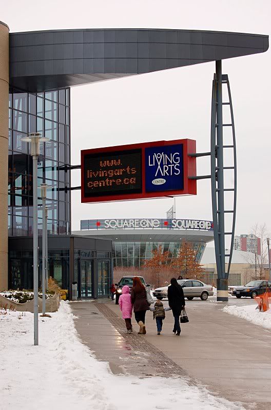
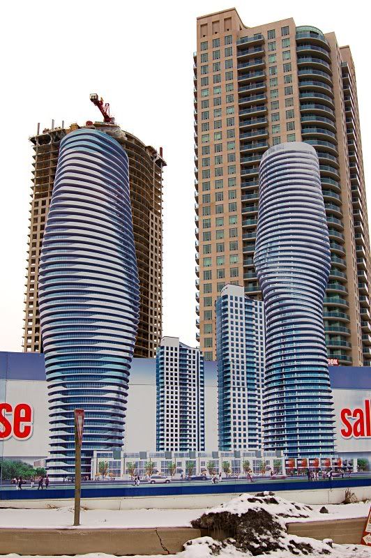
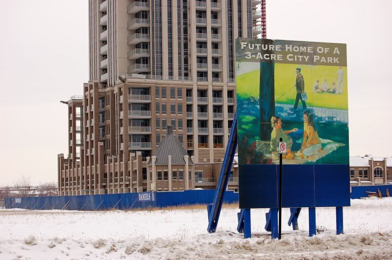
At least they're honest about their priorities. This is classic Mississauga.
JasonParis
Moderator
Nice shots, thanks!
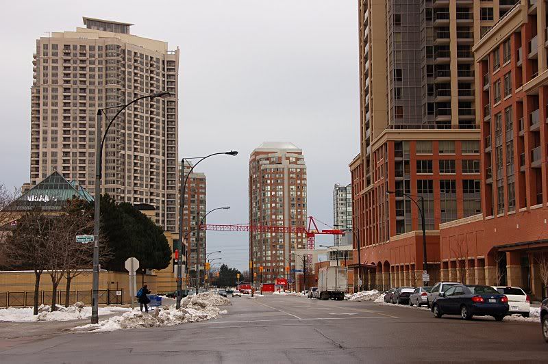
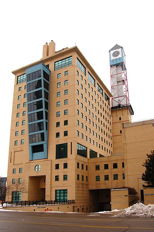
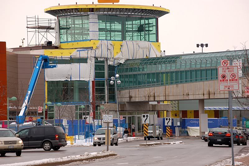
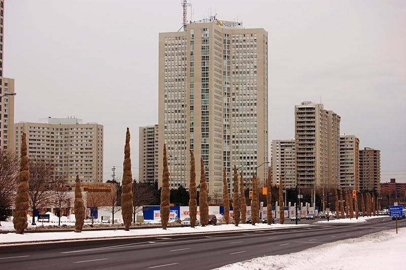
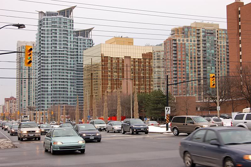
Despite all the new buildings, I'd say MCC is only marginally better at ground than its ever been. Still, it's inching the right way and you got to at least admire their plans.
Despite all the new buildings, I'd say MCC is only marginally better at ground than its ever been. Still, it's inching the right way and you got to at least admire their plans.
Towered
Superstar
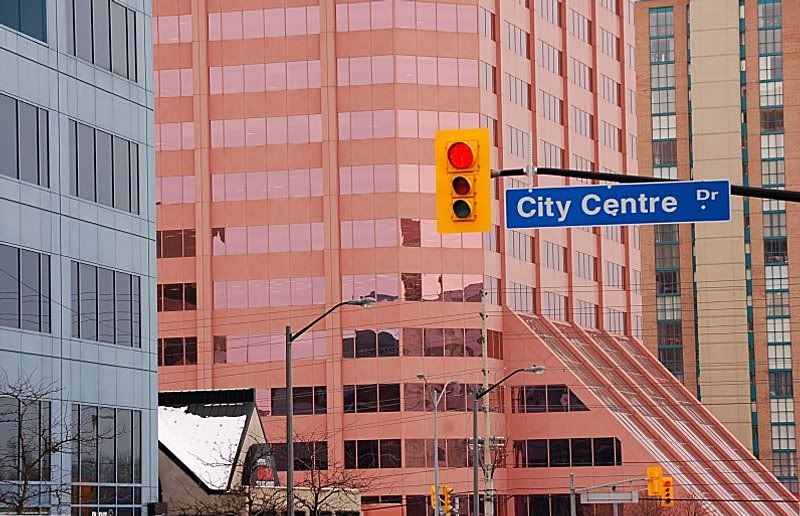
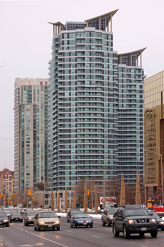
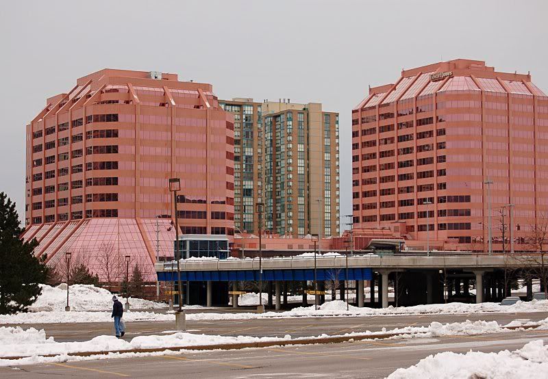
There's something very 60's about those triangular launch pads.
ganjavih
Senior Member
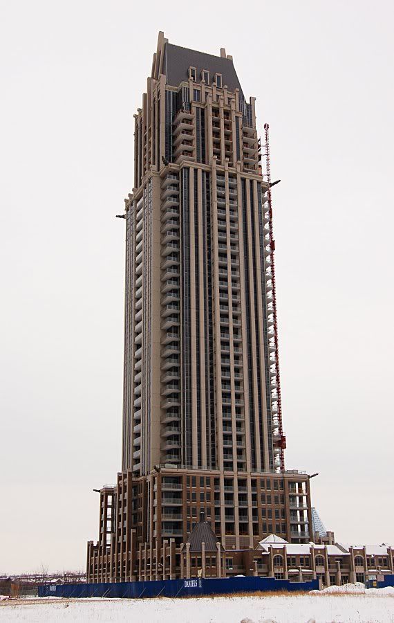
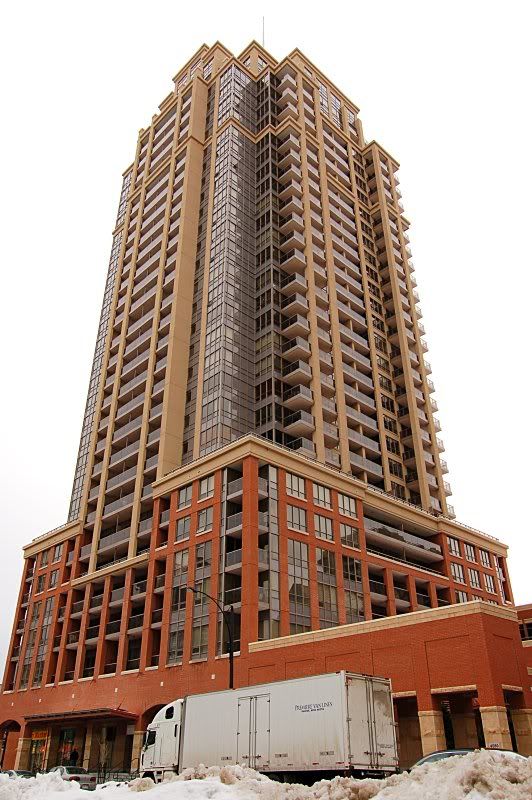
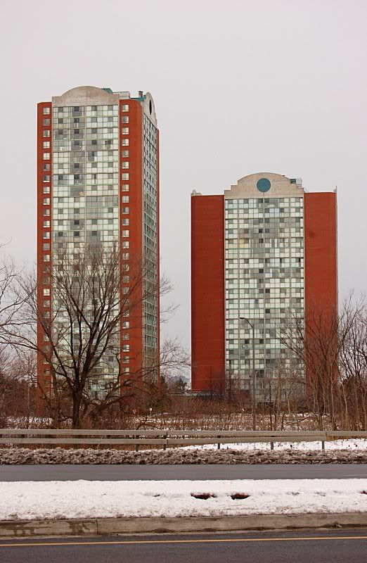
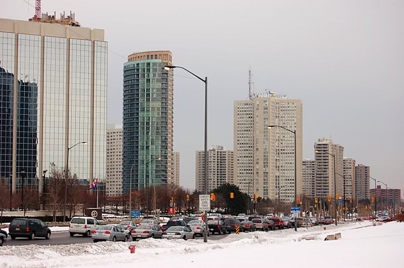
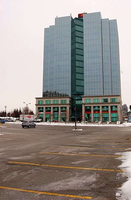
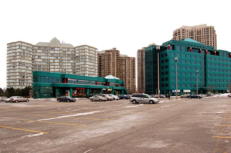
As goofy as One Park Tower is, it looks fantastic compared to the Capital buildings. Mississauga is well on its way to answering the ancient question, "Does building a bunch of condo towers make for an urban experience?"...
scarberiankhatru
Senior Member
As goofy as One Park Tower is, it looks fantastic compared to the Capital buildings.
I was going to post almost the exact same thing
H
Hydrogen
Guest
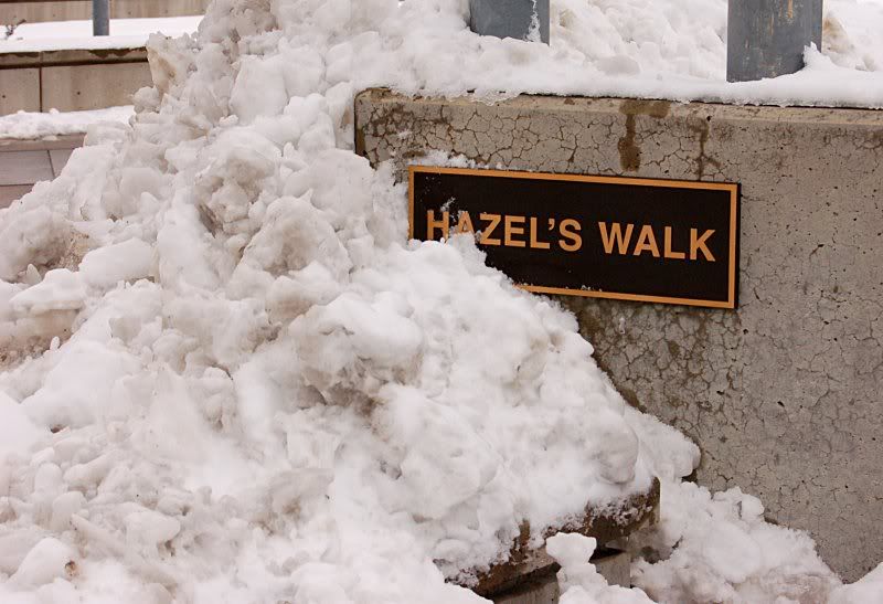
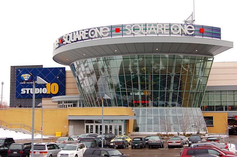
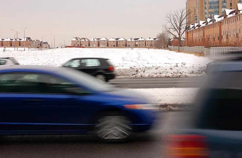
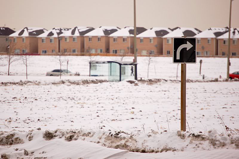
I took the Walmart image to be a sly remark on the state of the vertical suburb. Maybe I'm wrong on why it's there, but it made me laugh.
BobBob
Senior Member
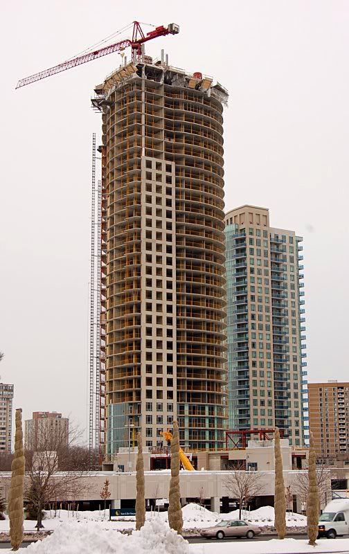
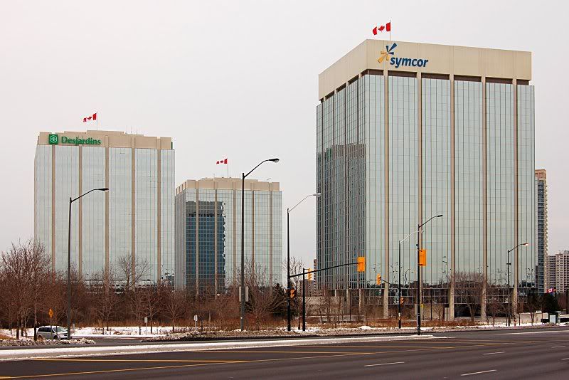
These photos demonstrate what needs to be done to make MCC more attractive than it is now: increase the colour saturation.
junctionist
Senior Member
Though, the same could be said about most of Toronto's waterfront high-rise condos.
doady
Senior Member
Increasing colour saturation only works in situations were the colours are already nice in the first place. A cloudy and grey winter day is not one of these situations. That's the reason sometimes people go for black and white, sometimes less colour is better.
flar
Active Member
Overcast skies give high colour saturation in photos. That and the lack of shadows is why most of my phototours occur on overcast days. Trust me, these wouldn't look good in b&w.
edit: actually, some of them look okay in b&w
edit: actually, some of them look okay in b&w
junctionist
Senior Member
They could look great in black and white if some minor curves adjustments are done. Here I was thinking that BobBob was suggesting that the skyline could attractive if there were condo projects of various colours rather than just a few beige/red towers amidst a backdrop of glass. It turns out that it's just the photo that needs more saturation as we're being led to believe...
doady
Senior Member
I wasn't suggest that these be converted to black and white at all. Just mentioned it as example of when higher saturation is not better. If these photos make MCC look good, it has nothing to do with saturation.
Just look this photo for example
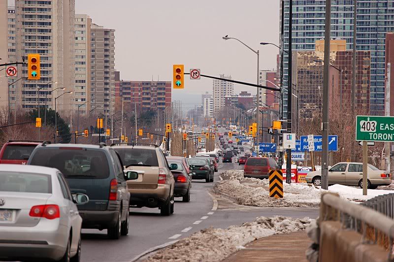
MCC looks good here because of the extreme telephoto lense that makes the buildings look much closer together than they actually are. It is because of the photographer and the camera, not saturation. I admit, I do this sometimes to make Mississauga look more urban than it actually is.
Just look this photo for example

MCC looks good here because of the extreme telephoto lense that makes the buildings look much closer together than they actually are. It is because of the photographer and the camera, not saturation. I admit, I do this sometimes to make Mississauga look more urban than it actually is.
