darwink
Senior Member
Same architect as the Bowness project:

 www.hindle-architects.com
This.It's literally next door to The McLeod at RiverWest, 27 stories and kitty corner to Calgary Place, 36 stories. It's the same size site as Vista West (10th St / 8th Ave), which is 21 stories, 111 suites plus a little office and ground floor retail, or as a better comparison more recently 6th and Tenth, which is 31 stories, 224 units.
Fundamentally, it's out of scale to the community; it should be three times the height. Drop some of these in Montgomery, West Hillhurst, Capitol Hill, Ramsay; places that need starter density. Build downtown buildings in the downtown.
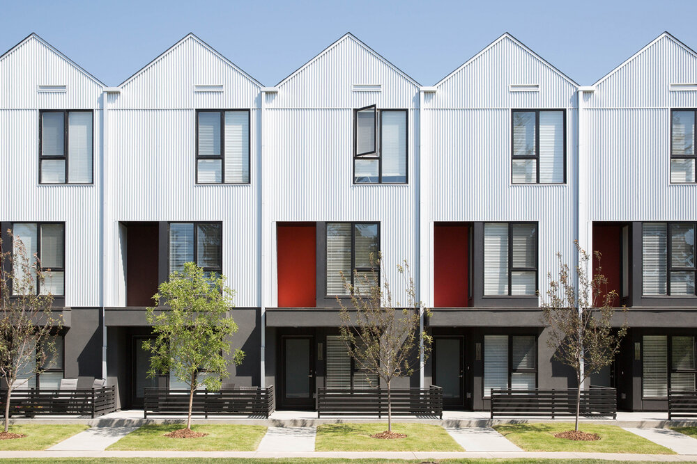
I get what you are saying, but apart from pure height I respectfully disagree. Half the area is parking lots or buildings or podiums lower than this. It's about the height of the podium for the Avenue tower. I think the design is tasteful and appropriate for the context - 25m tall, full lot coverage, and sidewalk fronting instead of driveway or carport fronting. In these ways it's is actually more appropriate for the city centre than several taller, car-oriented, or out of scale buildings nearby (like West Village Towers).It's literally next door to The McLeod at RiverWest, 27 stories and kitty corner to Calgary Place, 36 stories. It's the same size site as Vista West (10th St / 8th Ave), which is 21 stories, 111 suites plus a little office and ground floor retail, or as a better comparison more recently 6th and Tenth, which is 31 stories, 224 units.
Fundamentally, it's out of scale to the community; it should be three times the height. Drop some of these in Montgomery, West Hillhurst, Capitol Hill, Ramsay; places that need starter density. Build downtown buildings in the downtown.
I'm with you on this.I get what you are saying, but apart from pure height I respectfully disagree. Half the area is parking lots or buildings or podiums lower than this. It's about the height of the podium for the Avenue tower. I think the design is tasteful and appropriate for the context - 25m tall, full lot coverage, and sidewalk fronting instead of driveway or carport fronting is actually more appropriate for the city centre that something taller, car-oriented, or out of scale the other way (like West Village Towers).
Could the site be fine with a higher building? Of course - but it doesn't need it. It's still a very urban building and adds to the diversity of designs in the area.
Fully agree we should be seeing something like this design in many, many more areas of the city (reasonable density, full lot coverage, human scale, pedestrian-focused).
Might as well make a thread for this project, now that @YourBoy007 found the drawings.
View attachment 414672
