You are using an out of date browser. It may not display this or other websites correctly.
You should upgrade or use an alternative browser.
You should upgrade or use an alternative browser.
- Thread starter Surrealplaces
- Start date
darwink
Senior Member
My eyes!!!

The Familia
Active Member
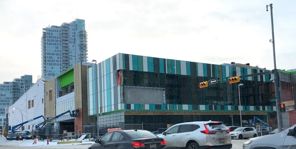
Wow, two misses in a row for East Village. This, The Hat, and the Hilton are huge failures in my mind. Love that Arris will be providing some much needed amenities and should really kick start the East Village, but in terms of design, epic failure. Looks like a cheap Lego. I'm surprised CMLC is allowing these kinds of designs to be permitted in the area. Personally, Evolution is my favorite condo complex in East Village and one of the best in the city. I wish the original Arris concept was built (brick warehouse looking podium).
If I had to rank all the East Village projects up until now it would be as follows:
Library
NMC
Evolution/First/XYC (based on renderings)
Alt Hotel
N2/Verve
Ink/Arris/Hilton
The Hat
If I had to rank all the East Village projects up until now it would be as follows:
Library
NMC
Evolution/First/XYC (based on renderings)
Alt Hotel
N2/Verve
Ink/Arris/Hilton
The Hat
Calgcouver
Active Member
This looks like a bowling shirt from the 90s.

Alternatively, you could have told me this is the Silver Dollar Casino's new East Village location, and i would have believed you.
Alternatively, you could have told me this is the Silver Dollar Casino's new East Village location, and i would have believed you.
haltcatchfire
Senior Member
1875
Senior Member
fwiw the only view of that is from the freeway so it will be a fleeting one, as long as you make the light
BKha
Active Member
I would mostly agree, except I like INK, and the Hilton is okay.
Wow, two misses in a row for East Village. This, The Hat, and the Hilton are huge failures in my mind. Love that Arris will be providing some much needed amenities and should really kick start the East Village, but in terms of design, epic failure. Looks like a cheap Lego. I'm surprised CMLC is allowing these kinds of designs to be permitted in the area. Personally, Evolution is my favorite condo complex in East Village and one of the best in the city. I wish the original Arris concept was built (brick warehouse looking podium).
If I had to rank all the East Village projects up until now it would be as follows:
Library
NMC
Evolution/First/XYC (based on renderings)
Alt Hotel
N2/Verve
Ink/Arris/Hilton
The Hat
UrbanWarrior
Senior Member
The white part of the Hilton is a win, the grey sheet metal part is barf city.
Agreed. I really like the white panel section. I also like INK. It's nice to have some color.
maestro
Senior Member
I don't think I would change anything with the list. Ink has a funky design. The fit and finish is as bad as The Hat. I get why some like it and others don't.
The Familia
Active Member
Yeah I actually like the design of Ink a lot, it’s the cheap spandrel I don’t like. If there was more clear glass and only spots of coloured spandrel I would like it more. If they duplicated “Colours Condo” I would be much happier.
MichaelS
Senior Member
Just wait until they plaster the majority of it with digital advertising. Not the corner you posted by the looks of it, but a lot of the other walls are slated for it I think.
http://www.calgary.ca/PDA/pd/Documents/Direct-Control-Districts/2018/151D2018.pdf
From the DC bylaw:
Purpose
1 This Direct Control District is intended to provide for:
(a) expansive and more permissible digital signage regulations offering the necessary commercial exposure to businesses operating on-site in East Village.
haltcatchfire
Senior Member
Yep, get ready for lots of Revlon and Joe Fresh.
gsunnyg
Senior Member
Man I hope the signs are big enough. It'll help light up the area and add street character. Calgary and Canada in general outside of Toronto seriously lacks in its advertising game. Lots of metro cities around the world will have big LED ad boards littered all over hot spots and they really help enhance the street scape visually. Instead in Calgary u get mid sized rectangular signs at best with ur local real estate agent advertising how fast he can sell your home. I remember seeing one massive billboard in London on a major roadway during Spiderman Homecoming. The way it was placed around a curving road made it seem like Spiderman was shooting a web right at your face, it was pretty damn cool. I wish Calgary was more open to things like that especially along roadways like Macleod and Mcknight. Hopefully this digital advertising on the Arris podium will make the 5th ave flyover more interesting to drive on during rush hour.
Platopos
Active Member
At least it fits the color scheme of EV. Who knows, maybe with the tower it'll look decent.This looks like a bowling shirt from the 90s.
View attachment 173747
Alternatively, you could have told me this is the Silver Dollar Casino's new East Village location, and i would have believed you.
