You are using an out of date browser. It may not display this or other websites correctly.
You should upgrade or use an alternative browser.
You should upgrade or use an alternative browser.
- Thread starter Surrealplaces
- Start date
UrbanWarrior
Senior Member
Still have no idea as to what it’ll look like when it all comes down….
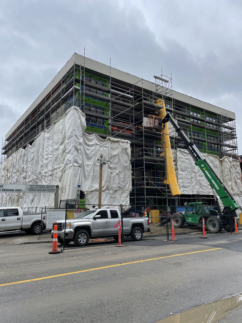
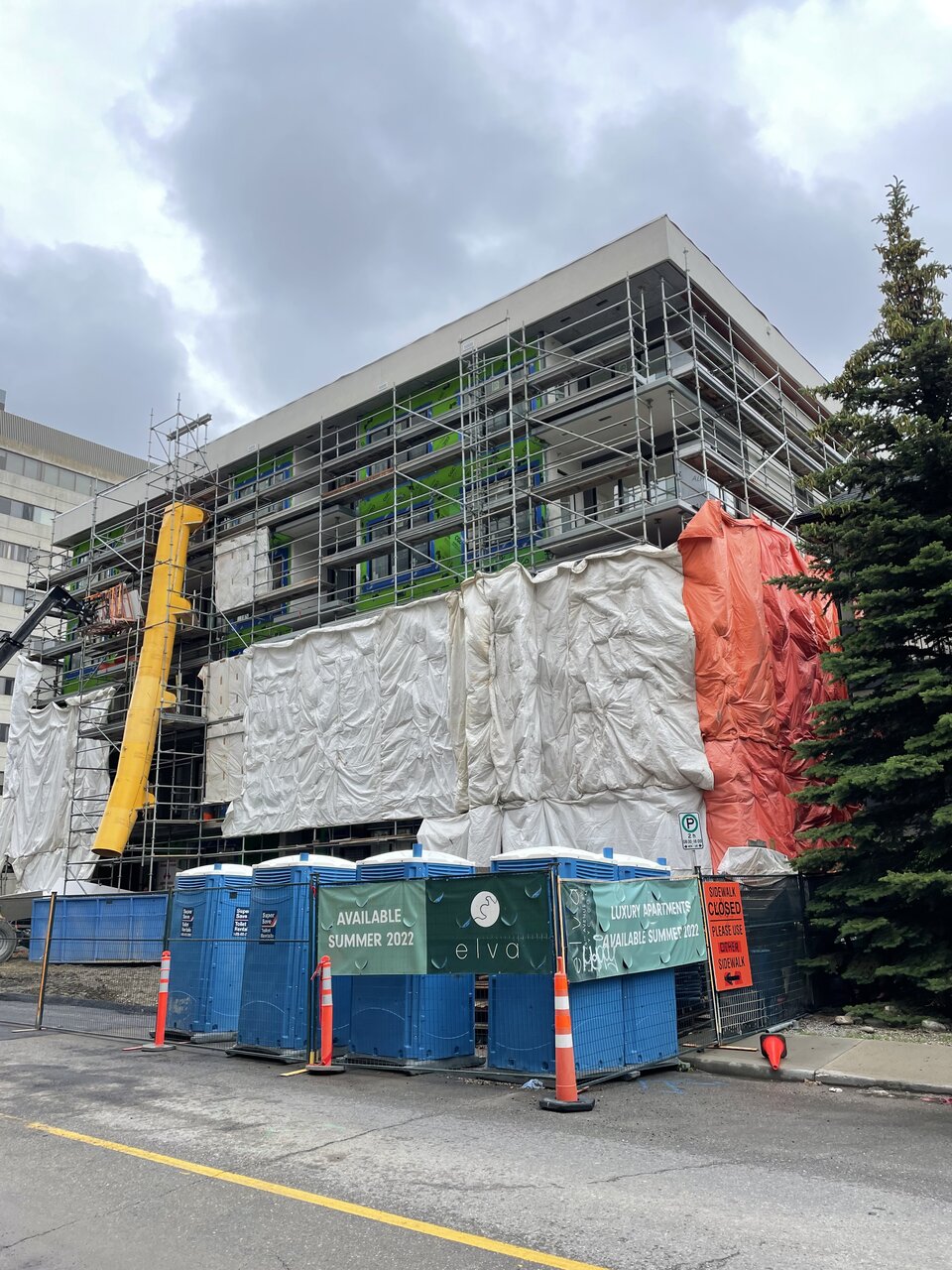
Urb
Active Member
A value engineered grey box
Habanero
Active Member
It looks that way doesn’t it.A value engineered grey box
haltcatchfire
Senior Member
A little early to judge. Need to see clothing off.
Alex_YYC
Senior Member
Urb
Active Member
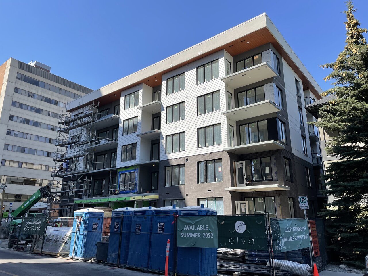
I really like the renderings of this project, but it looks like they stripped out most of the nice details. This looks like an affordable housing development now.
Definitely VE’dI really like the renderings of this project, but it looks like they stripped out most of the nice details. This looks like an affordable housing development now.
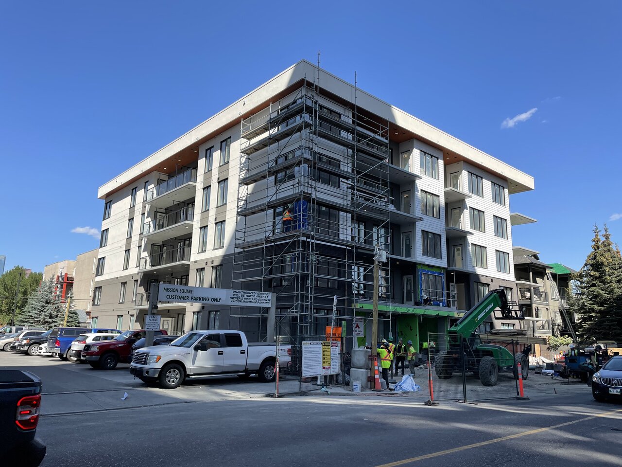
Decided to take the long way home after work, and snap a few photos.
UrbanWarrior
Senior Member
The new standard of mediocrity…
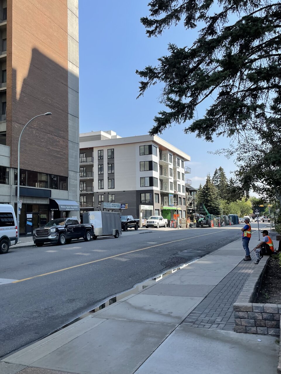
Just build it
Active Member
It’s a downgrade from the stone finish to the siding but it still looks good. I’d be happy seeing more builds like this.
UrbanWarrior
Senior Member
Not the worst, could be much better.
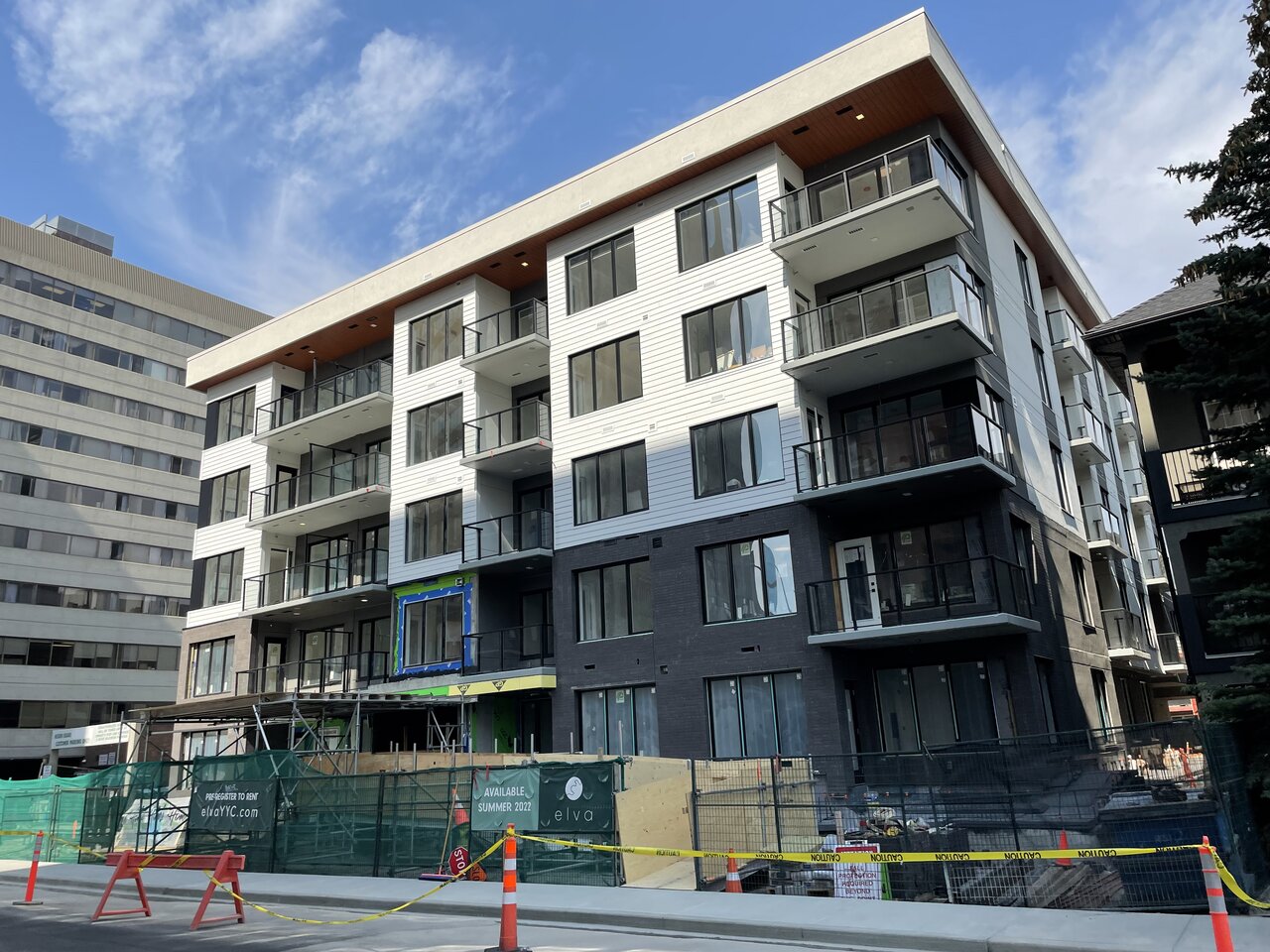
gsunnyg
Senior Member
It's strange they went with siding on the front and stucco on the other 3 sides. Personally, I would have gone with light colored brick on the front instead of the siding...or at least stucco and either stucco or siding on the other three sides. Would have made all the difference IMO.That hardie board/vinyl finish killed it. Would've rather taken stucco. Every time I see this stripe pattern, I think of Calgary's cheap patented suburbia home sidings.