You are using an out of date browser. It may not display this or other websites correctly.
You should upgrade or use an alternative browser.
You should upgrade or use an alternative browser.
- Thread starter MichaelS
- Start date
CT (Chinese_T)
Active Member
Does anyone know what the house will be used for? Amenity space? Commercial Unit?
LloydBraun
Active Member
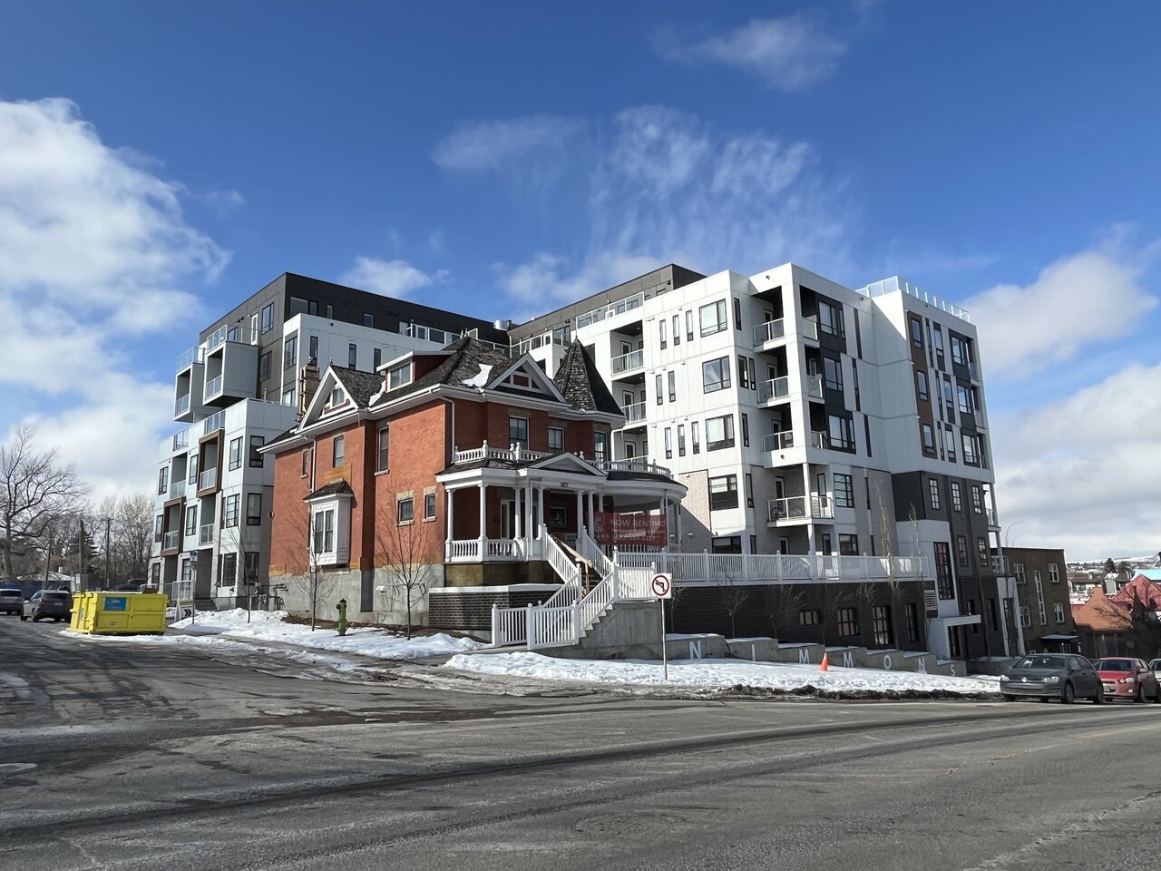
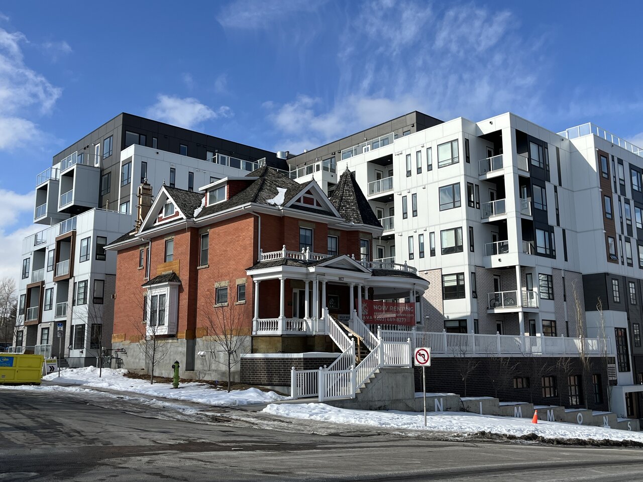
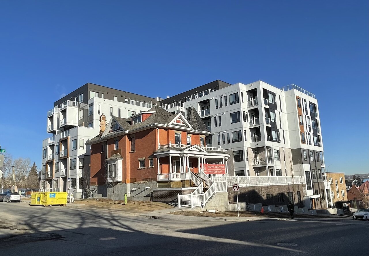
This is a very bizarre project. I am glad they were able to deliver and incorporate the heritage building, but I find that the new development neither complements nor contrasts for an effective pairing. Matching the tone of the heritage brick might have been the way to go here to help tie it together, faux pas be darned.
Last edited:
The Familia
Active Member
Glad they saved the old house. New building is a mess of materials and styles, not very complimentary to the old house.
Mountain Man
Senior Member
Using similar brick would have gone a long way.
haltcatchfire
Senior Member
I don’t like how the house sits up unnaturally 5’ higher out of the ground than it originally did. The avenue side is technically the back of the house as the north side was the orientation for views down the valley so the new site context defines the house as out of place.
BKha
Active Member
Overall the project is a win IMO. Some things could’ve been done better but it’s a perfect scale it a good use of a heritage home.
Alex_YYC
Senior Member
Not any difference from Urban Warrior’s update on Jan 4, except that some of the balconies have personal items, this one is definitely completed.


YourBoy007
Active Member
I give this an A
Tarsus
Active Member
Overall a very good project on a lot that was wasting away. Not only new density to the area, but new life on a heritage home.
Alex_YYC
Senior Member
The snow is gone and we get a good look at the final product. This will be nice once the grass is green and there’s some shrubs or foliage.

Mountain Man
Senior Member
Very unharmonious...
cameronhowe
Active Member
the cascading signage down the edge of the building looks hodge podge.
I don't like the signing down the side. I'm curious to see how this looks when the trees kick in.
potatopizzafan
Active Member
Would love to see a pub open in the old house! 