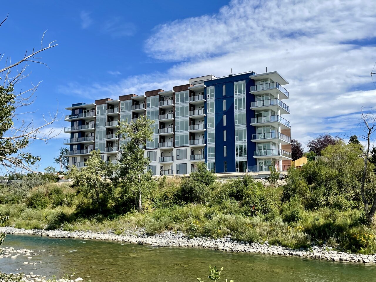
I was wondering if it might even be fiber cement, but usually those panels a thicker.
You are using an out of date browser. It may not display this or other websites correctly.
You should upgrade or use an alternative browser.
You should upgrade or use an alternative browser.
- Thread starter Surrealplaces
- Start date
Mountain Man
Senior Member
Hardie panels are typically 5/16" thick, so about the same as ACM.
jianxia15
Active Member
Color looks a bit weird, but a nice project overall.
Mountain Man
Senior Member
Yeah not really a fan of that angle, too many colours that don't really go together lol.
CalgaryTiger
Senior Member
I just assume the architect is an Eiffel 65 fan...
Yo, listen up, here's the story
About a little guy that lives in a blue world
And all day and all night and everything he sees is just blue
Like him, inside and outside
Blue his house with a blue little window
And a blue Corvette and everything is blue for him
Yo, listen up, here's the story
About a little guy that lives in a blue world
And all day and all night and everything he sees is just blue
Like him, inside and outside
Blue his house with a blue little window
And a blue Corvette and everything is blue for him
Last edited:
DiscoStu
Senior Member
Ive watched this go up from my office window...and had my hopes up that it would be tastefully done. But nope, another project bungled up with too many colors.
1875
Senior Member
the curse of high visibility
Daemon
New Member
1875
Senior Member
the sw corner units with the wrap around terrace are pretty sweet. great location.
Last edited:
^lol, we must have just missed each other. According to the timestamp, I was there at 2:48pm.


1875
Senior Member
its on my way home from cold garden.
Mountain Man
Senior Member
Turned out pretty good.
CalgaryTiger
Senior Member
There's still too many materials and too much going on. Should've picked one of the blue and brown and dropped the other colour.
DiscoStu
Senior Member
Yeah, it turned out decent...but just overcooked with the colors. Developers here just can't seem to get out of their own way sometimes.
Mountain Man
Senior Member
I think a lot of the multiple colours / materials on buildings these days is the city pushing developers and architects to break up large sections of wall and massing.