Silence&Motion
Senior Member
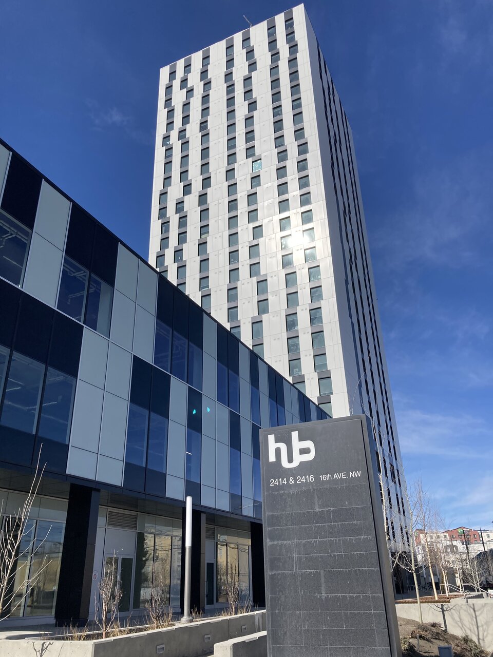
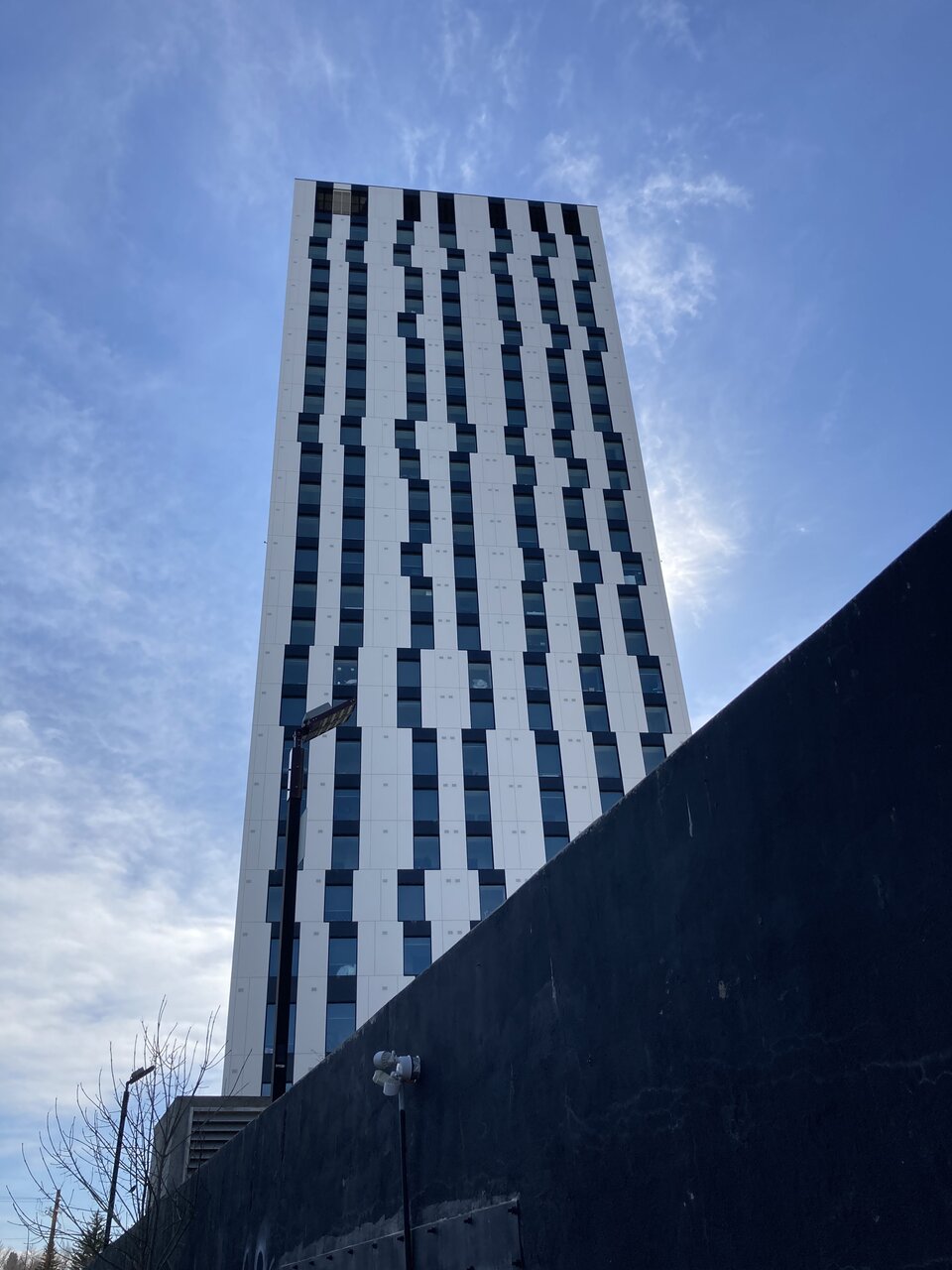
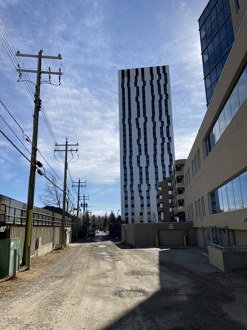
This tower has definitely grown on me. It looks cheap from close up and its immediate surroundings are truly dreadful, but it’s doing more good than harm. I just feel bad for the people who have to live in it.


|
|
| |||||||||||||||||||||
| |||||||||||||||||||||||
I've never minded it either, the tower gives me strong European vibes for whatever reason. I have some friends that live there too and the interior and the amenities aren't half bad.
this fact alone makes it a win in my books. Anything better than the 80 shades of beige, cheap trim, vinyl garbage we see on most projects in this countryIt's a black and white rectangle with uneven windows on top of a black and white rectangle with uneven windows. There isn't anything special here.
The soviets wish they had built stuff so high quality. That doesn’t negate the unfortunate pattern of the curtain wall which could have easily been playful.Soviet era garbage.
In Central London this would be a very high quality tower and would thus look way better. This building as it is, is super cheap and crappy looking. The first picture in Silence&Motion's picture shows how crappy it is, the oil canning on the while cladding panels looks awful. When the spandrel panels on the podium curtain wall look better, you know it's not a job well done.It's something you would see stuck up outside of Central London. Again, add a few decent towers around it and I don't see why this can't be a decent win.


