I prefer the lighter colours, but otherwise I still hate the street level treatment and just generally think it's a lazy, cheap design for such an important intersection. This corner deserves something more ambitious and creative. University District does better than this - a lot better - and they're not even inner city.

I'm not even saying it should be a highrise - Truman's Broward is similar size project to this and based on the renderings at least is far, far better.
 
Last edited:
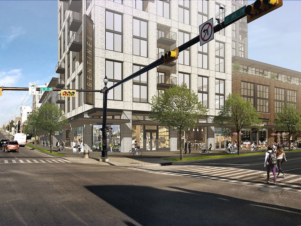
Wow, it has gotten worse, I'd take the steps and planters over this. There is nothing more sterile and off-putting than a block-long wall of glazing only slightly broken up by sections of brick.
 
This building is bigger than I thought...

fawjjofwojaf.PNG
 
This building is bigger than I thought...

View attachment 545795
It's why although I would prefer for this to at least have one +16 story tower for a prominent gateway, the amount of units being proposed is good in the grand scheme.

If they did a tower(s), it could be even more, but with all the projects they apparently have on the go, perhaps they don't have the capital to afford the costs for the foreseeable future.
True. What I find disappointing is that this is the lowest quality of their projects (at least based on the rendering). I am guessing that this is their lowest priority to proceed, as Enzo is now u/c and they appear to be ready to move forward with Francesco's next (based on the DP heading to CPC this week). Hoping the market changes enough to encourage something more ambitious and interesting before it actually goes ahead.
 
Can this please get cancelled? No really. This is such a wasted opportunity, and honestly shouldn’t be allowed to proceed.

Go build this building anywhere in Calgary, not on 17th Avenue. It doesn’t look good and it’s far too low on the density.

Can Calgary not set minimum density/height requirements for the beltline?
 
I’m with everyone on the design of this being pretty lame, but I don’t have a problem with the scale. The height/density seems fine to me. Personally I don’t like having towers or taller buildings directly on high streets…they are more imposing and block more light, which works against having a human-scaled experience, which I think is what often makes a great pedestrian-focused shopping street.
 
Last edited:
Agree that it doesn't have to be tall, but it also must not suck. This looks to me like a residential building that would be built in the suburbs. I know there's retail at grade, but it looks more like an afterthought than a focal point in the renders. Aside from that the colors are muted and boring, the materials don't look promising, and the overall design is derivative and generic. This thing will be the largest building at one of the most important intersections in centre city, and so needs to be of high quality.
 

Back
Top