Calgcouver
Active Member
Every street-facing edge of this POS looks like it was treated as a back entrance. Every angle of WVT is absolutely tragic from the ground level. I can't remember the last time i've seen a mixed-use tower put so little thought into the at-grade interaction in a way that this is completely offensive from an urban design standpoint.As weird as it is to say, I think the street interaction would've been improved a lot more if the doors were just nicer, or if there was a look into the lobby. This just looks like some shady back entrance. Compare that to BLVD:
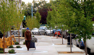
View attachment 405548
BLVD has just as many issues (if not more) - facing a busy car-oriented street, there are steps up for flooding protection, but it just looks a lot more welcoming


