Edmonton | MacEwan University Centre for Arts and Culture
You are using an out of date browser. It may not display this or other websites correctly.
You should upgrade or use an alternative browser.
You should upgrade or use an alternative browser.
- Thread starter SRC Admin
- Start date
Oct. 23 Update




Dec. 15

Hilman
Active Member
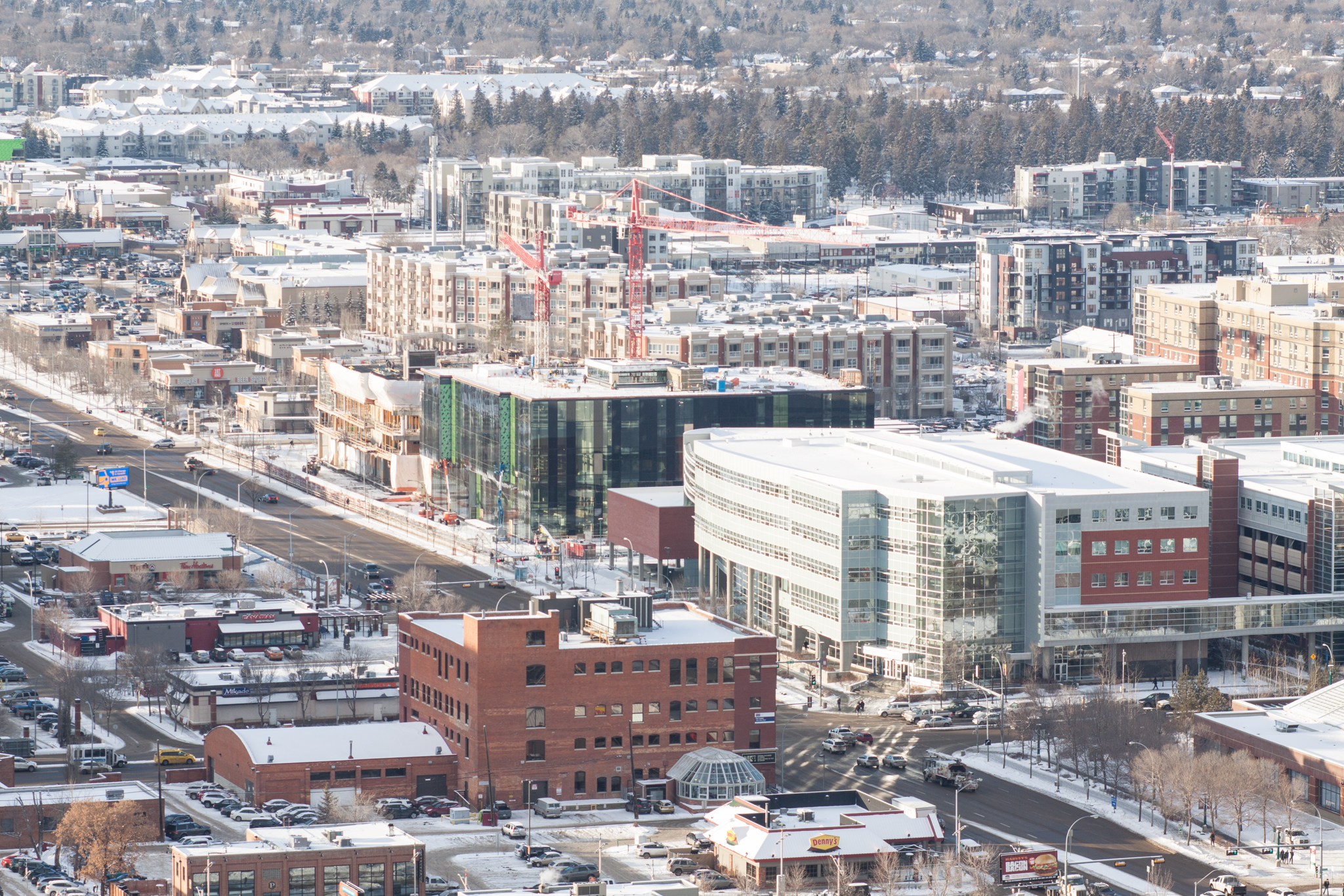
Love the piano look, nice shot Dave.
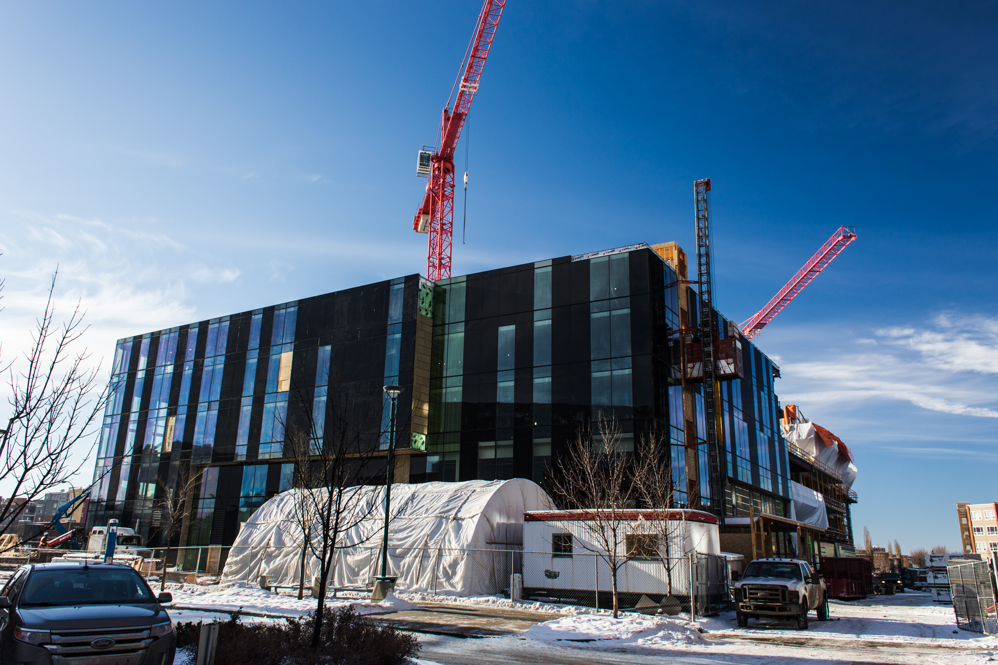
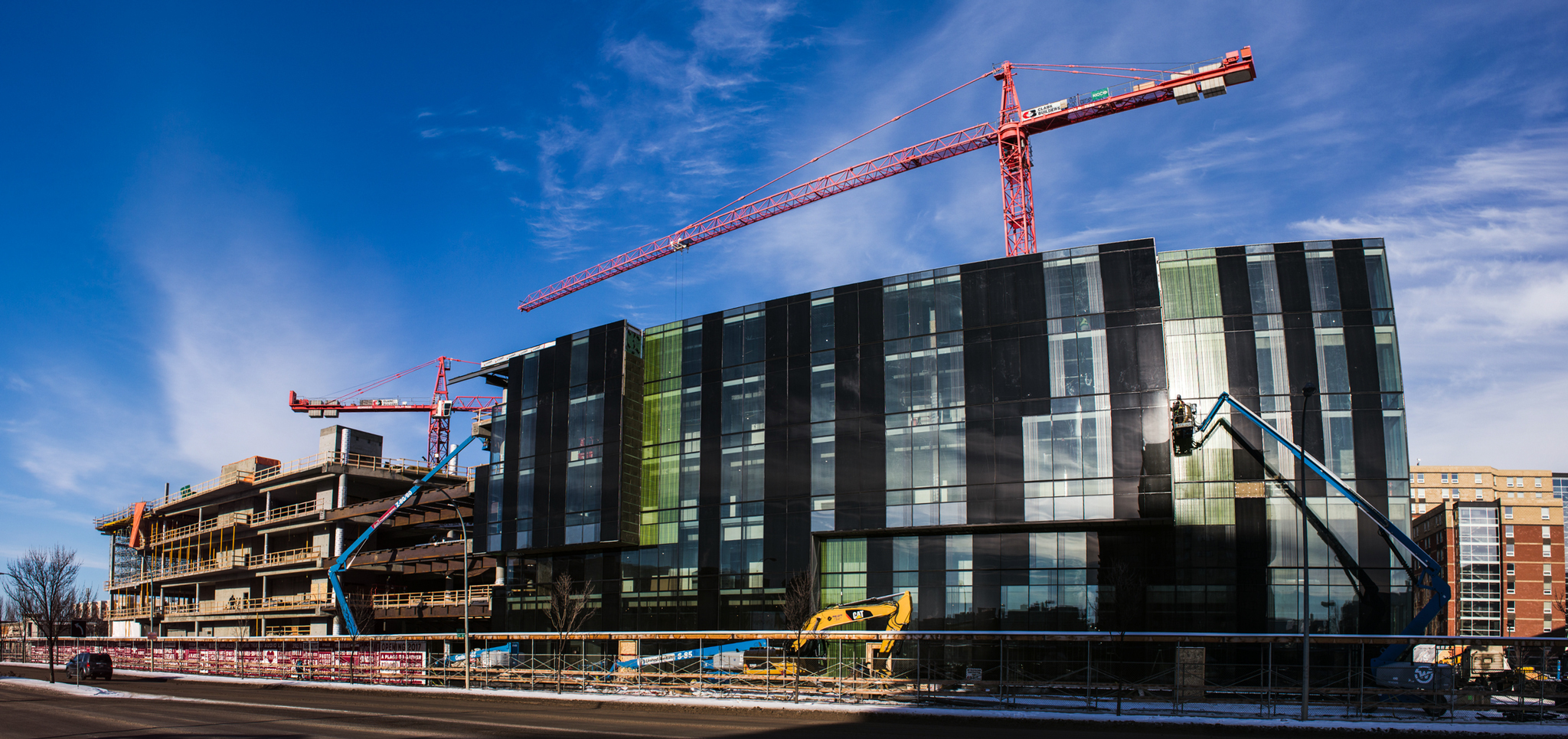
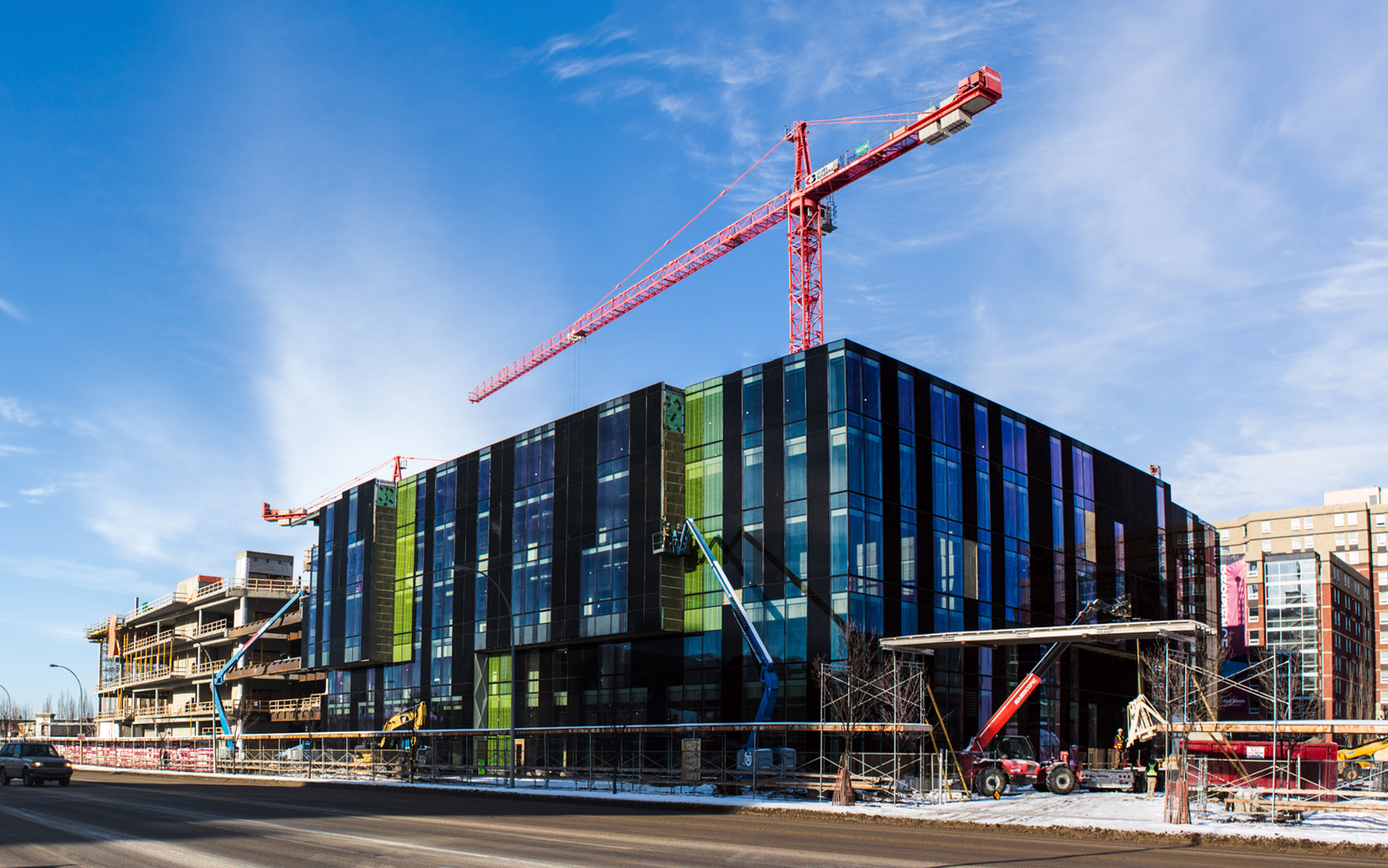
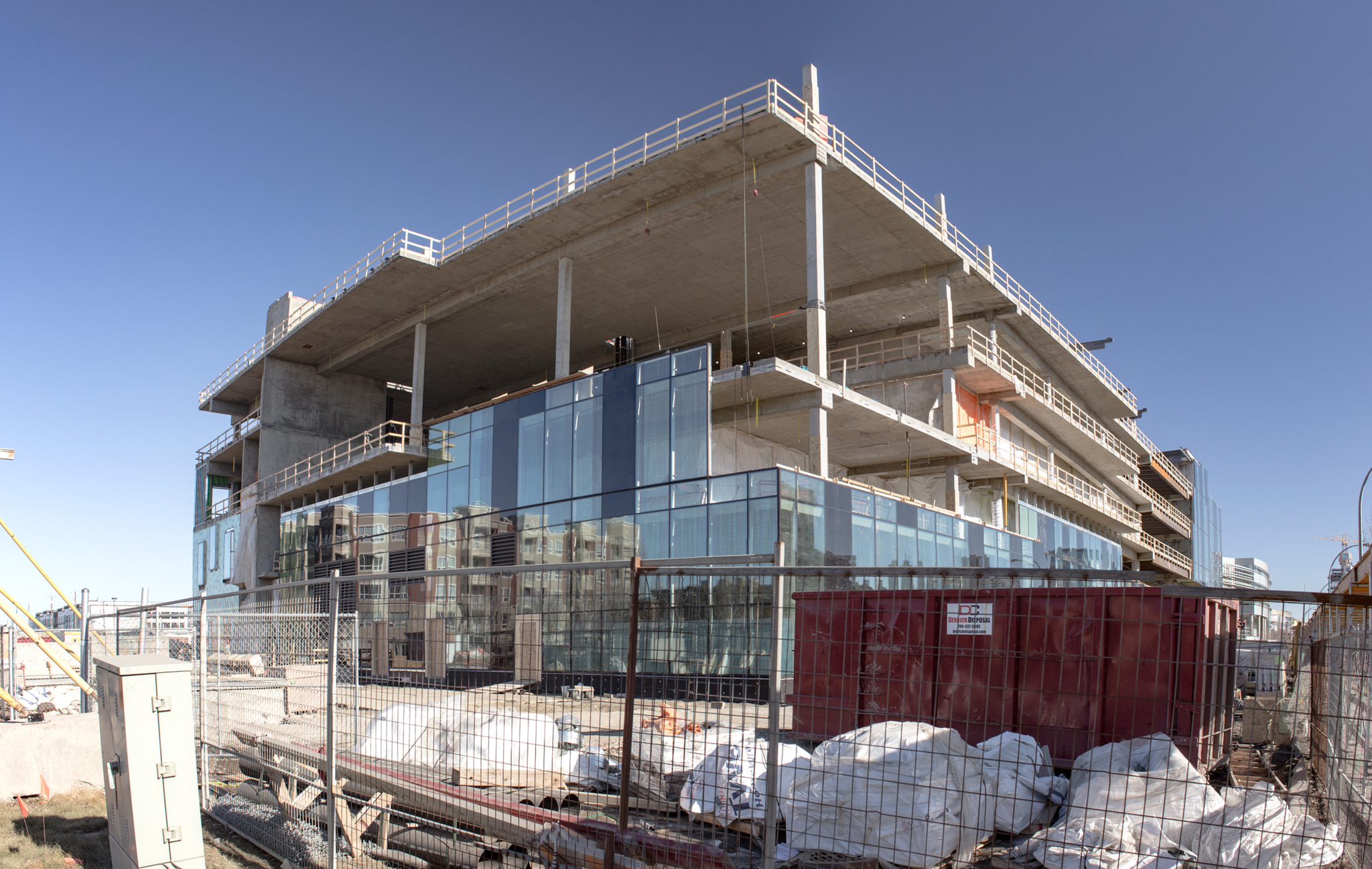
Jan 18 Update - Top-out of concrete has completed.





Froggy
Active Member
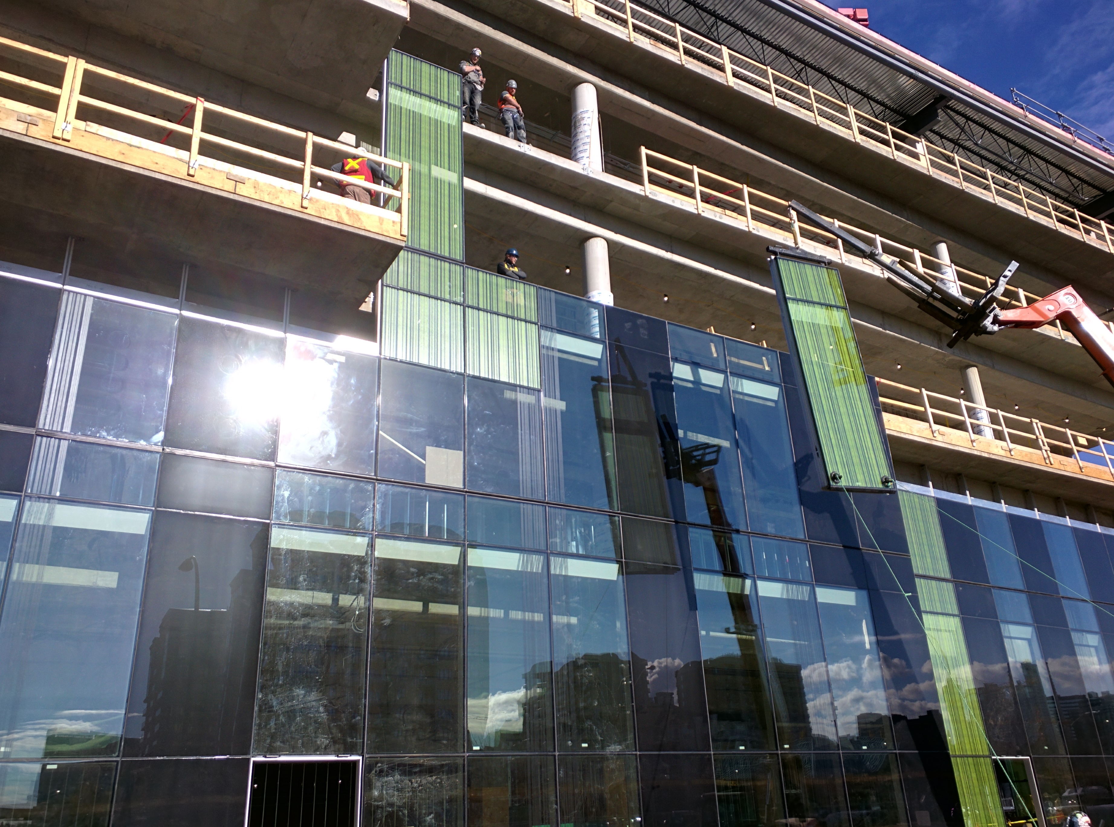
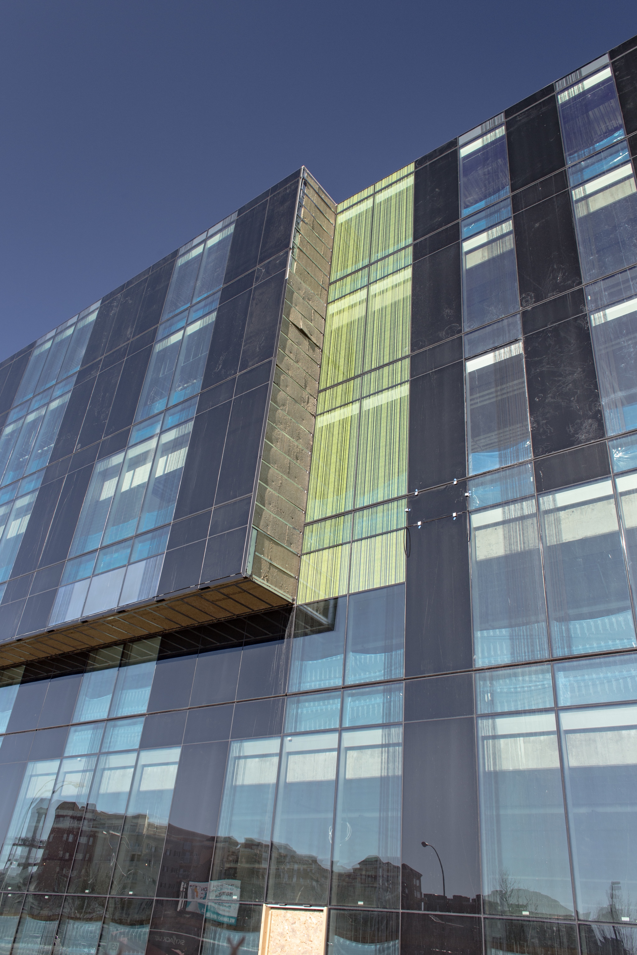
Coming along together nicely. Are the green windows tainted? I like the effect!
Hilman
Active Member
Tainted or tinted 
This is a picture from Dave in above post showing the window:

This is a picture from Dave in above post showing the window:

Hilman
Active Member
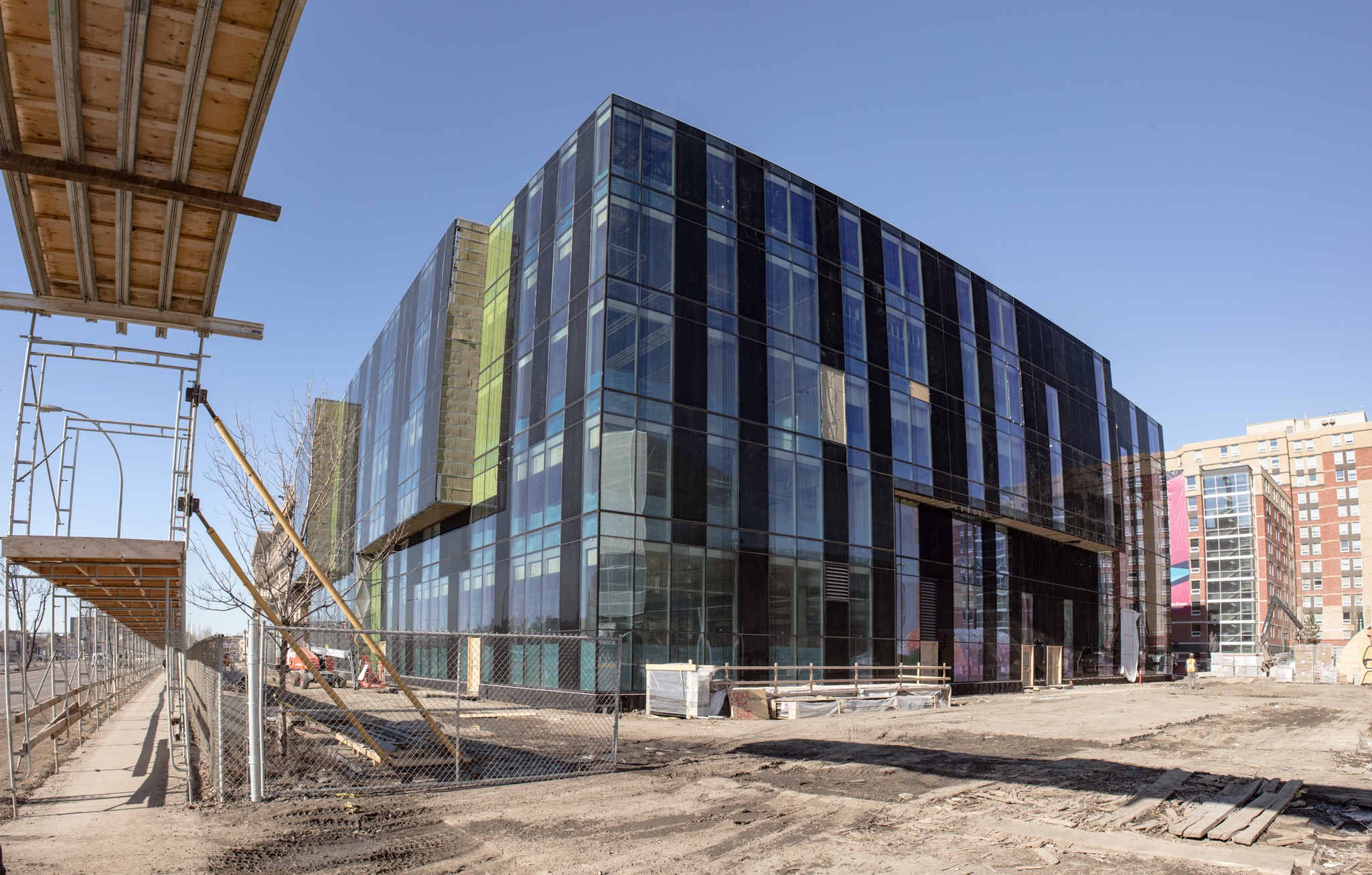
Feb. 25 Update


Hilman
Active Member
Great pics, this is turning out to be a really sharp looking building.
archited
Senior Member
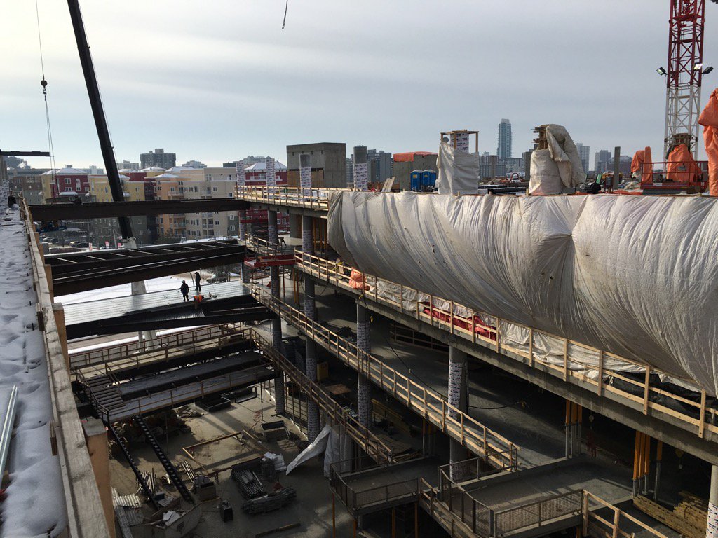
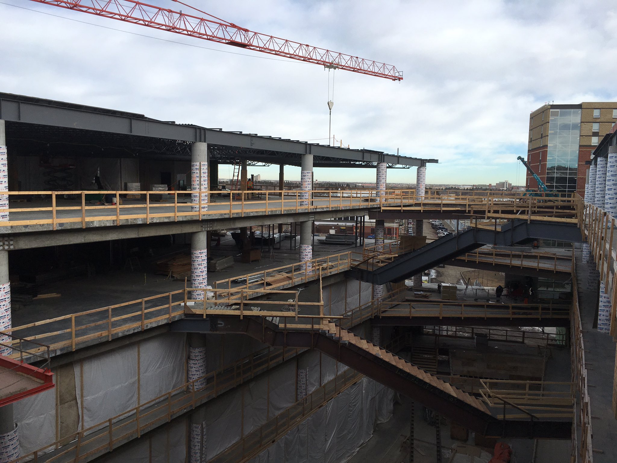
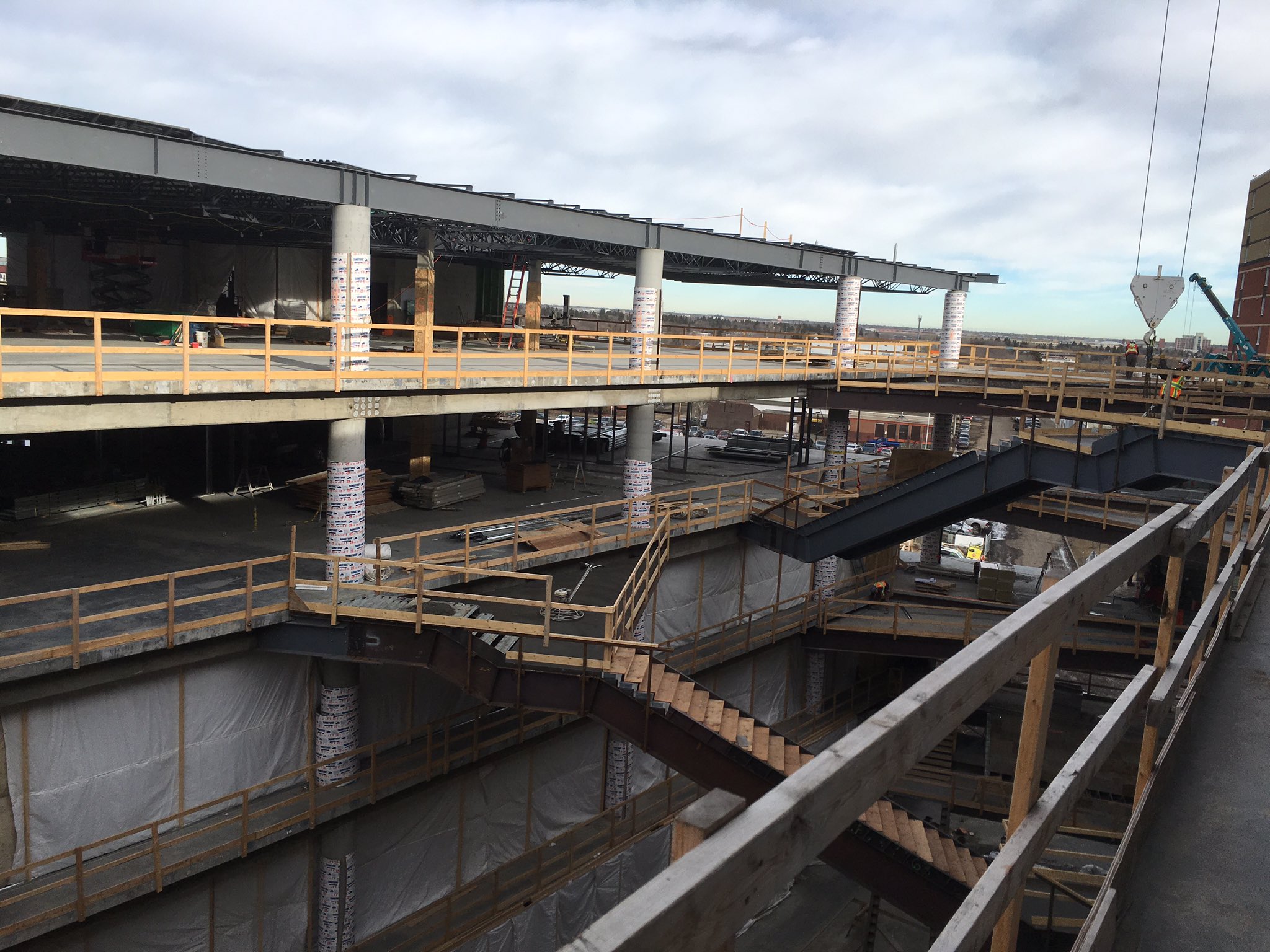
I wish that the original exterior curves could have stayed (apparently chopped for budget reasons) -- now the building has inched closer to a suburban-office-park-looking structure. The three hues of spandrel panels definitely help and Bing Thom's vision of an arts building facade replicating the character of a piano keyboard save the building from the "blah" category. The most exciting part of this development, however, is going to be the central interior quad -- a multi-level open space where people can congregate on ramps, stairs, and "balconies" to view performances and to perform themselves. This building "heart" will make it all worthwhile. One can see the space beginning to take form on Hilman's photo (seventh from the bottom). Btw -- excellent exterior photo record by Dave, as usual.

Andrew Knack @AndrewKnack 4 hours ago
The view from the top floor of the future @MacEwanU Centre for the Arts and Culture building. #abpse #yeg #yegdt
archited
Senior Member
That's what I mean -- spectacular interior space -- will definitely get artistic creative juices flowing! This space should be very popular with students and visitors to the building alike.
