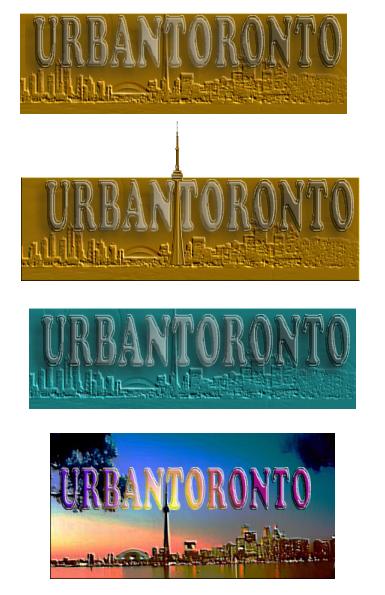
News   GLOBAL  |  Apr 02, 2020
 9.1K     0 
News   GLOBAL  |  Apr 01, 2020
 40K     0 
News   GLOBAL  |  Apr 01, 2020
 5.2K     0 

3

3Dementia

Guest
Here's a very quick look at a completely different direction for the logo. Bear in mind this is by no means being submitted as final art... just a quicky idea so we have some radically different styles to compare (I still like dencity's direction)

tologo.jpg
 
I like the second one the best, because the cn-tower breaks out of the rest of the logo. Nice colors!

dencity
 
It will be interestin to see all the different approaches o the logo taken by different forumers.
 
Nice work 3D. I prefer the second one myself. I love the way the CN powers its way up through the logo.
 

Back
Top