"A staff member from the City of Toronto said the development of the precinct would add about 600 trips of cars in the morning hours, and add 4000 people by foot. The street plan comes from the City's approved Lower Yonge Precint Plan..."

The City contends that there will be too many people living and working here for the sidewalks to handle pedestrian movements alone. They expect 4,000 people to walk into the core every morning from these few blocks. Those sidewalks would be particularly difficult during winter blizzards (or rain at other times of the year), so they want the protected walkways there to stop those down there from consider taking their car instead. (There will be those riding TTC buses, or the LRT as well, once it's built. Not sure what number they expect on transit, but it's above and beyond the 4,000 pedestrians.)

Still, the City does not seem to be worried about there not being enough animation at street level with the densities being proposed here. With this many people, the sidewalks (with a high quality public realm) will still be a popular place.

42
These are my big takeaways from the reports.

With projected 4000 people commuting by foot, that looks to be the overwhelming mode. These sites must be designed with maximizing pedestrian comfort and ease of use in mind. I think the PATH system, whether above or underground, will be essential part of this area's transportation infrastructure.

That said, I think creating a brilliant pedestrian and retail realm at grade is a slightly different yet concurrent goal, and something that has not been talked about or addressed as of yet in these preliminary reports. I hope to see more of how these towers will meet the street when we move past simple-massing renderings. I also don't think the developer or Waterfront Toronto should cheap out when looking for a landscape architect for the Harbour Street extension.
 
I also don't think the developer or Waterfront Toronto should cheap out when looking for a landscape architect for the Harbour Street extension.

Honestly though they should just adopt the general design principles from the West 8/DTAH Central Waterfront project - particularly on material palette/design elements. Might also create economy of scale benefits?

AoD
 

Here is what we are concerned about, what kind of uses exist at ground level. (Page 17)

Harbour Street clearly looking like the area where the pedestrian realm will be the most animated. All the retail is fronting it, while Lake Shore and 'New' Street are only residential tower entrances, and Cooper Street receives the back of the flagship LCBO. Slightly concerning then that the park is cut off from Harbour Street by the structure on the north end of the block, but maybe it will be connected well to the 1-7 Yonge site.

The parking lot at LCBO is situated within the block, and is not taking away from any potential street frontage. This is in fact what we want, and how cities like Barcelona deal with their parking.

My other large concern is the large size of the retail spaces listed at ground level here. If we want to point at something that might not be conductive to creating an animated pedestrian realm, IMO it is that.

Here is how the PATH connections will look like here. (Page 12)

I think the ramps and PATH connections are designed well actually, it just requires one to expand their conceptions of what the PATH is. Look at the PATH here not as a place that steals the spotlight from street-level retail, but as transportation infrastructure designed for the on-foot mode of transport.

You see in the diagram above, the PATH doesn't interfere much at all with Harbour Street and its uses. The PATH ramp extending to the park is situated behind the north-facing building. The entire orientation of the PATH connections is towards the northwest (connecting to the Community Centre, and Union Station beyond). People traveling on Harbour Street and in the PATH have different trip generations/destinations and trip patterns in mind.
 
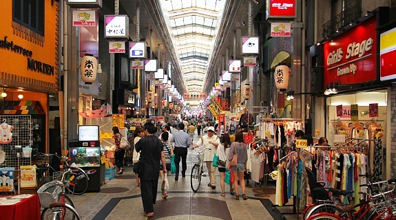
What about incorporating covered arcades like you see in Japan?

4024_06.jpg

[Image courtesy of Japan-Guide.com]

I've always been a fan of them, although there would still be caps at intersections, and still be chilly at those points as well. Sapporo has a climate similar to Toronto, and I thought used these covered streets well.
 
Last edited:
Riocan appear to be going that direction with the Well so we'll probably see this replicated all over the city if it works out for them.
 
The harbourfront is being overwhelmed by twin tower developments. It makes an already generic and bland area all the more monotonous. Whatever happened to the days when developers would get different architects to design each tower in a multi-phase development?
 
I can't think of a development of this scale that had different architects for the same block. It's definitely an idea I really would like to see accomplished. All these high rise masterplans being developed are so formulaic. Colour is not change much.
 
Well, this one, right? B+H on the LCBO tower and aA on Ice 3 and 4?

But, yeah, I wish as much as anyone we had Snohetta, Adjaye Associates, DSRNY, Herzog & de Meuron, and Jean Nouvel each take a building here (or in 3C or Portlands or 1 Yonge or wherever) ;)
 
I was thinking local residential developments. Manhattan is just in another league.
 
Well, this one, right? B+H on the LCBO tower and aA on Ice 3 and 4?

But, yeah, I wish as much as anyone we had Snohetta, Adjaye Associates, DSRNY, Herzog & de Meuron, and Jean Nouvel each take a building here (or in 3C or Portlands or 1 Yonge or wherever) ;)

The rigid, repetitive master plan needs to change first. It's too planned out with each tower perfectly positioned down to the centimeter to provide the most uninterrupted views.
 
Really! Let's march to City Hall and demand that they quit planning this so well! Time to get sloppier!

42
 
I was thinking local residential developments. Manhattan is just in another league.

Regent Park - DSAI, HP, RAW, KPMB, Core, SvN, Wallman, Giannone Petricone, Quadrangle, CS&P
 
Last edited:

Back
Top