The design sorely lacks in inexpensive blue spandrel and exposed concrete balconies /columns.

Arches? Stepbacks? Windows with real mullions? rubbed bronze lanterns? How dare you , AUDAX. You're trying too hard. I want a big wall-o-glass at the street level . There is no other way to flatter a heritage structure. Send it back to the drawing board.
 
Last edited:
However.....when one looks at the maps in the Official Plan (https://www.toronto.ca/city-governm...elines/official-plan/official-plan-maps-copy/), the swath of yellow for Neighbourhoods is the same yellow used in Rosedale, Forest Hill, the Annex and Lawrence Park as the yellow used in "priority neighbourhoods". While the wealthiest neighbourhoods certainly have more ability to fight development, the planning principles within the OP regarding Neighbourhoods are (I believe) applied equally throughout the city, particularly when they are in a more non-political environment such as the OLT.

What is ironic in this discussion is the fact that most of the big development fights of the 1970's that resulted in the current thinking of neighbourhood "preservation" were those involving poorer neighbourhoods fighting demolition for "high-rises", such as North St. Jamestown, the "Hydro Block" on Henry Street or Trefann Court. Also remember that post-war, Rosedale itself was seeing many homes demolished for low-rise apartment buildings, and large houses converted to rooming houses. In fact, when one refers to planning policies "stacked in favour of those who have wealth and land", how does one explain the mini-expressway known as the Clifton Road extension that cut a swathe through the heart of Rosedale in order to connect Mt. Pleasant (at that time only running north of St. Clair) to Jarvis Street?

View attachment 339863
Thanks for bringing some valuable historical nuance to the discussion. I think the discrepancy between your observations and those who now say that zoning protects wealthy landowners comes down to a growing inequality in wealth since the 1960s in the city and growing demand for housing.

It used to be common for lower middle class and middle class people to afford houses in the city. They did enjoy some protection with zoning, even though planning policies were still filled with prejudice back then (for instance, a belief that walkable Victorian neighbourhoods were inferior and worthy of wholesale redevelopment).

Nowadays, it’s difficult to buy a house without a household income of $200,000+. Condos have become small, expensive, and impractical for many (e.g. working class families) due to size constraints. The situation reflects the fact that the city has grown and demand is now on a more metropolitan scale. We’re facing a much different reality today than 60 years ago socially speaking.

Today, there’s not enough land to meet demand, even across a huge urbanized area. The people who can afford land are more uniformly well off. Zoning hasn't really responded to these social problems the way it did in the past when planners decided not to allow people to build houses next to toxic industrial plants (and vice versa) or when planners prohibited low-quality construction over fears that slums would proliferate. Those were progressive ideas at one point.

Zoning is a major factor today as to why housing construction is unaffordable for many and supply doesn't reflect a lot of people’s needs.
 
The design sorely lacks in inexpensive blue spandrel and exposed concrete balconies /columns.

Arches? Stepbacks? Windows with real mullions? rubbed bronze lanterns? How dare you , AUDAX. You're trying to hard. I want a big wall-o-glass at the street level . There is no other way to flatter a heritage structure. Send it back to the drawing board.
Please submit your application to the following: https://www.toronto.ca/city-government/planning-development/outreach-engagement/design-review-panel/
 
  • Like
Reactions: xy3
Photos taken August 31st, 2021:

1630457294842.png


1630457314913.png


1630457348980.png


1630457363195.png
 

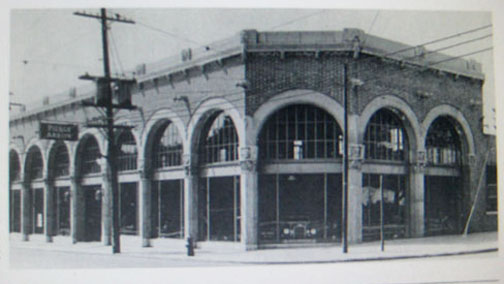
See the Arches with glazing is nice........I'm not keen on what they chose though. Doesn't give a heritage feel, doesn't seem compatible w/the rest of the building, frankly, looks kinda cheap. (though I imagine it wasn't)

Edit to add: @ProjectEnd actually posted a photo of the historical look here. Definitely not a match.

cbcstudio81.jpg


Further addition: Doesn't match the render:

1645215747298.png
 
See the Arches with glazing is nice........I'm not keen on what they chose though. Doesn't give a heritage feel, doesn't seem compatible w/the rest of the building, frankly, looks kinda cheap. (though I imagine it wasn't)

Edit to add: @ProjectEnd actually posted a photo of the historical look here. Definitely not a match.

cbcstudio81.jpg


Further addition: Doesn't match the render:

View attachment 380924
it's just temporary for the sales centre...
 
No new renderings are updated in the database! The only change that was updated in the database was the parking count- reduced from 126 parking spaces to 106 parking spaces.
 
Hope \"Broadeves\" is correct about the temporary glazing here. Definitely not what is shown in the renderings, but still, that must of cost a few bucks putting that size and \"reasonable quality\" (but not for the status of this condo) of glazing on the whole long stretch of this building. Took some close pictures.

DSC04269.JPG


DSC04270.JPG


Brief mention in this article:

Devron and Constantine Enterprises Inc. want to build a multi-storey condo at 1140 Yonge St. that Safapour said is “rooted in the heritage” of the Pierce-Arrow automobile showroom built on the site in 1930.

The vision is for the building to have larger units that will work well for downsizers from surrounding upscale neighbourhoods.

“We’re making progress with stakeholders on the zoning side and we hope to be in a place where we have more concrete updates in the next month,” said Safapour.

 
See the Arches with glazing is nice........I'm not keen on what they chose though. Doesn't give a heritage feel, doesn't seem compatible w/the rest of the building, frankly, looks kinda cheap. (though I imagine it wasn't)

Edit to add: @ProjectEnd actually posted a photo of the historical look here. Definitely not a match.

cbcstudio81.jpg


Further addition: Doesn't match the render:

View attachment 380924
I would hope that HPS insists on the replication of the original glazing in the new building (notwithstanding what the applicant is showing in the renderings).
 
Judging from the rendering, it looks like this is a temporary thing for the sales centre.

I assume they want the sales centre to be presentable, without breaking the bank before the majority of the units have sold
 

Back
Top