ProjectEnd
Superstar
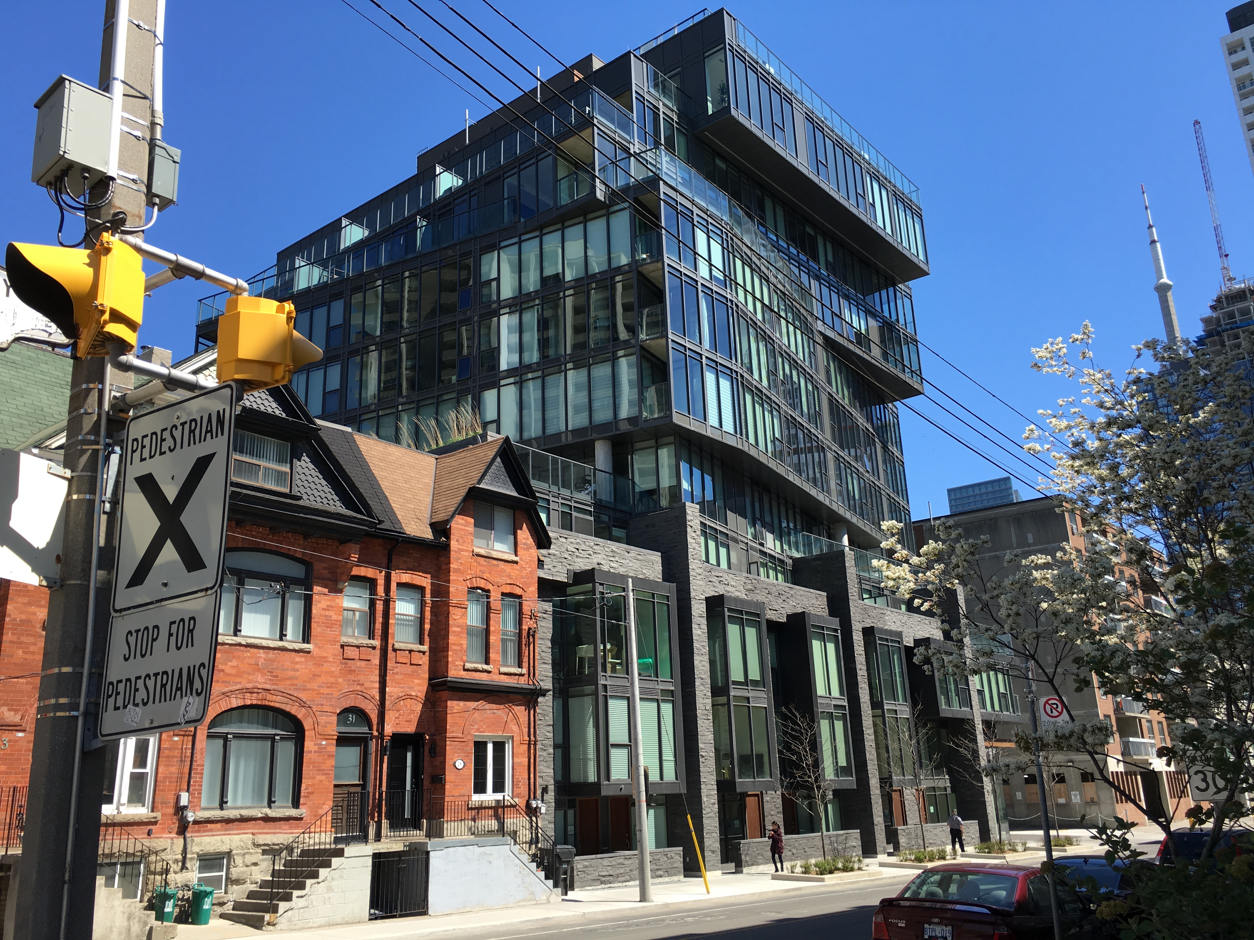
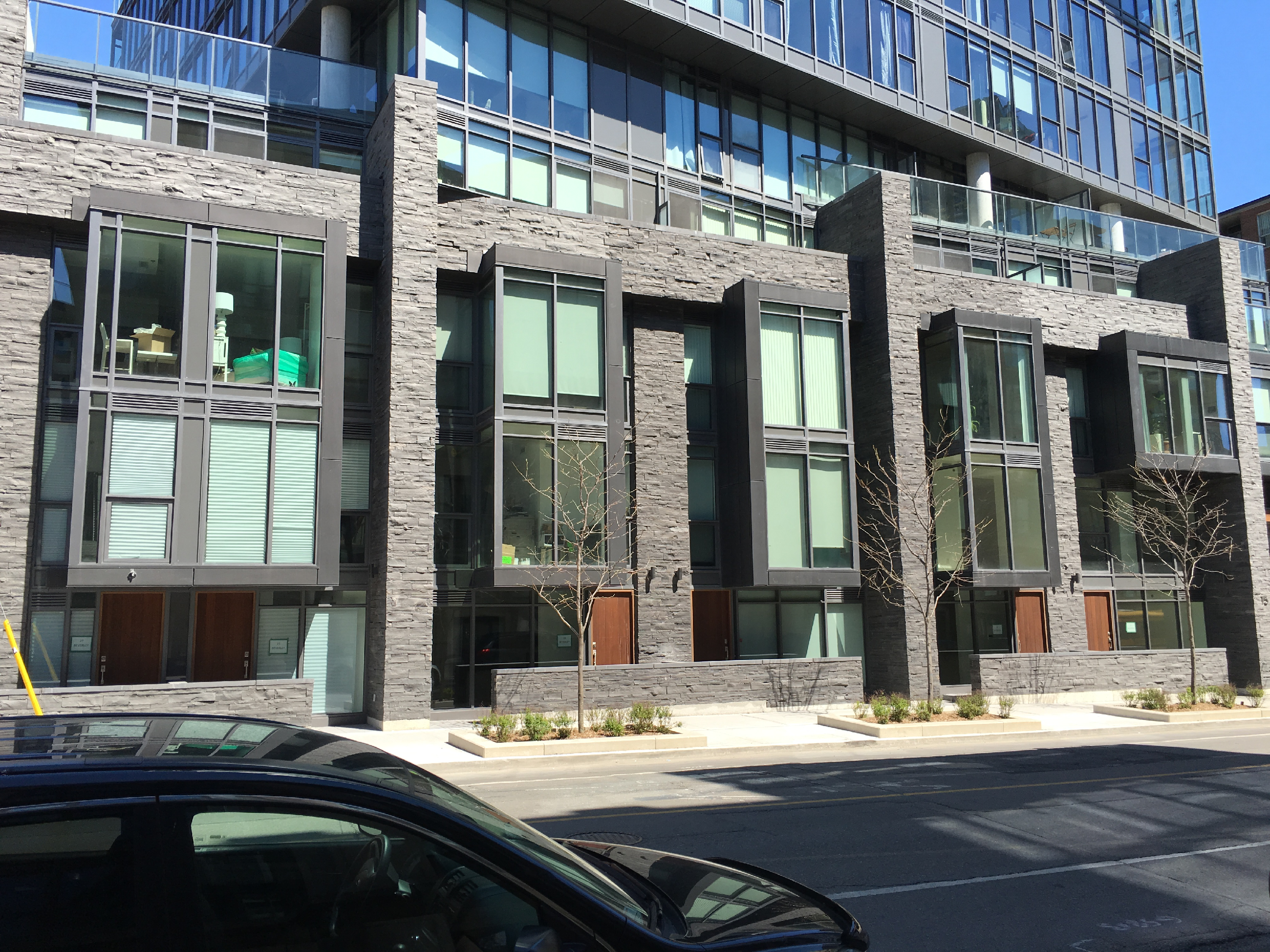
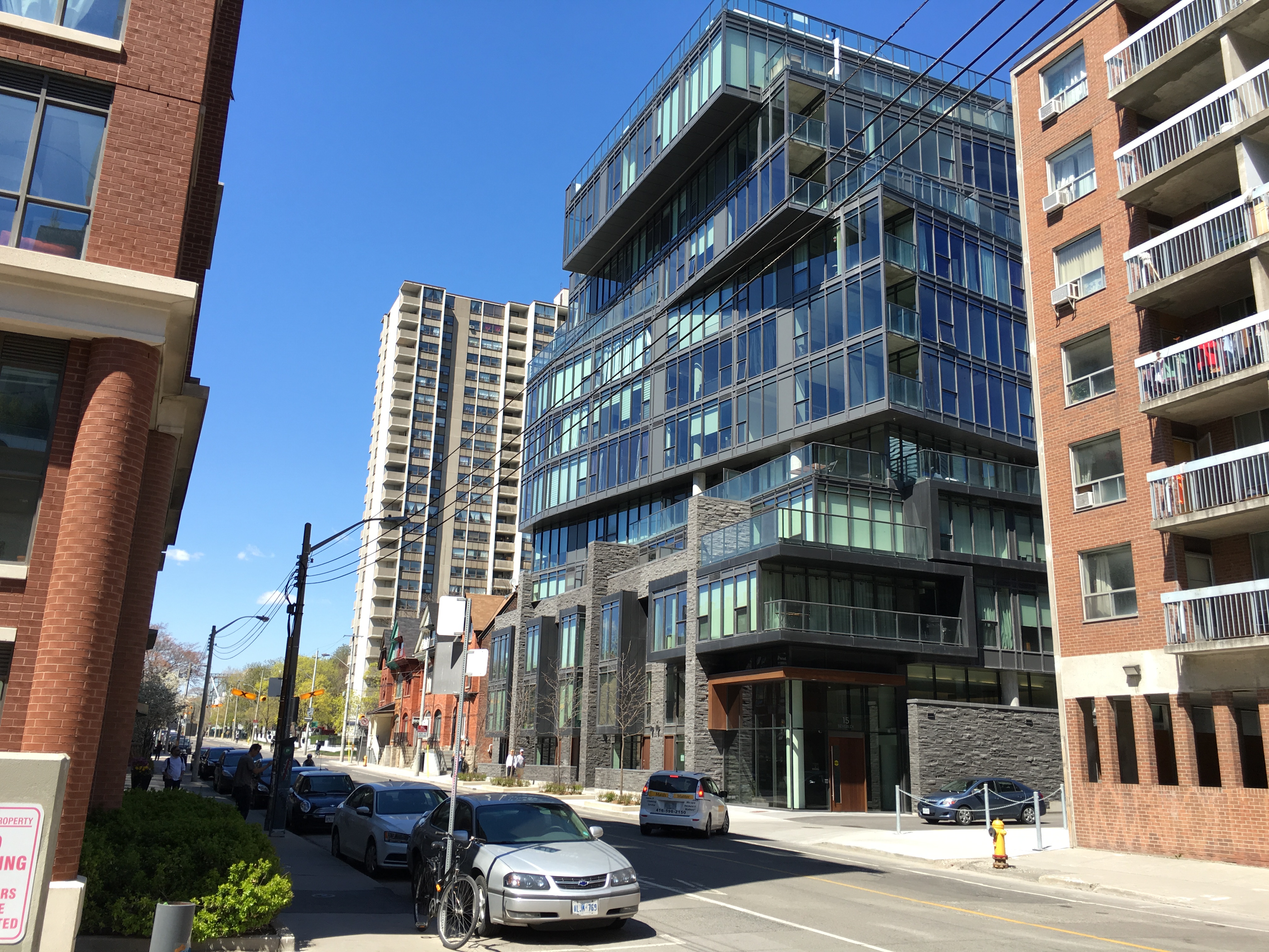
The fieldstone on the townhouses is confusing and, as TKE notes above, the grey window wall leaves much to be desired but overall it's a positive addition.
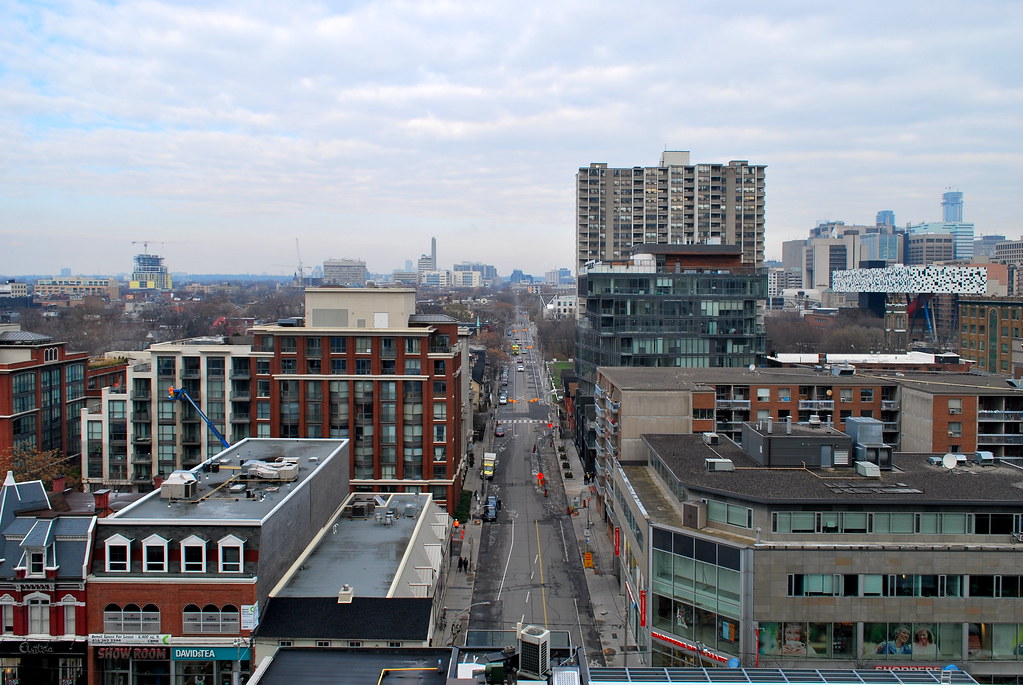 Picasso Tour by Marcus Mitanis, on Flickr
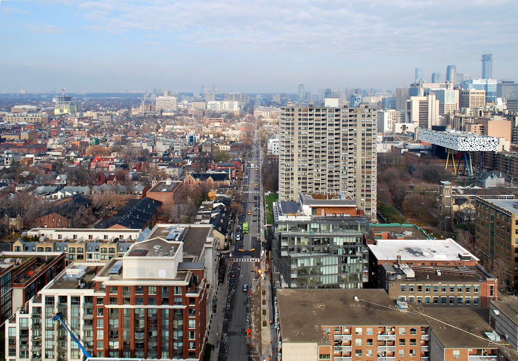 Picasso Tour by Marcus Mitanis, on Flickr
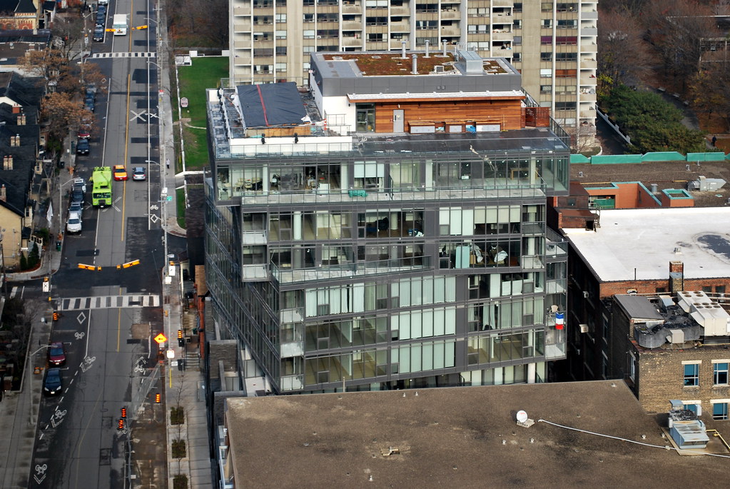 Picasso Tour by Marcus Mitanis, on Flickr
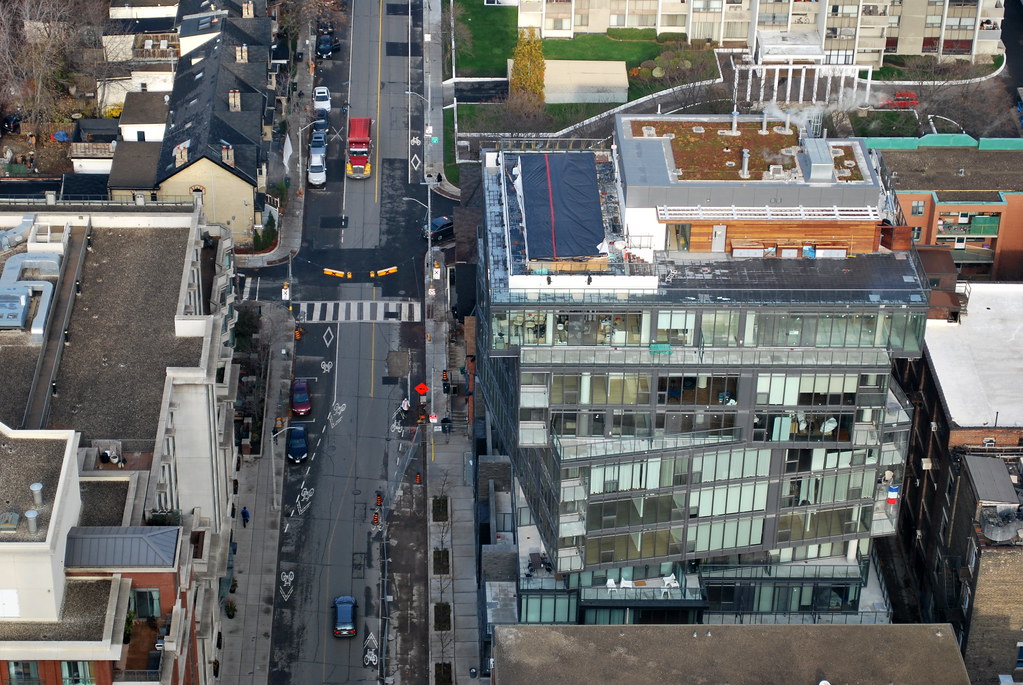 Picasso Tour by Marcus Mitanis, on Flickr
 Picasso Tour by Marcus Mitanis, on Flickr