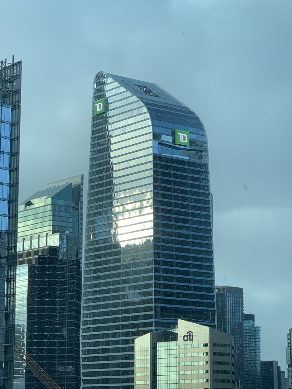
Full branding up this afternoon - not as abrasive as yesterday's test?

IMG_3632.jpeg
 
Last edited:
...must have been an artifact of the camera as it looked like that green dropped acid. 🙀
 
Almost all the commercial towers in downtown Toronto would look better without the logos. The same applies here. The TD logos, as unfortunately slapped on as they are, are better than the past months of black boxes.
 
I have to say, it looks so much better with the TD logo vs the blank black square we saw before - yes it's not ideal, but I honestly felt it ruined the building prior to this being turned on.

I guess this is a lot cheaper if tenants change :D
 

Back
Top