Combing through some files I came across a cool 80-storey concept plan for CC3 which was passed over in favour of the shorter tower and spire plan:
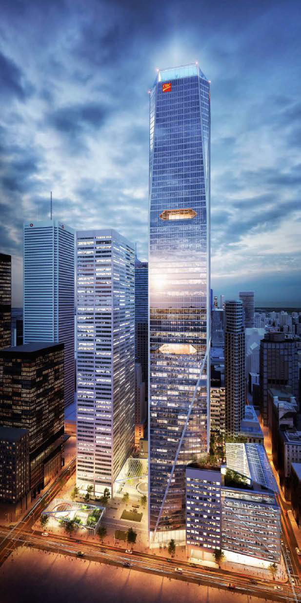
176558
 
The above was rejected by the City because it enclosed the courtyard and would have shadowed St. James Cathedral and park, so the more squat 1.0 that everyone is familiar with was submitted to the City instead.

42
 
So, sneaky us have been working throughout the late afternoon to bring you this: 2.0.

Check out the updated database file, and read the front page story!

176591

176593


42
 
Last edited:
Loses a lot of that wow factor.. but I guess slimming it down is a good thing. But I’m regards to the height, the 299.447m is kinda annoying ?
 
Looks like the tower got its 'suit' retailored so it it doesn't look like it's bulging out at the seams now. It reminds me of the NYT Building by Renzo Piano, which is of course a good thing.

Also interesting though that the roof slant remains even as it's no longer reflected in the design- is it mainly due to shadowing?
The height is all about not adding shadow to St. James Cathedral and park.

Oh… and I'm going with the previous version looked ungainly. Sure it's purely rectilinear now which can be dismissed as boring, but it should be a clean design here: this building should complement and be referential to Commerce Court West, and the new design is. It also backs away slightly from Commerce Court North, and its design no longer competes for attention with the carved heads of CCN's ornate top. CC3 is more reserved and respectful now, and that's a good thing in this context. All good in my books.

42
 
Last edited:
So, sneaky us have been working throughout the late afternoon to bring you this: 2.0.

Check out the updated database file, and read the front page story!

For those who only care about height, this part of the article is for you:

That 299 metre number will be significant for those who check for whether a skyscraper has supertall status, which according to the Council for Tall Buildings and Urban Habitat, kicks in at 300 metres. As the land drops across the site, the south face of the tower along Wellington Street is about 2 metres lower than the courtyard, and on that face, the south edge of the glazed screen will rise over 301 metres from ground level. Either way, the actual roof of the tower is approximately 15 metres lower than the top of the screen, far below 300 metres and supertall glory. Height fetishists will have one more arrow in their quiver, however: a nearly 90-metre-high architectural spire is planned to rise from the roof. It is proposed to top out at 373.9 metres, which if you're happy to allow such items in these contests, would make it incontestably the tallest building in the country, and a clear locker room champ over the 312 metre height of the twin spires of The HUB, another current proposal a couple of blocks to the south.
 
I like this much better than the last iteration. It's clean and crisp, contextual without being too heavy-handed in its reference to Commerce Court West, and it has just enough texture to keep it from being bland (unlike, say, the new Bay Adelaide buildings). My only complaint is the asymmetry of the crown -- why the glass screen on one side? The rest of the tower is so clean and symmetrical, why not extend that symmetry all the way to the top? I guess it's all about the shadow impacts. Still, this is really nice.
 

Back
Top