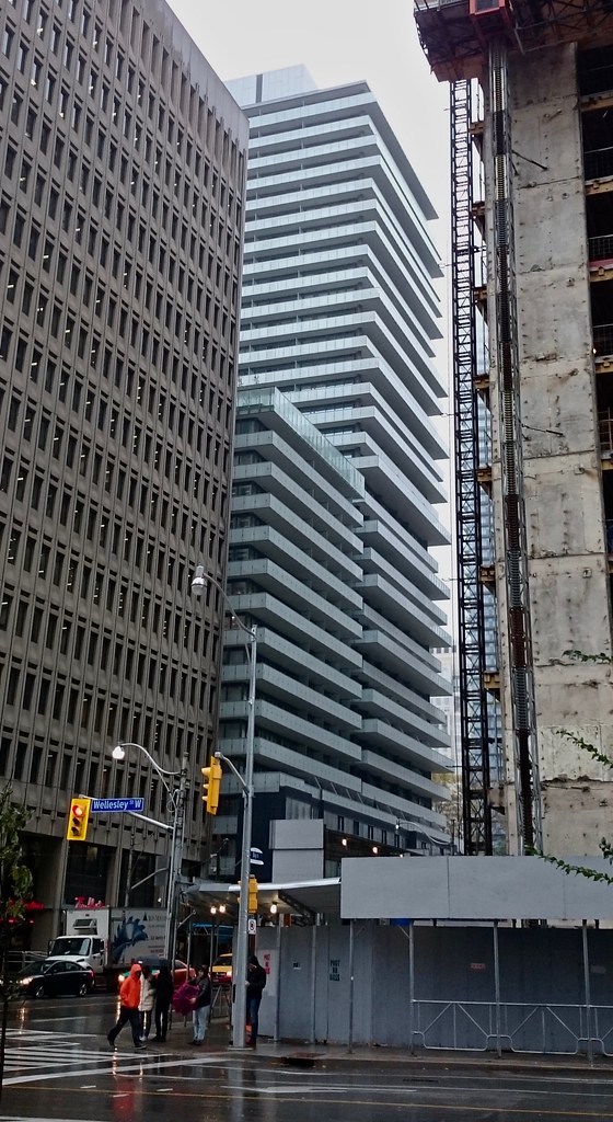
No way x2 mech is far superior. One of the best mech levels of recent in my opinion. Looking at them both right now. X2 is one of the nicest new buildings in my opinion (x is nice too but I like the mech level incorporation on x2 more)

To each his own. The different coloured glass (being spandrel) , the different floor height, the lack of balconies just looks odd to me. Not very Miesian either
 
Landscaping.
image.jpeg
image.jpeg
image.jpeg
image.jpeg
image.jpeg
 

Attachments

  • image.jpeg
    image.jpeg
    942.5 KB · Views: 1,161
  • image.jpeg
    image.jpeg
    941.5 KB · Views: 1,136
  • image.jpeg
    image.jpeg
    1.2 MB · Views: 1,138
  • image.jpeg
    image.jpeg
    876.1 KB · Views: 1,117
  • image.jpeg
    image.jpeg
    1.2 MB · Views: 1,113
Hoarding/fencing down along Bay:

Screen Shot 2016-10-12 at 11.07.46 PM.png
 

Attachments

  • Screen Shot 2016-10-12 at 11.07.46 PM.png
    Screen Shot 2016-10-12 at 11.07.46 PM.png
    769.5 KB · Views: 602
So there's the building, and there's the podium. And beyond one resting on the other, they appear to have very little to do with one another.

I'm also not a fan of the inconsistency in the design language between the balconies on the two masses.
I do like the clean and sharp look of this overall. Looks quite a bit like Exhibit.

Today:

30609517305_ddae0d01d7_b.jpg
 
I'm also not a fan of the inconsistency in the design language between the balconies on the two masses.
I do like the clean and sharp look of this overall. Looks quite a bit like Exhibit.
I know...I don't understand why they didn't variegate the balconies on the second structure either. It's odd.
 
Totally backwards: it's the poorly stacked one that's odd.

Good thing too.

42
 
Agree, it's odd but, I like it. Would have been too much to do both sides. Aligning the balconies would end up bland. Perhaps a different coloured frit for the shorter tower would have worked better or... maybe not.
 
It's sober and soused aA, all in one building.

42
 

Back
Top