AHK
Senior Member
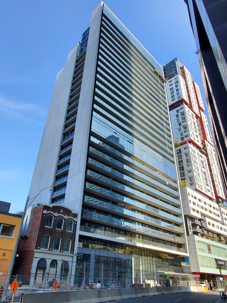
September 28, 2020. The exterior of the building - particularly the south and west facades, now look to be pretty much complete.

Au contraire, thankfully it does have some design. It's nicely squared off, with shiny, reflective north and south elevations contrasting with the precast frame on the east and west sides, which lead to a nice, neat cap that connects them at the roof. Mid-rise on the south side there's a sleek, curtain-walled strip that articulates the balconies into two volumes. Up top, the north side terraces towards Queen Street in deference. This is one of the more elegant boxes to be put up in this city in the last while and I appreciate it.This building is so bland and boring I don't think you can come up with anything less exciting if you wanted to
Has no accent anywhere