AlbertC

Superstar
Member Bio
Joined
Apr 25, 2007
Messages
22,880
Reaction score
62,571
City:
Toronto
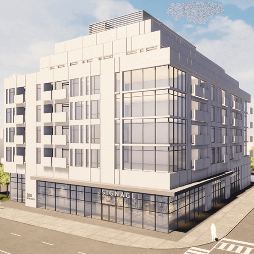
The engineering firm, Lithos Group were engaged for the planning of a future (potential) development at 380 Donlands Ave, which is currently a Beer Store location at the SW corner at O'Connor. No details on who the developer or architect are though.


1599085433148.png


1599085487293.png
 
The Beer Store is one facet of why that corner is dangerous for pedestrians, cyclists and even motorists. Eliminating that, in so far as it simplifies and reduces turning movements near the intersection would be welcome for that alone.

Interesting that in that massing I don't actually see a parking entrance at all.

This proposal, with replacing the angled parking with parallel on the east side, widening the sidewalks and doing some streetscaping, cycle tracks on Donlands, and on O'Connor west of Donlands, and you have a welcoming
environment for active transportation and much improved safety.
 
Last edited:
Yep, would be good to see Donlands and Pape (north of the Danforth) gradually see some development action. The potential is there, although it's been left largely untouched. O'Connor has a bit more going on, but the new projects only pick up east of Woodbine as it starts to curve north.
 
380 DONLANDS AVE
Ward 14: Toronto-Danforth

Development Applications

Project description:
Proposal for 7-storey mixed-use building containing 73 rental residential dwelling units. The proposed residential gross floor area is 5181 square metres, and the proposed non-residential gross floor area is 394 square metres.
 
Hmm, at first blush, looking at the numbers, I don't think they've incorporated any additional properties (SFH to the west) or the parking next to the Bell building.

It's not really that small a site, before deducting for some sidewalk widening, ~14,000ft2
 
I agree that this intersection needs some TLC. It’s always hectic and very dangerous for all those who enter by whatever means.
 
It's not bad, for what it is; but it really needs some more zip.

My thought, lose the translucent balcony panels in favour of stenciled black panels.

The contrast would look nice. Stenciled so that you still get some light coming through; but there's enough black to add that visual contrast.

No faux-Victorian railings; something modern.

Also change out the grey cladding on the one wall for something in a contrasting colour.

Could go black again, but could also do something more playful.

A metallic finish that would work with my balcony idea.
 
Good, sensible scale and massing but the projected appearance looks rather bland. Would love to see them inject a little colour and contrast into this vanilla, vaguely institutional-looking building.
 
Good, sensible scale and massing but the projected appearance looks rather bland. Would love to see them inject a little colour and contrast into this vanilla, vaguely institutional-looking building.
I expect to see the residents on the balconies to only wear off-white hospital smocks. It does have a "we live in a medical centre" look to it.

42
 
Good, sensible scale and massing but the projected appearance looks rather bland. Would love to see them inject a little colour and contrast into this vanilla, vaguely institutional-looking building.

Ahh, this must be the residences where staff of the new Sanofi plant will be living. ;)
 

Back
Top