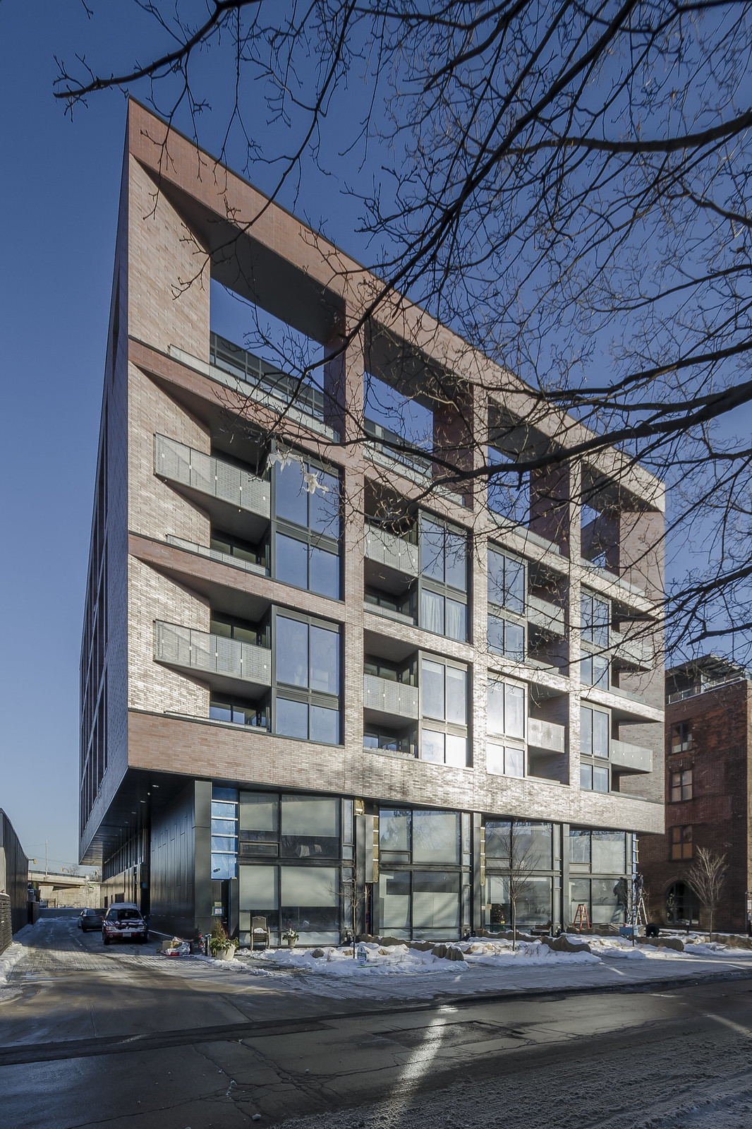
Oh my that sawtooth design on the ground level. <3

I would gladly give my right arm if aA would normalize that in their typically bland ground level designs.

I find that sawtooth facades generally don't provide a good sense of enclosure, framing and definition to the public realm in front of a building. That's done more effectively when the building follows the line of the street frontage in front of it at ground level.

Sawtooth facades may break the monotony of long, flat walls of glass in their angles. But that can also be done more effectively overall by varied materials, framing elements for individual "storefronts", and other design features.
 
Looks even better IRL.

IMG_20170121_082419.jpg
IMG_20170121_082531.jpg
IMG_20170121_082923.jpg
 

Attachments

  • IMG_20170121_082419.jpg
    IMG_20170121_082419.jpg
    746.4 KB · Views: 668
  • IMG_20170121_082531.jpg
    IMG_20170121_082531.jpg
    718.1 KB · Views: 649
  • IMG_20170121_082923.jpg
    IMG_20170121_082923.jpg
    593.2 KB · Views: 649
The brick changes colour depending on light conditions. That brick, as well as overall tasteful design and visual balance, is what really makes that building such a delight. It is unfortunate that the alley separating it to the south is so narrow, but that's the reality of building in Toronto now.
 
Wow! I knew that everyone I asked loved it, but didn't realize it was that popular. Gotta say the *brick* is one of the essential features. Photos do not do it justice. And the colour changes on them, not by intention, but just due to the richness of colour.

And I used to live right next door some...shid...almost four decades ago at 363. It was an ex-candy factory, and my first introduction to "wall to wall cockroaches" (they fed on the infused molasses in the floorboards). On the up-side, packed with very good artists.

My how some things change...
 

Back
Top