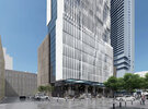
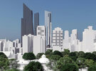
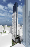
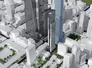
I walk past this building multiple times a week, lack luster retail on the ground, the building itself is also extremely boring, would love to see better use of the building given its location.

Current building is also extremely ugly too.
 
I walk past this building multiple times a week, lack luster retail on the ground

100%

, the building itself is also extremely boring, would love to see better use of the building given its location.

Fair enough

Current building is also extremely ugly too.

I wouldn't go quite that far; you have to leave a place for even lower ratings, like the building immediately to the north.

Both visible in this streetview pic:

1641957147180.png
 
A major problem with the existing structure is that the ground floor is raised 4 ft above sidewalk level and is accessed by stairs, which line the entire Yonge St facade. This must be remedied in the new structure -- barrier-free access. I can't tell for sure from the renders, but I'm not sure this has been addressed. Also, something could be done to enhance the proposal's north facade, facing the POPS. This is the bulding's longest facade. The current proposal is for the condo lobby, with a glass wall facing the POPS and access at both the west (Yonge St) and east (Sheard St) ends, with no access from the POPS -- for all intents, a blank wall. The POPS, which fills the space where McGill St formerly passed through to Yonge, is currently populated primarily by pigeons and drug- and drink-addled youth. Speaking as someone who lives in the neighbourhood, we'd love to see some form of animation provided for this space. It would make an ideal restaurant or bar patio -- intimate, adjacent to but sequestered from Yonge. Some commercial or retail use would be ideal at some point along the length of this lengthy facade. At the very least, a door from the condo lobby directly into the POPS would help generate some traffic/life in the space. The proposal ignores any potential for this space. Aside from this, I'm fine with the massing and height.
 
A major problem with the existing structure is that the ground floor is raised 4 ft above sidewalk level and is accessed by stairs, which line the entire Yonge St facade. This must be remedied in the new structure -- barrier-free access. I can't tell for sure from the renders, but I'm not sure this has been addressed. Also, something could be done to enhance the proposal's north facade, facing the POPS. This is the bulding's longest facade. The current proposal is for the condo lobby, with a glass wall facing the POPS and access at both the west (Yonge St) and east (Sheard St) ends, with no access from the POPS -- for all intents, a blank wall. The POPS, which fills the space where McGill St formerly passed through to Yonge, is currently populated primarily by pigeons and drug- and drink-addled youth. Speaking as someone who lives in the neighbourhood, we'd love to see some form of animation provided for this space. It would make an ideal restaurant or bar patio -- intimate, adjacent to but sequestered from Yonge. Some commercial or retail use would be ideal at some point along the length of this lengthy facade. At the very least, a door from the condo lobby directly into the POPS would help generate some traffic/life in the space. The proposal ignores any potential for this space. Aside from this, I'm fine with the massing and height.
I live in the area and 100% agree, across the path theres tons of space and the subway restaurant had some seating out side. The elevation of the building itself was always confusing to me, did the street shrink or did they design the building to be inaccessible LOL.
 
. The elevation of the building itself was always confusing to me, did the street shrink or did they design the building to be inaccessible LOL.

Some of that is a design choice.............but....

Yonge is on a slight slope here; both N-S, and in terms of grade from east of Yonge to Yonge itself. There are different ways to address that within and outside the building.

They chose to keep the building level, and use exterior stairs to address the grade change.

Have a look:

1642034951294.png


If you count the number of steps on the left, then then the right, you'll see a difference just shy of 2 full steps.

Then look at the corner by the existing park:

1642035100281.png


One less step again.

****

Now....wait for it..........let's look at the east/back of the building:

1642035198655.png


Ta Da! It's at-grade.

****

Not an uncommon way to address this issue in an earlier era.

Many buildings have similar challenges; and they are often addressed by subtle level changes within the building; built-up floors w/stairs/ramps etc.

****

Maybe the best known example for resolving the challenge indoors is the Eaton Centre, where you move up/down an entire floor from Dundas to Queen.
 
... and in the past, stairs weren't thought of as barriers, but provided a sense of arrival
(the same way that many houses have steps up to the main level).
 
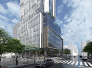
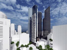
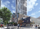
New renderings are updated in the database! The overall building height decreased from 239.26m to 229.9m. The overall building storey count increased from 61 to 69 storey. Another update is to increase the total unit count from 450 to 471 units. Finally, the total parking spaces increased from 57 parking spaces to 122 parking spaces.

The renderings are taken from the architectural plan via Rezoning Submission:
 

Attachments

  • PLN - Architectural Plans - DEC 29  2021-38.jpg
    PLN - Architectural Plans - DEC 29 2021-38.jpg
    655.9 KB · Views: 160
  • PLN - Architectural Plans - DEC 29  2021-39.jpg
    PLN - Architectural Plans - DEC 29 2021-39.jpg
    1,022.2 KB · Views: 153
  • PLN - Architectural Plans - DEC 29  2021-40.jpg
    PLN - Architectural Plans - DEC 29 2021-40.jpg
    854.6 KB · Views: 147
  • PLN - Architectural Plans - DEC 29  2021-41.jpg
    PLN - Architectural Plans - DEC 29 2021-41.jpg
    687.2 KB · Views: 142
  • PLN - Architectural Plans - DEC 29  2021-43.jpg
    PLN - Architectural Plans - DEC 29 2021-43.jpg
    930.6 KB · Views: 155
  • PLN - Architectural Plans - DEC 29  2021-44.jpg
    PLN - Architectural Plans - DEC 29 2021-44.jpg
    816.7 KB · Views: 147
  • PLN - Architectural Plans - DEC 29  2021-45.jpg
    PLN - Architectural Plans - DEC 29 2021-45.jpg
    931.4 KB · Views: 150
SPA has been filed for this one:


The architecture, if that's what we're calling Kirkor's work remains substantially similar.

There have been some small changes in areas like unit count:

1663493775468.png

1663493828662.png
 

Attachments

  • 1663493818315.png
    1663493818315.png
    65.5 KB · Views: 94
No new renderings are updated in the database. The overall height changed slightly from 229.90m to 229.60m. The total unit count reduced from 471 units to 414 units. Finally, the total parking space count changed from 122 parking to 120 parking.
 

Back
Top