Design Review Panel - April 24 2008 Minutes
Menkes' 2nd attempt with the Design Review Panel following their first try in October 2007 ... some progress, but more revisions required

***********
Project 1 – Scarborough District, Scarborough City Centre Pilot Area
Corporate Drive and Consilium Place, south-east corner
Address There is no confirmed municipal address for this property
Use Residential, Retail and Publicly Accessible Park
Zoning City Centre Office and City Centre Residential
Application Status OPA/ZBL app (July 2007, rev. Feb 2008); Site Plan app (April 2008)
Architect Vladimir Losner, Page & Steele
Owner Menkes Consillium Land Holdings
Applicant/Agent Laurie McPherson (Bousefileds Inc.)
Review Second (first review held October 2007)
City Staff Russell Crooks, Community Planning; Robert Stephens, Urban Design
Conflict of Interest: Sol Wassermuhl
Evaluation: Refinement (5-3) NOTE: The Panel supported this project with the proviso that it was reflective of the rezoning application (not Site Plan)
Introduction
City staff outlined the area context, history and area policy priorities, and sought the Panel’s advice on the following:
• How does the current proposal connect to and enhance the fabric of the Scarborough Centre as a whole, and the potential development of the remainder of the block to the south, in particular?
• How does the latest design create an urbane environment for the site and how does it avoid generating activities which are largely inward-looking and, therefore, detrimental to the adjacent public realm?
• How does the site plan encourage pedestrian permeability and how do the uses in the lower levels of the building contribute to pedestrian activity on the adjacent streets and open space?
• How does the design of the base of the building create an appropriate podium/street-wall which is distinct from the towers, as per the City’s Official Plan policies and the Design Criteria for Tall Buildings?
The applicant team described the design rationale and responded to questions from the Panel.
Panel’s Consensus on Key Aspects Needing Improvement
Sustainable Design
• Build upon LEED Silver target to develop and integrate a comprehensive sustainable design strategy throughout the project, including but not limited to:
- use of natural ventilation in garage areas
Site Plan Design
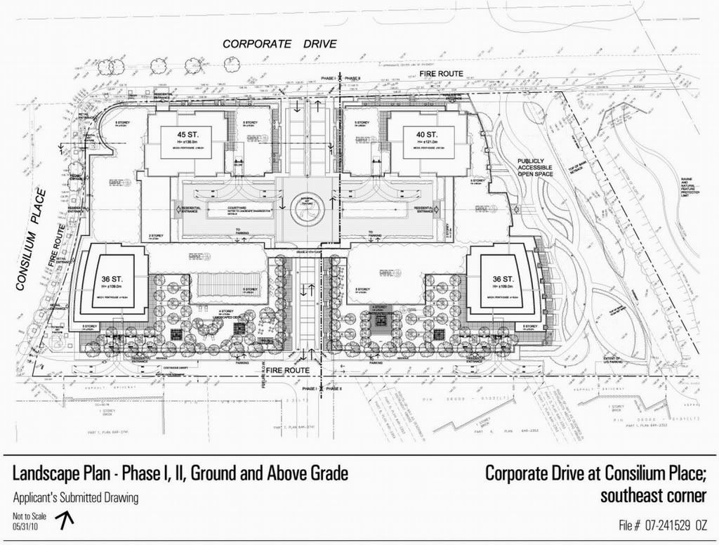
• Develop a strong street/block grid
• Create a cohesive, high quality urban environment along edges of the site:
- creating east edge as public mews with limited vehicular traffic
- creating street address for east public lobby
- avoiding cul-de-sac conditions
• Create a cohesive, high quality urban environment through the site:
- developing central street to provide continuous urban sidewalk
- limiting vehicular traffic
• Develop internal courtyard to:
- reduce extent/impact of vehicular traffic
- provide high quality pedestrian environment
• Develop courtyard design option with the following urban features:
- west half of courtyard with vehicular/pedestrian/landscape environment
- east half of courtyard with pedestrian/landscape environment
- central street continues north/south through courtyard, with continuous sidewalk along east edge of street
• Examine grade related functions including:
- placing retail along Corporate Drive frontage, in place of present residential
- considering introduction of other at-grade uses along Corporate Drive (e.g. small offices, neighbourhood services, clinics)
- consider placing residential along Consilium Place frontage, in place of present retail
• Develop south edge of project:
- anticipating adjacent future context
- placing continuous residential along this frontage
- improving quality of pedestrian environment
Pedestrian Realm
• Develop pedestrian realm along Corporate Drive and south edge of project
• Develop well defined transition between public realm in areas where residential uses are located along street frontage
• Develop retail uses closer to street edge to create an active, urban environment
• Place retail at same level as street edge sidewalk
• Develop high quality environment for residences along internal street
Building Form and Articulation
• Pedestrian bridge detracts street vista
- develop option(s) without bridge
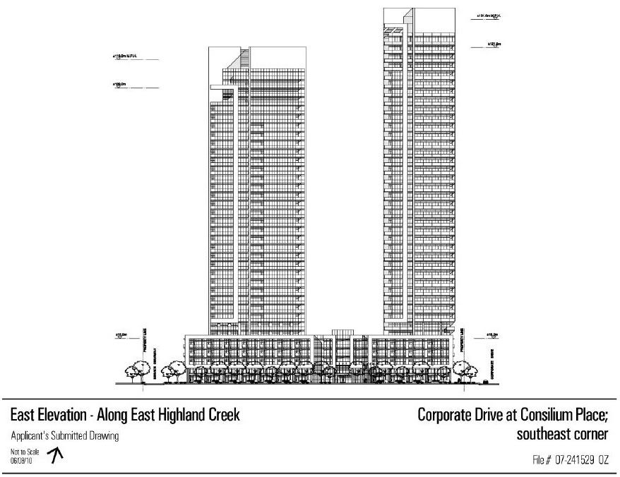
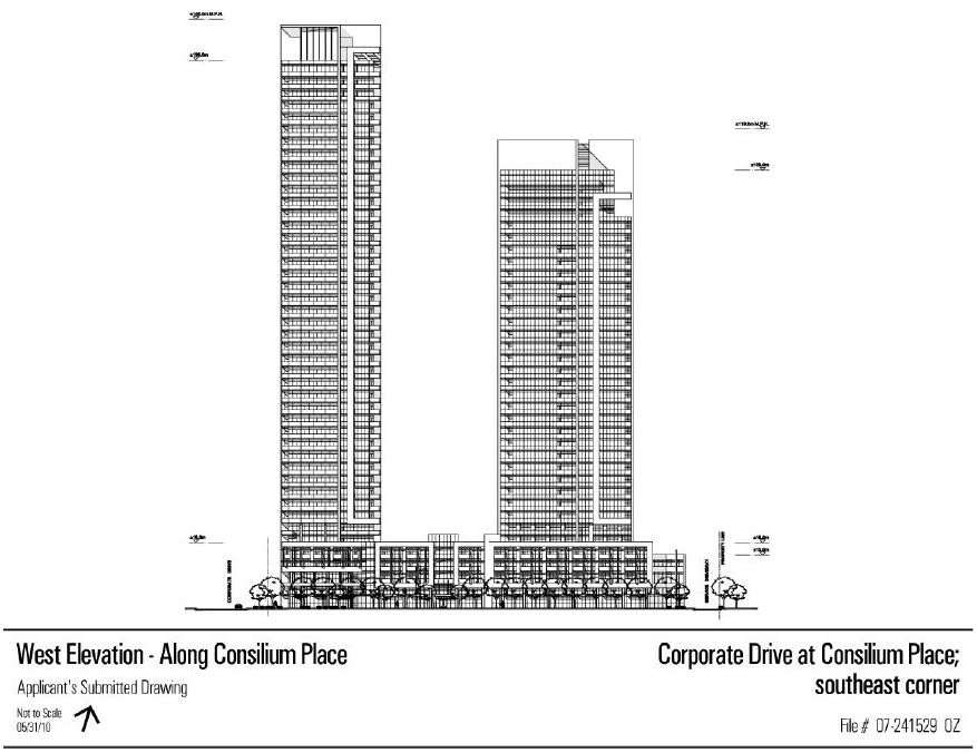
• Develop towers to achieve visual variety between buildings within project
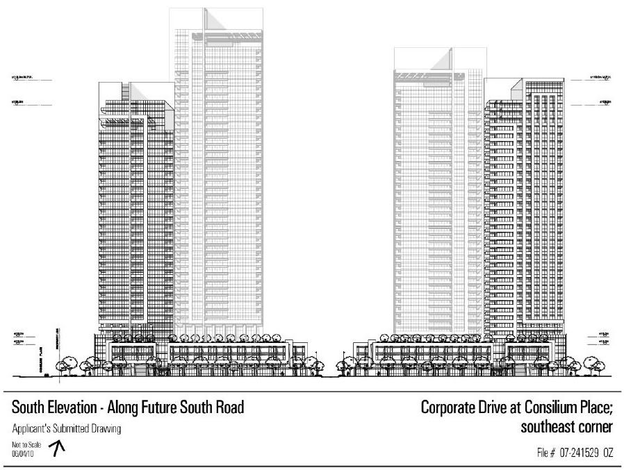
• Develop south edge of project to:
- articulate and enliven appearance and scale of south façade
- screen parking with more active functions (see Site Plan Design comments above)
• Enhance material type to provide “human†/ â€hand†scale, especially at street/podium level
Landscaping Strategy
• Develop high quality landscape strategy beyond minimum currently shown:
- to highlight main entries into buildings
- throughout internal street/courtyard, including separating/defining vehicular and pedestrian zones
- address need for landscape along south edge of project
• Ensure Publicly Accessible Park:
- has sufficient soil depth for high quality, mature trees and plants
- works effectively and attractively with adjacent ravine area
- prevents underground parking garage grilles/vents from detracting from park setting
Submission Package
• Efforts made since the first review are much appreciated
Comments for City Staff
• Concern expressed by Panel members that City needs to clarify whether the package
submitted is intended for Site Plan Approval application
• Further context information required to adequately place submission within the City’s intended “big picture†urban design vision for this area
- south edge of project cited as example, with insufficient information presented to be able to fully understand and comment on relation to proposed context
Related Commentary
The Panel was generally satisfied with the improvements that had been made to this proposal since it’s first review in October 2007, and the Panel voted to support the project with the proviso that the vote was reflective of the rezoning application (not Site Plan). Some concerns and suggestions for improvement were identified as follows:
Sustainable Design
The Panel was appreciative of the sustainability checklist within the briefing materials, having requested to see this during the project’s first review. The proponent was commended on seeking LEED Silver certification, although some areas for improvement – such as providing natural ventilation in the garage instead of mechanical – were still identified by Panelists.
Response to Context
The Panel commented that the revisions to the original plan would result in significant improvements to the public realm, indicating that the enhanced activities at-grade would lead to a more positive urban experience in the area.
Site Plan Design
Site Planning concerns related largely to the size of the property being developed, and the challenge this poses of addressing every aspect well. It was suggested that one way of improving the site plan conditions would be to strengthen the grid plan by introducing a northsouth oriented mews or laneway between the eastern edge of the building and the publicly accessible park. This type of use beside the park would have the benefits of enhancing vehicular access around the site, providing a safer environment in that area of the site, and introducing a more “public†street address to the eastern residential lobby.
The Panel was also concerned with the identity of South Street, indicating that it should emerge as a successful residential street rather than the servicing lane that it currently appears as. It was suggested that planting trees along this street, and connecting it to the mews described above
would help this condition.
Concerns were expressed about the quality of space for the units that are located on the central north-south drive aisle, as they do not have a public street address or entry point. Similar concerns were expressed with the eastern residential lobby, although there is one access point to this lobby from Corporate Drive.
Other Site Plan concerns related to the proposed at-grade residential uses along Corporate Drive. While acknowledging that this design was an improvement over the previous submission, a number of comments were made questing why retail uses would be viable on the Consilium frontage but not along this Corporate Drive frontage. Subsequently, the Panel encouraged the
Proponent to determine whether or not other uses, such as commercial services (medical,banking etc.), would work in this location so as to generate a more animated and urban streetedge there.
Pedestrian Realm
Building upon comments from the first review, the Panel re-emphasized the importance of pedestrian connections within and around the site. It was suggested that the central north-south connection would be improved by installing a continuous sidewalk along an edge of the drive aisle. It was also suggested that the quality of pedestrian realm around the site would be
improved by increasing the number of street tree plantings, particularly in the vicinity of the retail areas, which it was noted, is comparatively sparse in the current plan.
Building Form and Articulation
The Proponent was encouraged to develop the at-grade street edge of Consilium Place in a more urban way. Suggestions as to how this could be done included aligning the building edge with the street rather than having it peal away from the street (the south-west corner was used as an example for this), and ensuring that the retail entrances are at-grade rather than stepped up from the sidewalk.
The Panel also indicated that the proposal would benefit from an improved podium design, including the choice of materials. Specifically, it was suggested that south façade would benefit from a break in the pattern of articulation, and that the relationship between the residential entrances and the sidewalks should be strengthened. It was also suggested that the design
would benefit from the use of varied materials; the use of EFIS (stucco) in the design was discouraged for reasons of both durability and character.
The Proponent was encouraged to further develop the varied tower expression of the proposal, indicating that this is necessary in order to diverge from the suburban condition of similarly styled buildings.
While not shown in the elevation drawings, the Panel indicated that the proposed 5th floor pedestrian bridge would likely interrupt the visual separation that is created by the central northsouth connection, and suggested that it is counter-productive to breaking up the scale of the
proposal. The Proponent was encouraged to remove this element from the proposal.
Landscaping Strategy
The Panel expressed a number of concerns with the landscaping strategy of the proposal, indicating that the overall plan is minimal and lacking of a unique expression. Specific concerns were expressed with the park over the underground parking garage – it was suggested that it was unusual to locate a park in the vicinity of a natural heritage area and that the vegetation in this
location would not thrive as a result of limited soil depth there. It was also suggested that the amenity of this space would be reduced by the parking garage exhaust vents that would likely be installed in the park, and that the City should not permit the development of this type of amenity in response to these concerns.
The Panel also expressed concerns with the proposed landscaping for the interior courtyard, indicating that it would be unlikely for the vegetation to thrive there given the heavy convergence of vehicle-related uses in this location (including salting during the winter months). Removing the
central median of the northern drive aisle for the purpose of creating more space in this location was suggested as one method to improve this condition.
Comments for City Staff
The Panel felt that more direction was required from the City to fully understand how the proposal would relate to this portion of the Scarborough Civic Centre, particularly the large industrial parcel to the south of the site.
