You are using an out of date browser. It may not display this or other websites correctly.
You should upgrade or use an alternative browser.
You should upgrade or use an alternative browser.
steveve
Senior Member
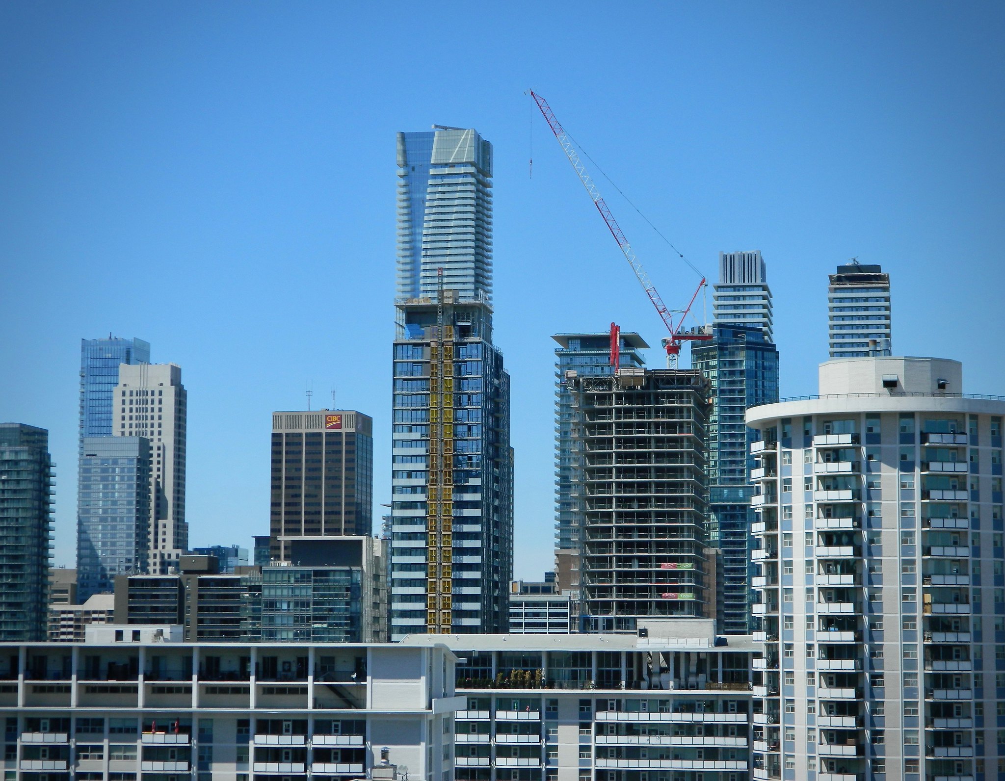
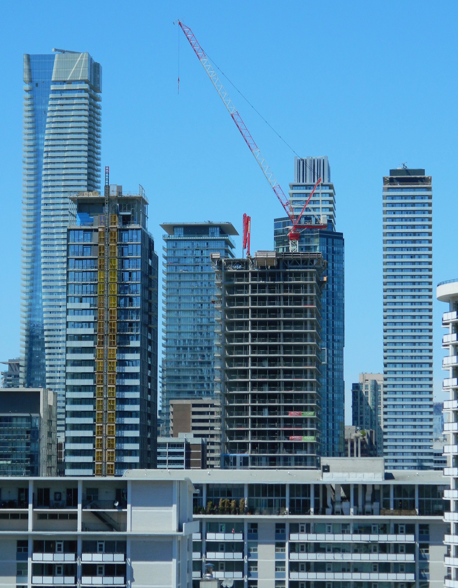
Today:


Benito
Senior Member
PMT
Senior Member
steveve
Senior Member
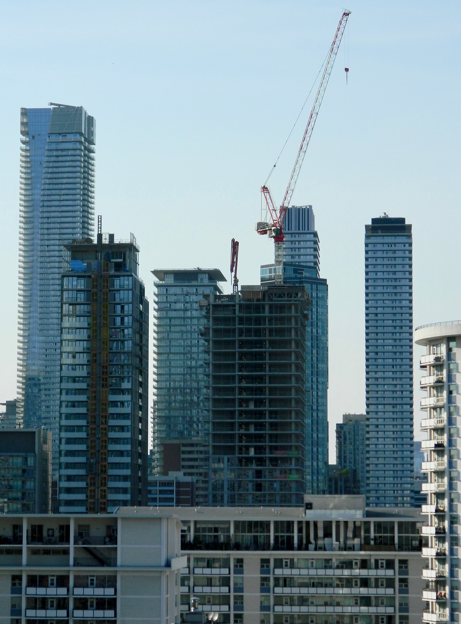
Yesterday:

Benito
Senior Member
Benito
Senior Member
TwoDogs_39
Active Member
More grey spandrel and another dull rectangular box of a condo. Someone kill me now. This is looking hideous!
ptbotrmpfn
Senior Member
I don’t know about hideous but certainly repetitive with all the blue making none of these buildings stand out when next to each other physically or in behind the others in many photos. They’re just stating to blend together.. same shade or tinting or reflectivity. These are all nice separately but. From many areas they are all u see from ground looking up in a boring kinda way. I’m sure I’m not the first or last to ask, but seriously why does every developer se this basic tinting. And please don’t say cause it’s cheapest material. Cause that’s quite un true. There’s a lot of materials out there surely all glass buildings aren’t that cheap.
Last edited:
Benito
Senior Member
Benito
Senior Member
steveve
Senior Member
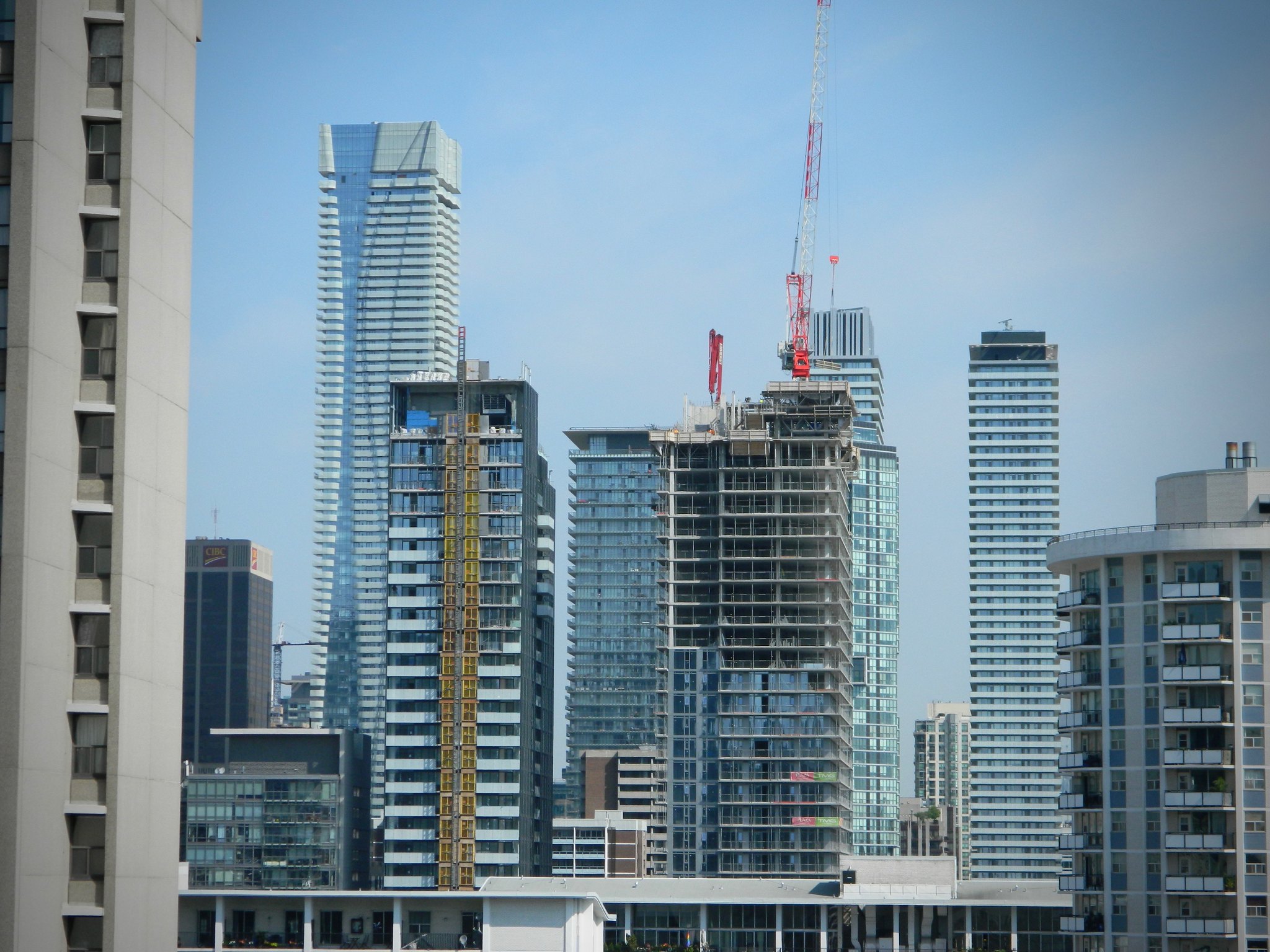
Today:

Gphorce
Active Member
Why is there no puking emoji?
Benito
Senior Member
new balcony glass.


Attachments
-
 89B0A38B-6A52-40FC-B264-D1538C563DBF.jpeg242.9 KB · Views: 570
 -
 896B4F2C-985C-477B-AC97-2C77A8EC8947.jpeg236.5 KB · Views: 552
 -
 5B3FE96B-B7C4-4B64-A3C0-243C43015C91.jpeg268.8 KB · Views: 571
 -
 78BDF558-B0B9-45EB-90F0-0AAC460E8772.jpeg286.3 KB · Views: 593
 -
 CCCD9971-8BEC-4DCC-A399-3749DC1367C4.jpeg147.2 KB · Views: 568
 -
 226782DB-540C-4E65-BBBA-692CB553A20D.jpeg251.9 KB · Views: 572
 -
 E259D4FA-FBED-4B80-AE63-5FCDB2259D76.jpeg269.4 KB · Views: 535
 -
 D50E4567-150D-45B1-B1AD-BB13E13537E5.jpeg213.4 KB · Views: 550
TheKingEast
Senior Member
This is turning out pretty shitty.


