You are using an out of date browser. It may not display this or other websites correctly.
You should upgrade or use an alternative browser.
You should upgrade or use an alternative browser.
- Thread starter androiduk
- Start date
UtakataNoAnnex
Superstar
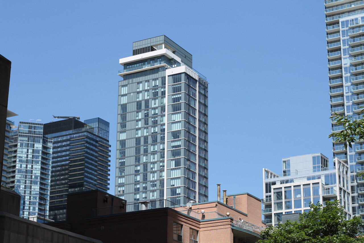
...I don't think it's that messy. Slightly on the uninspiring end...but not messy.
amh
Active Member
In an era where metal panel cladding is ubiquitous, stainless steel is one of the better cladding options out there. You get reflection and sheen against what is generally a very matte material. Costly but looks fantastic.
Rascacielo
Senior Member
Nearly all the buildings on that stretch of Charles are decent enough (non-offensive like Social or whatever ends with Haus), but bland and uninspiring. I guess Casa really set the tone for what the developers would call ‘timeless architecture’.
innsertnamehere
Superstar
the majority of them are aA - which is why it's like that. Hell, half of the towers are all the same "development" as CASA.
amh
Active Member
the majority of them are aA - which is why it's like that. Hell, half of the towers are all the same "development" as CASA.
This is a tremendous oversimplification and shows that you are overlooking a lot of what makes Charles St E the way that it is.
It’s a street that was planned one lot at a time with little relationship between buildings. It being designed by other architects wouldn’t have created more variety beyond things that are skin deep - more facade doodads and attempts to look “different”.
I’d argue that without the CASA’s, love them or hate them, the only notable difference in how Charles St E turned out would be the lack of the mid-block connection planned through to Hayden Street.
In my opinion, less “sameness” wouldn’t be the antidote to the experience of Charles Street. It would have been planning on the scale of the block and alleviating the way each lot exists with complete indifference to the lot next to it. (i.e. the way servicing and frontages are handled, with each building having a driveway separating it from the lot next door.)
I don’t think the point I’m making would be very controversial. That said, if your argument is that the solution would have been more facade doodads and “articulation” to try and hide what is fundamentally the same housing beneath the facade - then I fundamentally disagree. I think that would be fenestration patterns creating visual clutter on a street that is still fundamentally flawed from a planning and city-building perspective.
The CASA’s and 55C are not without their flaws, but let’s not pretend that Chaz (IBI project) or the new Aspen Ridge (Quadrangle) project break the mould and contribute to the street in some deep and novel way. The issue here is deeper and more fundamental, and Toronto’s planning department has acknowledged this as well.
Above: For reference, an image of a bunch of residential towers each with a different facade, none of which were designed by a—A.
To conclude this long and overwrought post, in case someone misreads my intentions with this post as a "defender" of anything other than good planning and my subjective take that "variety" is not a better alternative to "sameness" of condo towers, I should add that I'm actually not a big fan of 55C.
Last edited:
GenerationLee
Senior Member
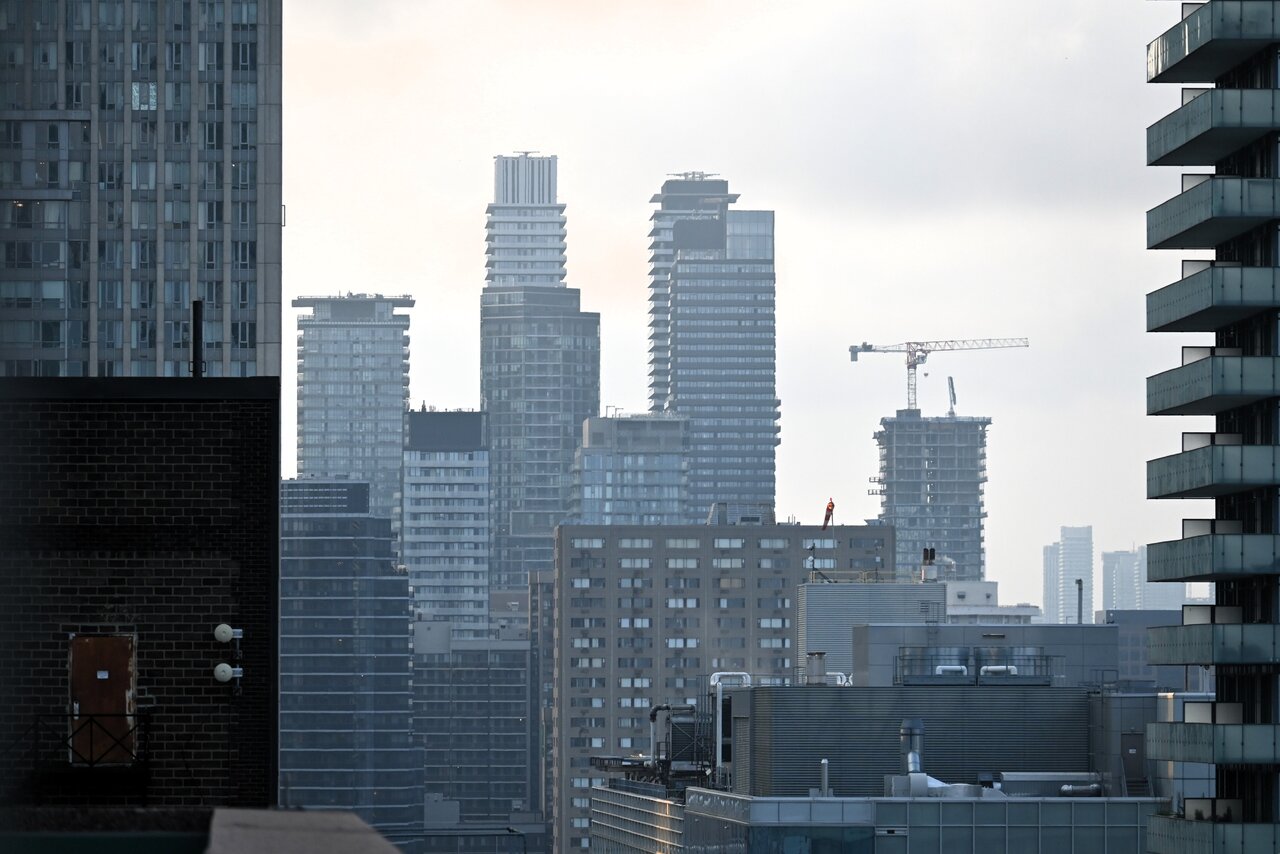
This is one of my favourites on Charles, but only because its a darker colour, giving some more variety to what is a very dense and rather sterile looking part of downtown:

Benito
Senior Member
A Torontonian Now
Senior Member
July 30:

ProjectEnd
Superstar
There was a party at the top of 55C tonight both to celebrate the building's completion and MOD Developments' 15th anniversary. The lounge/event space at the top of the building is wonderfully high and rather elegantly decorated in a warm but minimalist way. I'd love to see the views from here during the day, but it was pretty spectacular on this atmospheric evening too. Here are some pics:
Noorez Lalani and Gary Switzer of MOD Developments:

It's actually two rooms up here, divided by a high wall and fireplace:


Lots of nice num-nums, these were the dessert treats. Already had a Thai dinner, so only indulged a little food-wise.

There's also a glass-walled terrace up here, and it provides some great views:


Good enough!
42
Noorez Lalani and Gary Switzer of MOD Developments:
It's actually two rooms up here, divided by a high wall and fireplace:
Lots of nice num-nums, these were the dessert treats. Already had a Thai dinner, so only indulged a little food-wise.
There's also a glass-walled terrace up here, and it provides some great views:
Good enough!
42
Northern Light
Superstar
There was a party at the top of 55C tonight both to celebrate the building's completion and MOD Developments' 15th anniversary. The lounge/event space at the top of the building is wonderfully high and rather elegantly decorated in a warm but minimalist way. I'd love to see the views from here during the day, but it was pretty spectacular on this atmospheric evening too. Here are some pics:
Noorez Lalani and Gary Switzer of MOD Developments:
View attachment 633540
It's actually two rooms up here, divided by a high wall and fireplace:
View attachment 633545
View attachment 633546
Lots of nice num-nums, these were the dessert treats. Already had a Thai dinner, so only indulged a little food-wise.
View attachment 633547
There's also a glass-walled terrace up here, and it provides some great views:
View attachment 633541
View attachment 633544
View attachment 633542
View attachment 633543
Good enough!
42
Great pics 42.
Have to say, the gender imbalance is a little conspicuous.....
Undead
Senior Member
Looks like a fun evening. Meanwhile, me, sloshing through the dark for discounted potatoes at No Frills.
UtakataNoAnnex
Superstar
...Mr. 42 should have invited us up for the cupcakes. <3
Last edited:
Great pics 42.
Have to say, the gender imbalance is a little conspicuous.....
In one of the two pics, it's 50-50... in the other, if I'd have spun around, it would be been more balanced. I wasn't thinking about any of that at the time and just wanted to show the room off!
Looks like a fun evening. Meanwhile, me, sloshing through the dark for discounted potatoes at No Frills.
If only I'd known to pick up a few bites for you and Utakata!
42