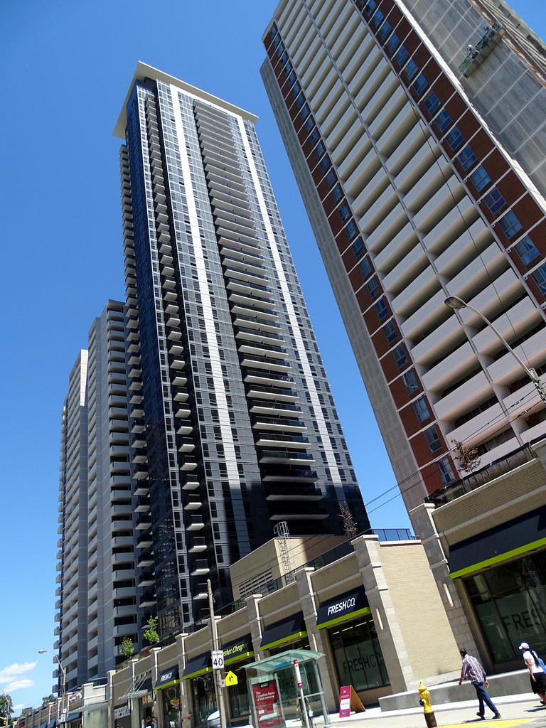
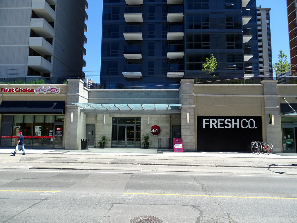
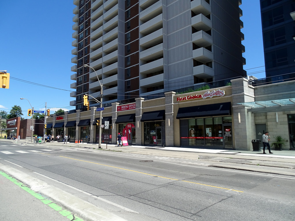
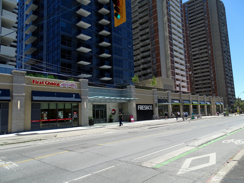
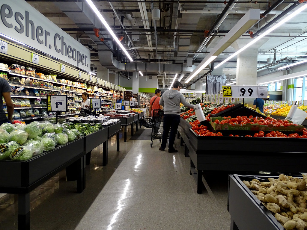
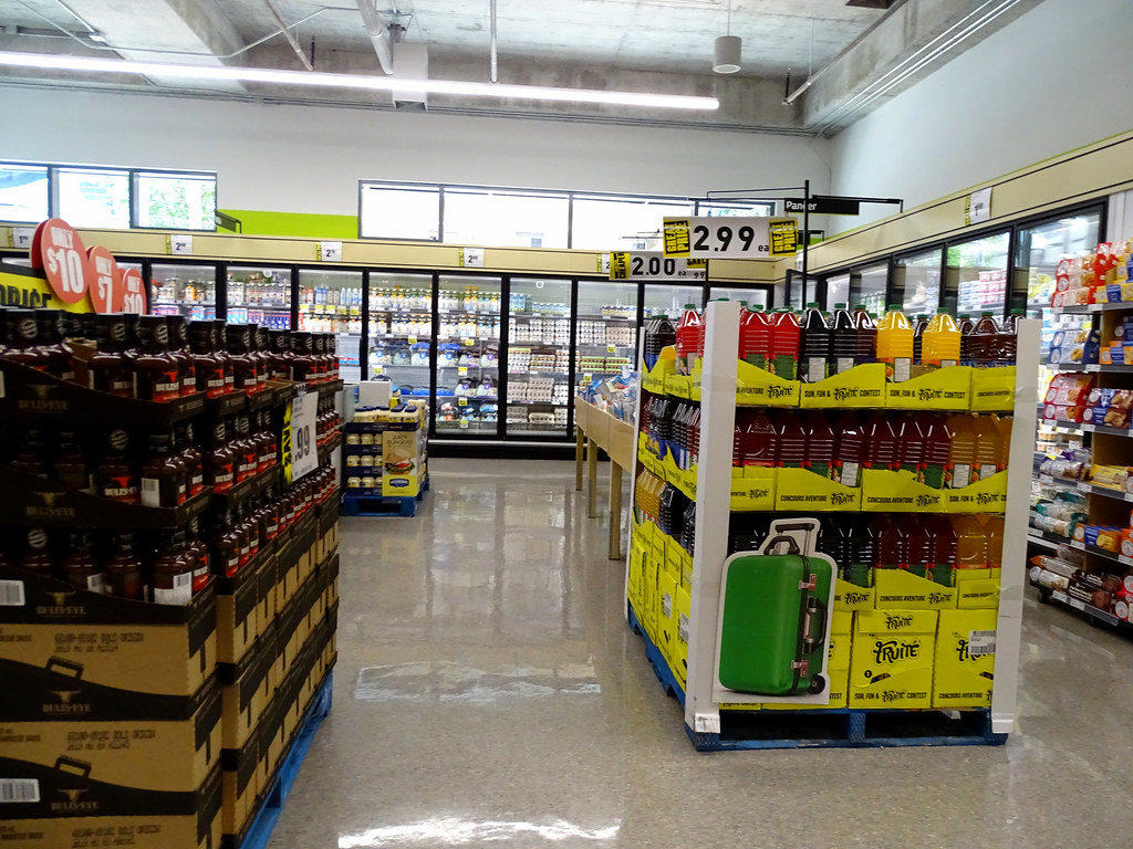
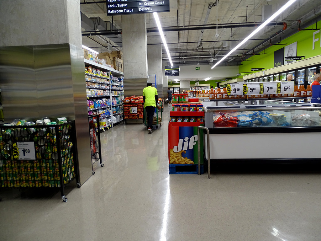
The Freshco is open for business. It’s a lot nicer than the Food Basics around the corner (Wellesley & Ontario). There are sections dedicated to Caribbean, Middle Eastern, South Asian and Filipino food, reflecting the demographics
 
I was in there, but didn’t get much of a chance to look around. If they have frozen goat meat, I’ll never have a need to visit that terrible FoodBasics again.
 
The food basics around the corner is terrible. I went there once some years ago and never went back. I generally like freshco better than food basics and no frills anyways.
 
July 07
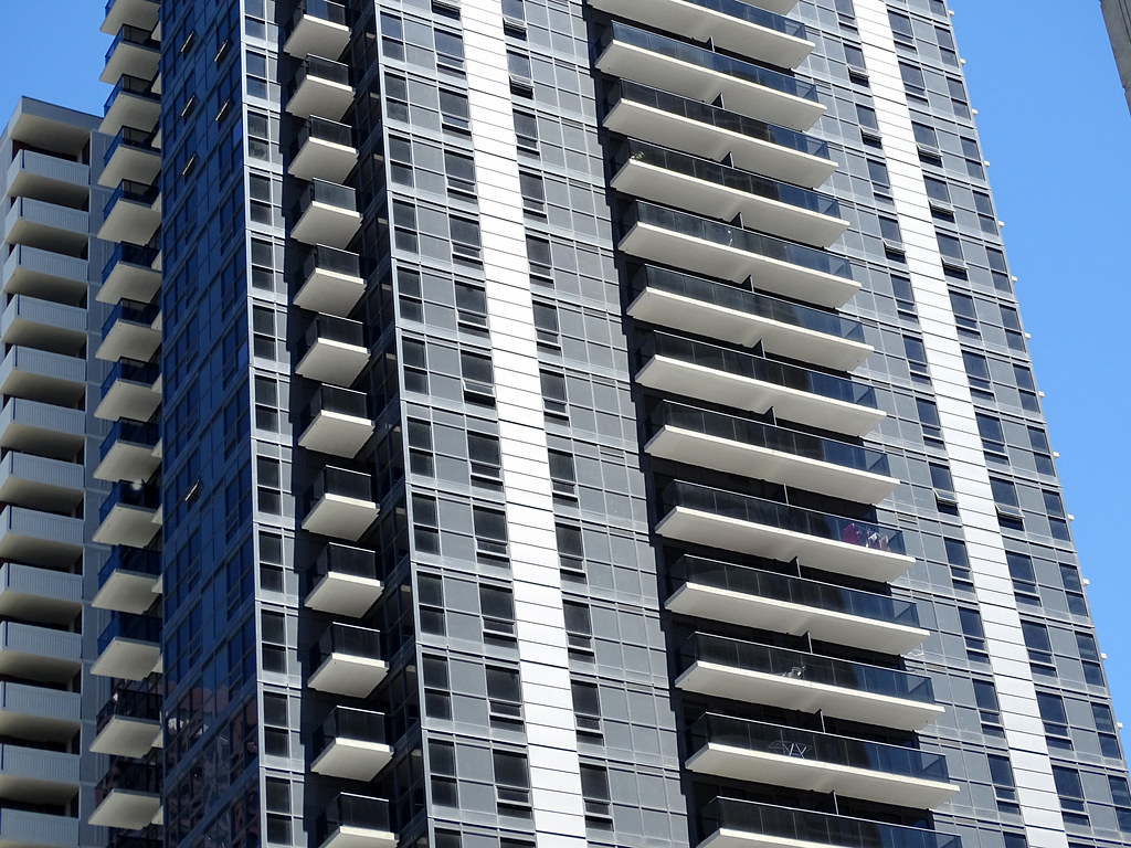
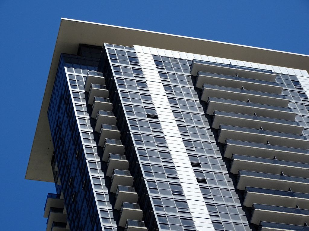
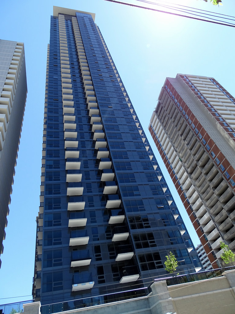
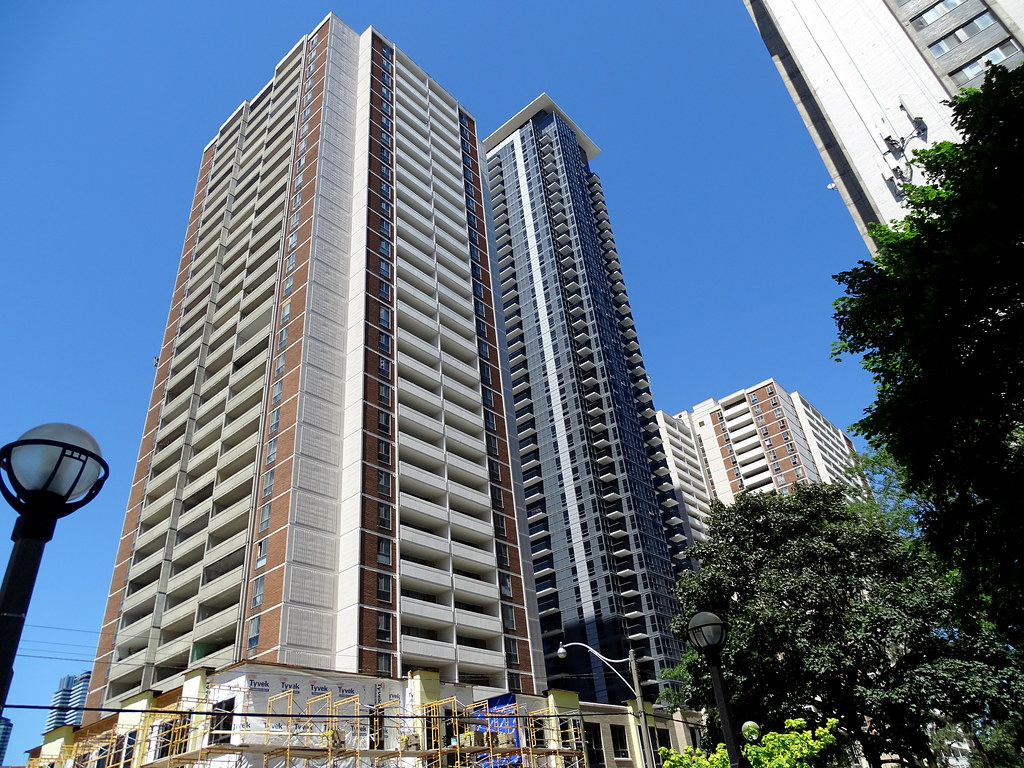
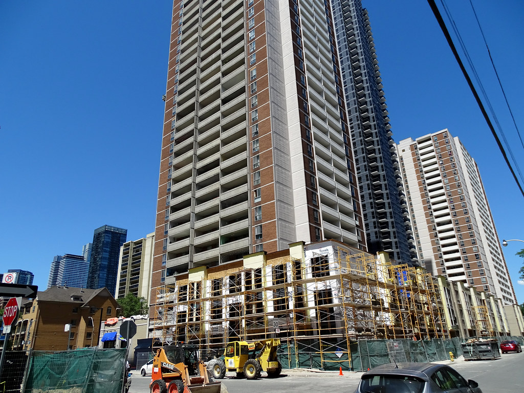
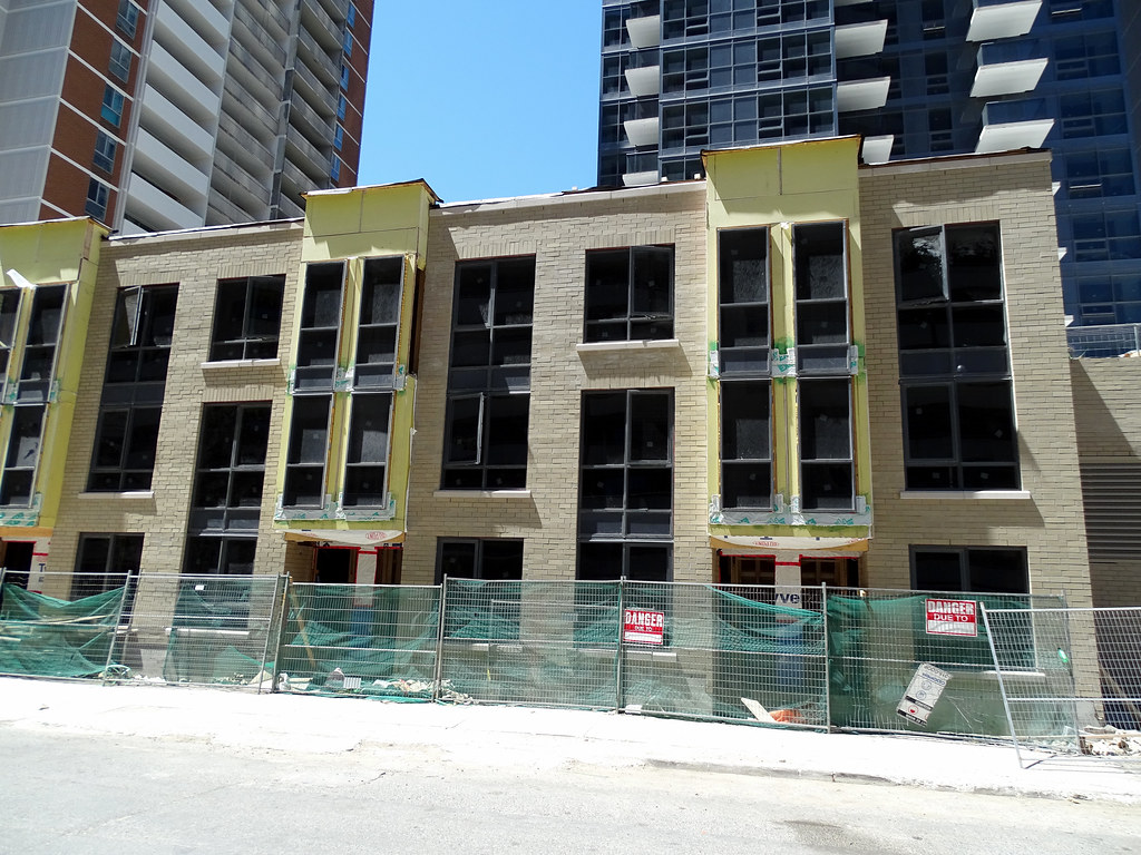
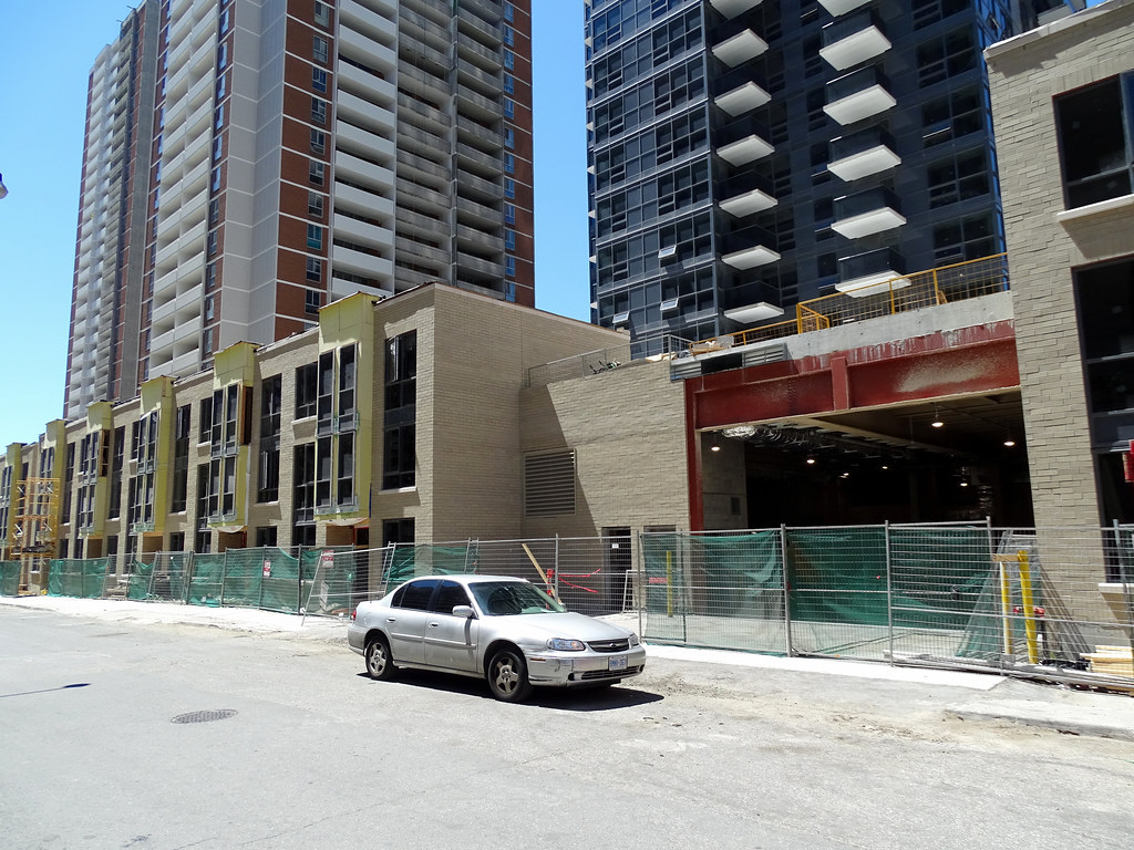
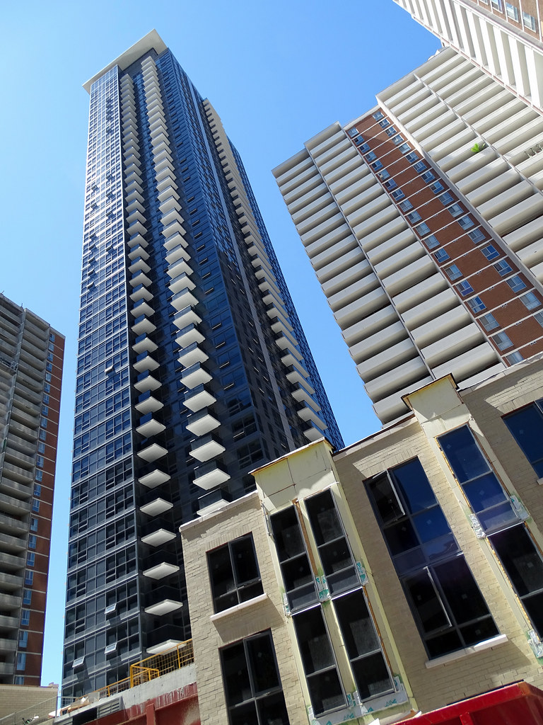
Uploaded these last night and more up on site. I noticed they are repainting the balconies of the existing buildings for this site. The new townhouse are still under construction. Was in Freshco and not bad. Have a few good deals when I was there as grand opening specials and carry some of them around me for the rest of the day of shooting.
41855414760_48a8f391bd_b.jpg

43663283421_fd66b97ab1_b.jpg

43616861382_d0f8a37d07_b.jpg

42946786524_3d738d16db_b.jpg

43616854322_383fe71765_b.jpg

42946779694_aa74602e5e_b.jpg

43663269501_a1ef3ef78c_b.jpg

43663266361_38bf7d390f_b.jpg

43663261141_f5ff82d27e_b.jpg

43663257461_202778a710_b.jpg

43617176962_d459d5d6cf_b.jpg

43617174932_ca33f9964b_b.jpg

42946914174_fb57472bfb_b.jpg

42946917574_d86f72fabd_b.jpg

43663405691_887900aa9c_b.jpg

29793658428_83c5ff60ae_b.jpg

29793663698_9474950441_b.jpg
 
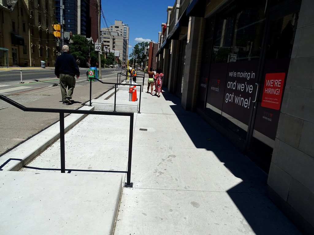
I realize that the city has probably not finished its part by re-doing the sidewalks and adding trees, but regardless, it still seems like the hardscaping could have been done much better. It doesn't seem like steps are even needed. They could have made the entire area barrier free. Some selective use of brick pavers would have helped a lot. The heaped up asphalt and mismatched sidewalks look terrible at this time, and the design aesthetic of the low-rise retail is low-budget suburban. This is an interesting area in terms of backgrounds and incomes, and it surprising that the developers would not choose a higher design aspiration given that many new residents, some with lots of disposable income, live in the immediate area.

20180801_124031.jpg
20180801_124034.jpg
20180801_124054.jpg
20180801_124135_001.jpg
20180801_124151.jpg
20180801_124323.jpg
20180801_124327.jpg
20180801_124341.jpg
 

Attachments

  • 20180801_124031.jpg
    20180801_124031.jpg
    198.7 KB · Views: 697
  • 20180801_124034.jpg
    20180801_124034.jpg
    242 KB · Views: 710
  • 20180801_124054.jpg
    20180801_124054.jpg
    205.5 KB · Views: 658
  • 20180801_124135_001.jpg
    20180801_124135_001.jpg
    201.6 KB · Views: 666
  • 20180801_124151.jpg
    20180801_124151.jpg
    237.2 KB · Views: 655
  • 20180801_124323.jpg
    20180801_124323.jpg
    256 KB · Views: 679
  • 20180801_124327.jpg
    20180801_124327.jpg
    205 KB · Views: 645
  • 20180801_124341.jpg
    20180801_124341.jpg
    214.9 KB · Views: 664
i know, i hate the hardscaping of the street. Why no trees? why is it raised so much, just to then have to step down, and why is messy asphalt the solution? also why the little squares in the cement that are covered by wood?
 
I realize that the city has probably not finished its part by re-doing the sidewalks and adding trees, but regardless, it still seems like the hardscaping could have been done much better. It doesn't seem like steps are even needed. They could have made the entire area barrier free. Some selective use of brick pavers would have helped a lot. The heaped up asphalt and mismatched sidewalks look terrible at this time, and the design aesthetic of the low-rise retail is low-budget suburban. This is an interesting area in terms of backgrounds and incomes, and it surprising that the developers would not choose a higher design aspiration given that many new residents, some with lots of disposable income, live in the immediate area.

i know, i hate the hardscaping of the street. Why no trees? why is it raised so much, just to then have to step down, and why is messy asphalt the solution? also why the little squares in the cement that are covered by wood?

This stretch of Sherbourne is being ripped up and redone soon. The hardscaping doesn't match existing because the existing will be rebuilt to match what you see there today. Otherwise, the developer would've had to redo everything once the city finished their work.

I'm not sure if the steps will remain, but the lowered space adjacent to Tim's would be a perfect space for a patio.
 
i know, i hate the hardscaping of the street. Why no trees? why is it raised so much, just to then have to step down, and why is messy asphalt the solution? also why the little squares in the cement that are covered by wood?

Wish there were some trees or planters somewhere. That sidewalk looks pretty bare.
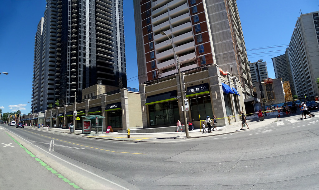
I realize that the city has probably not finished its part by re-doing the sidewalks and adding trees, but regardless, it still seems like the hardscaping could have been done much better. It doesn't seem like steps are even needed. They could have made the entire area barrier free. Some selective use of brick pavers would have helped a lot. The heaped up asphalt and mismatched sidewalks look terrible at this time, and the design aesthetic of the low-rise retail is low-budget suburban. This is an interesting area in terms of backgrounds and incomes, and it surprising that the developers would not choose a higher design aspiration given that many new residents, some with lots of disposable income, live in the immediate area.

With respect to the portion of the sidewalk where there is wood covering a few openings.

95% those are tree pits.

You'll notice the adjacent sidewalk has tiny in-laid squares.

Those indicate a reinforced sidewalk that can 'float' allowing for reduced compaction and greater tree root growth.

I can't say whether any are contemplated for the portion of sidewalk adjacent to the curb.

I went back and looked at the renders, they do show street trees, but the layout in the render does not seem to match the as-built.
 
I’ve never been to the No Frills that was here, but I’m sure this is a massive improvement. If this is shabby, what do you think of the FoodBasics just around the corner?
 
I’ve never been to the No Frills that was here, but I’m sure this is a massive improvement. If this is shabby, what do you think of the FoodBasics just around the corner?

The No Frills was about as good as a 1970’s Soviet ration queue.

Thankfully, the newer one (at Post Media Place/Square/Depot) is much better. It now has a second owner, who’s taken to improving the fixtures and added an organics/premium aisle (a rarity for No Frills). I suspect this new one is gunning to ratchet up to an Independent (or other Loblaws franchise) once the Y&B area is overrun with high-end grocers McEwan and Eataly. Proximity alone of the new Freshco to St. James Town will take a bite out of his low-income clientele; better to aim for the condo owners and renters to the west.

As for that Food Basics; that place is just bleak.
 
You may be right with the No Frills at the Post Media building aiming for something more upscale. Hundreds of luxury rentals / condo units are coming: the Selby, the hotel/condo project to the north of it, the Tridel project further east, etc.

Bleak is an understatement for that FoodBasics.
 
The No Frills was about as good as a 1970’s Soviet ration queue.

Thankfully, the newer one (at Post Media Place/Square/Depot) is much better. It now has a second owner, who’s taken to improving the fixtures and added an organics/premium aisle (a rarity for No Frills). I suspect this new one is gunning to ratchet up to an Independent (or other Loblaws franchise) once the Y&B area is overrun with high-end grocers McEwan and Eataly. Proximity alone of the new Freshco to St. James Town will take a bite out of his low-income clientele; better to aim for the condo owners and renters to the west.

As for that Food Basics; that place is just bleak.

There’s always the classic crowded No Frills on Parliament.
 

Back
Top