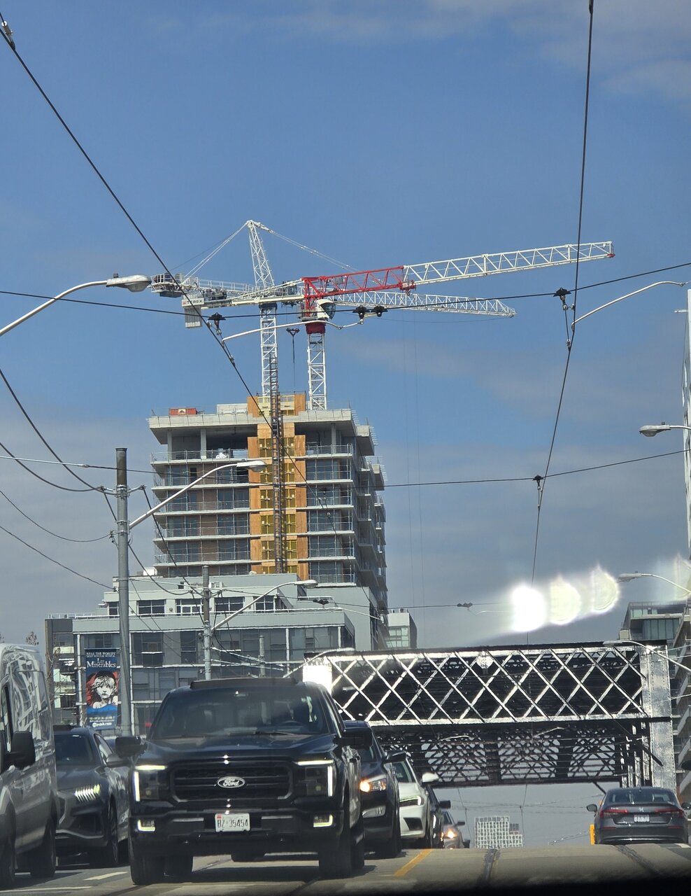
Snapped this shot this afternoon. May 1st.
1000006989.jpg
 
The "podium" (why would a slab form like this need a "podium" in the first place?*) is rough. And its endless window wall cladding reinforces the problem.

*Not saying there is never a time and place for that... but in a city where podiums serve as the default "solution", I don't understand why, when given the opportunity, the design team wouldn't have wanted to do something different here. This was an opportunity for a great canyon building and yet it falls short of that. It doesn't feel robust or urban. Missed opportunity.
 
Last edited:
...looks like they're starting to prep the holders for those triangular balcony dividers.
 
This building wouldn’t really bother me if it were on Dupont somewhere, but given its prominent location at a major intersection beside a future subway station, I must confess my disappointment. I know it’s not finished, but it’s looking insanely bland to a degree that I’m not sure that any potential fins or finishing details can save it.

By no means the worst of the year or anything, but I’m not impressed.
It's the blandest new building at that intersection...except for EVERY OTHER BUILDING AT THAT INTERSECTION (ignoring the heritage structures)

Respectfully, I get that people were maybe expecting more (perhaps they were too distracted by the fancy balcony dividers to notice the sterile glass ground realm in the renders), but in terms of colors and materials (no back-painted spandrel; non-glass balcony railings) this project is way ahead of the other new developments on that corner (current and future, as I expect the two Sweeney projects to get Toronto'd before they're built, and because I have no faith in Metrolinx/province making sure that whatever ultimately gets built on top of the subway stops doesn't look like crap - see the Foundry site), and way ahead of what we typically get in this city
 
Last edited:
Respectfully, I get that people were maybe expecting more (perhaps they were too distracted by the fancy balcony dividers to notice the sterile glass ground realm in the renders), but in terms of colors and materials (no back-painted spandrel; non-glass balcony railings) this project is way ahead of the other new developments on that corner (current and future, as I expect the two Sweeney projects to get Toronto'd before they're built, and because I have no faith in Metrolinx/province making sure that whatever ultimately gets built on top of the subway stops doesn't look like crap - see the Foundry site), and way ahead of what we typically get in this city

Colours and materials aside, in my view this building still reads like a heavy and imposing slab. The Minto building across the street is much more successful in that regard (excluding the abysmal street level environment along Bathurst).

It remains to be seen what exactly will go above the subway stations, but neither the King and Bathurst nor Queen and Spadina sites will offer a slab-like scenario quite like this.
 
If only our recent worst buildings where like this. And if the care and love that went into those where like this. The Artistry used earthed colours and inoffensive materials while not competing with the AGO across from it. The Social would draw your eyes in casual and good ways. Design Haus would take an unassumingly place respecting it's heritage it was painstakingly built upon. 365 Church acts like a warm calming presence on a vibrant street. I could go on...

...neither of these buildings would be spectacular in any fashion, but quite boring really. They would be the bench mark for this city sets where the rest can only get better. Instead of the reality we live with an occasional gem in a sea of the dreadful and dreck, IMO.
 

Back
Top