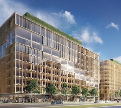
Unfortunate on two counts. An 8% reduction in the number of units in a building with such great transit access, plus potentially right at the King and Bathurst station should the Ontario Line materialize as currently planned - if not a walk score of 100 it should be pretty darn close. And a much less interesting design to boot. Really sad.
 
Built form is fine but my god, the ground floor articulation needs to be given extra attention in the refinements ahead. BREAK. THE. GLASS. UP.
 
Site Plan application submitted:

 
64-86 Bathurst

Hines is working through the rezoning process for a mixed-use development at 64-86 Bathurst St. in Toronto that Tesciuba expects to go to city council in September.

Construction is expected to start in Q2 2021 for a 17-storey building that will include: 307 rental apartment units; one floor of indoor amenity space; rooftop amenity space; two levels of retail; and two levels of office space.

 
The project is definitely inching closer to a potential start of demolition activities, and hopefully not for an interim use as a parking lot. The commercial properties are now all vacant except for Freda's, which is having its moving sale now. Starting at the north, and working towards the south end of the site. From the exterior, hard to tell that the Best Body Boot Camp is gone - however the door was open.....

20200904_174633.jpg


20200904_174702.jpg


20200904_174726.jpg


20200904_174829.jpg


20200904_174819.jpg
 
Very curious about this one. Hines is a massive developer with a globe-spanning presence. We've got CIBC Square, yes, but that's an office tower, not a residential condo. How they chose to approach this will be interesting.

I've been thinking/wondering exactly the same. They've been the DM (and not just an investor) on a few high-end resi projects where they've sprung for a top architect and given them the budget and latitude to deliver -- in NYC, F+P at 100 E 53rd and Nouvel with 40 Mercer IIRC -- and I believe they were part of the 56 Leonard consortium, though not sure what role they played.
 
The top is fine, some angle on the balconies for interest but the all glass podium is really not fitting with the area.
Something like Kingly (at Portland) with brick podium is much much better

Disappointing with developers + architects here

The saving grace is the colour scheme being white and bright here with golden accents, as opposed to the boring blue and green
 
Last edited:

Back
Top