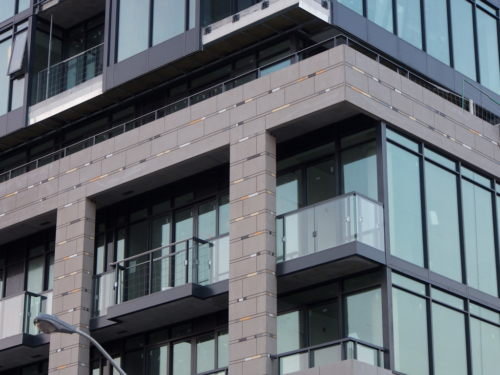
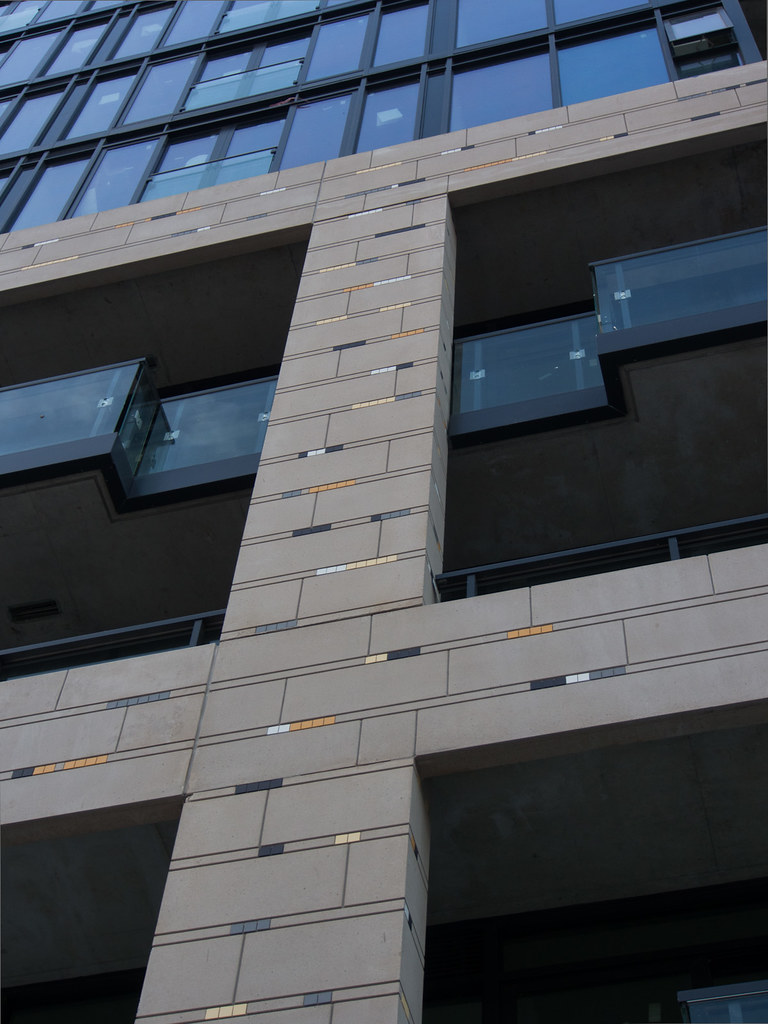
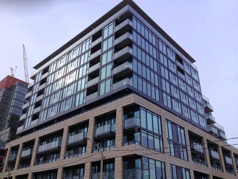
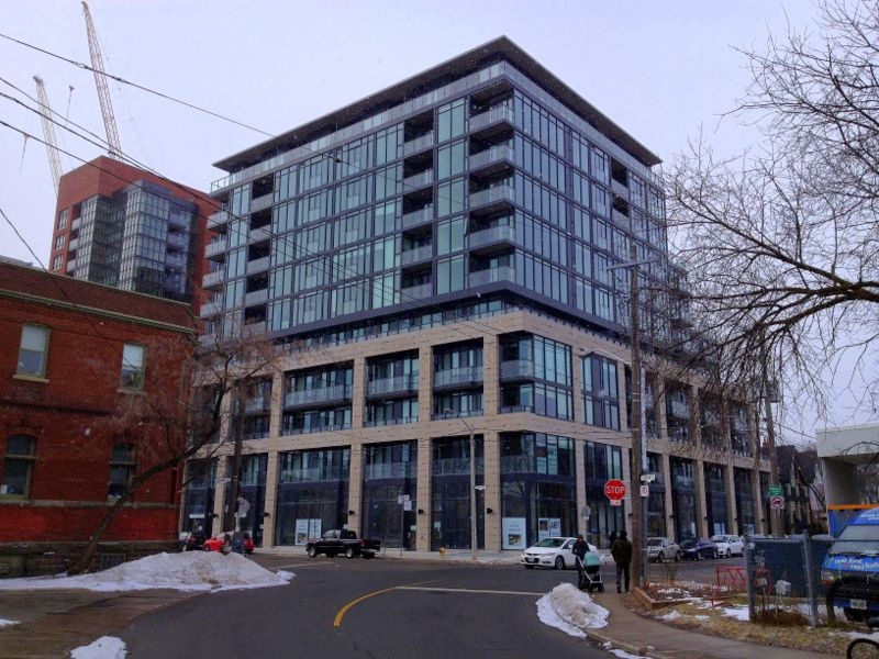
4 August 2012: Like the name, this project fails to impress. The precast is chipped & stained, the glazing looks awful. A very average project for a very average ghetto.

20120804181407.jpg


20120804181436.jpg


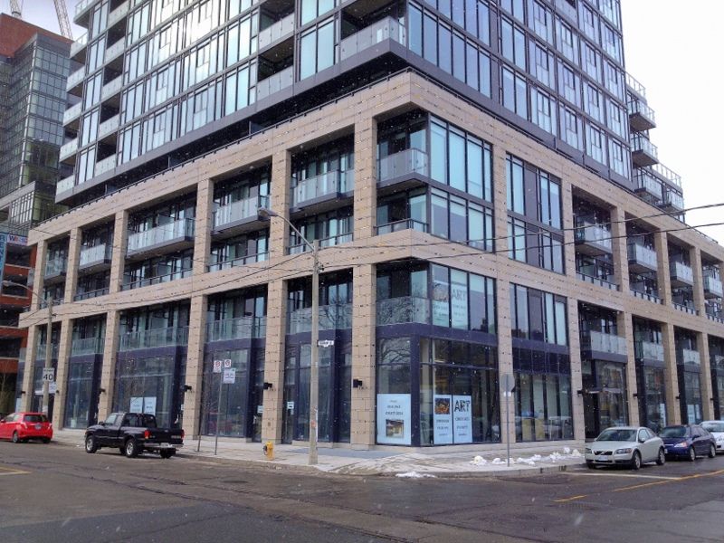
Ok so it looks alright from Queen West...

20120804181556.jpg
 
u sure they're not putting anything on top of that grey cinder block like material
 
They're precast concrete panels so no, there will not be anything (save for a healthy power washing) applied to them.
 
I was quite pleased to see this the other day.

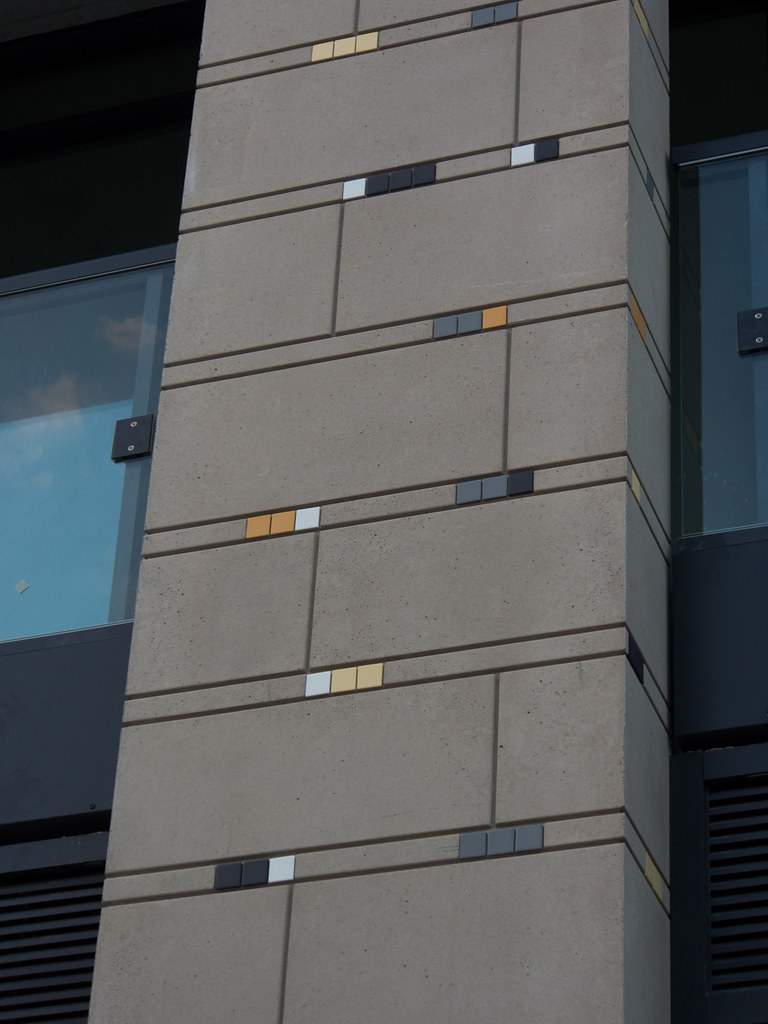
They've gone for a palette of earth tones here, just shy of including burnt umber and terra cotta. Based on this range of colours, those are the only additions I might have considered, but honestly, this looks pretty good. The bolder one gets with colour, in my mind, the fewer tones should be incorporated; I'm already impressed that the range already extends past Toronto favourites of black, through the ubiquitous grays, to white, and wanders as far as yellow ochre. I'm not being facetious; that already seems a step more generous than what we can typically ask for here.

In terms of would I have rather had bolder primary colours here? If only Hundertwasser were still alive I'd be wishing for a building (or a whole neighbourhood) with his signature on it here, so yes, bold can be made to work very well while still feeling organic… but typically I would rather see bold geometric on our more frenetic arterials. 'Art' is located on two collector roads, in a quieter area compared to much of the core. The earth tone palette works quite well here.
 
With all of the inlaid tile all over it you think it's sombre? I'm not saying that it's the opposite of that—the tiles would have to be primary colours or neons to make the effect exuberant I suppose—but the word sombre is more downcast than this building deserves. Pretty handsome structure if you ask me… with freckles.

42
 
What a difference some masonry (or quality precast) makes at the lower portion of a building as opposed to all glass. I think this one turned out quite handsome!
 
A gem in West Queen West...and turned out much better than the renderings :D

IMG_4954_zps4e90a140.jpg


IMG_4957_zps7f3719fa.jpg


IMG_4958_zps0dfeae84.jpg


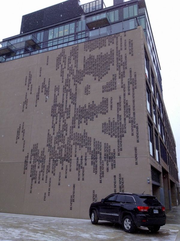
The back, north facing wall with...Art! I didn't see the "ART" right away when I first came around the corner...as my eye read the "business" part first. Then I stood back to take the pic and there it was haha. Very cool :cool:

IMG_4984_zpsfb6f8f30.jpg
 
Last edited:

Back
Top