296214_3.JPG


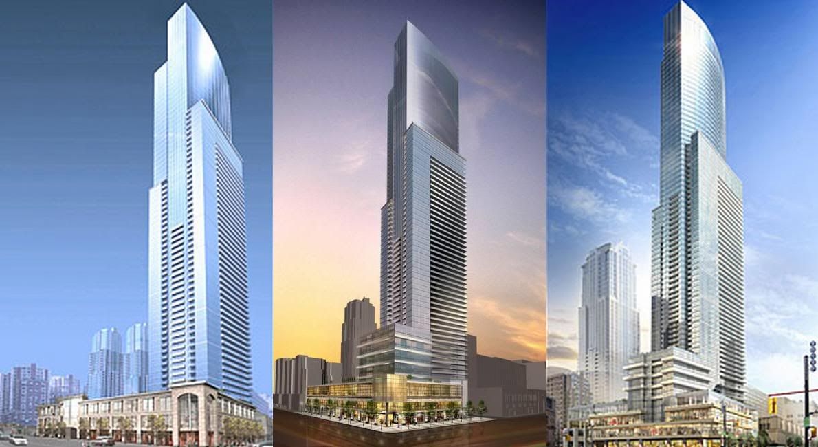
BEFORE (left): Much of the original plan for the 75-storey tower at Yonge and Gerrard Sts. survived the design review. AFTER (right): The review led to a repositioning of the tower, a taller podium and more emphasis on how it meets the street.

Toronto Star
There was also this proposal between the above two.
Aura_or_RoCP_III.jpg

(pic originally posted by Canuck)
 
The 2nd design is the worst by far. The first wasn't as good as the latest design though.

I love the new design for this baby. It's great... and because of the long design review process with the city, I am going to optimistically assume that the design will not change any further, luckily. :D
 
Yeh I think I like the latest better- particularly the podium. The base of the original looks like a suburban mall. Overall it's more interesting imho than 1Bloor E.
 
I've combined the three renderings of Aura in the order oldest - newer - newest:

Aura.jpg


Bill
 
#2 is awful!

1BE is very intriguing for its location, but I prefer the design of Aura.
 
I think the project definitely has made the progression in the right direction. I am more pleased that this may set a precedence in that all future projects be subject to a design review so we can avoid projects like Verve going up.

That also settles the height debate on 1 Bloor. 912 ft. is to the tip although I think it may go slightly higher to beat out Trump.
 
Considering where Trump is located, I'd much rather see Trump add back the 13 or so extra floors it chopped off.

Anything's possible in this game.
 
^ this type of comment make me shake my head in disbelief. #2 is #3 with some slight reorganization of podium density. Ridiculous. All 3 are the same damn building for allah's sake.

I'd have to agree. There is virtually no difference in design, other than the podium between the three towers. What makes the comparison worse however, was it was also rendered in three different ways.
 
^ this type of comment make me shake my head in disbelief. #2 is #3 with some slight reorganization of podium density. Ridiculous. All 3 are the same damn building for allah's sake.

The sky is much nicer in the most recent rendering :D
 
This building is massive. It almost has the feel of an Office Tower, not a condo.

1.3 Million Sq feet. God Damn! that's bigger than Bay Adelaide West!!!
 
I like the latest rendering the best, it appears a bit more refined with a nicer glass colour. The almost greyish glass in the second render looks too uninviting.
 
This building is massive. It almost has the feel of an Office Tower, not a condo.

Yeh I agree it does have a corporate office appearance, probably because the upper floors are sleek glass and don't have balconies in the render. But I guess it's a mixed use building so it will also have office space I expect..? I quite like the look of this one.
 

Back
Top