You are using an out of date browser. It may not display this or other websites correctly.
You should upgrade or use an alternative browser.
You should upgrade or use an alternative browser.
unrealestate
Active Member
CN, all I could do was laugh at that second photo. What a mess!
AlvinofDiaspar
Moderator
re: Park
Renovating and adding lights won't solve the woes - the problems run far, far deeper than that. IMO, the entire superblock is a planning disaster.
AoD
Renovating and adding lights won't solve the woes - the problems run far, far deeper than that. IMO, the entire superblock is a planning disaster.
AoD
Patdouville
New Member
steveve
Senior Member
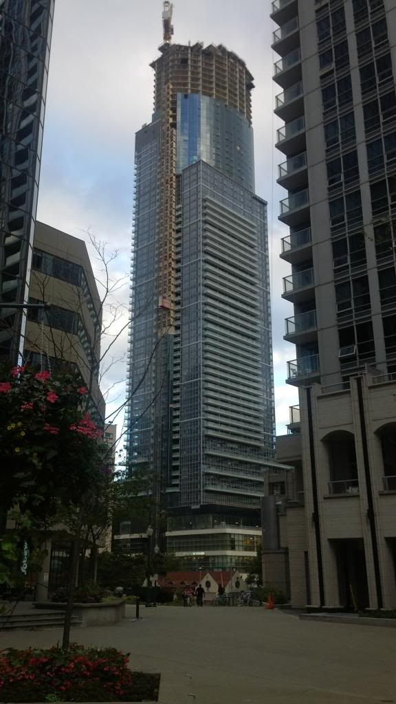
amazing view! ^ The interesting thing about Aura is it's massing and appearance drastically changes depending on where you're standing. For instance, in your photo, the sides appear wider while the north face almost disappears. The top curved portion almost resembles the floor plate of 1 King West.
It's a refreshing change to see a building of this size play with its geometry using different forms and setbacks as part of the design; whereas today, the vast majority of condos going up have more or less, the same form going around on all 4 sides.
These were taken today:
From Elm Street, there isn't a lot to hate about Aura. The curtain wall plays with the light nicely, and the overall form works well.
Not a lot of progress lately, but work on the tower appears to be in full swing.

DSC_0249 by stevevephotostream#1, on Flickr

DSC_0250 by stevevephotostream#1, on Flickr

DSC_0251 by stevevephotostream#1, on Flickr

DSC_0264 by stevevephotostream#1, on Flickr

DSC_0259 by stevevephotostream#1, on Flickr

DSC_0253 by stevevephotostream#1, on Flickr
It's a refreshing change to see a building of this size play with its geometry using different forms and setbacks as part of the design; whereas today, the vast majority of condos going up have more or less, the same form going around on all 4 sides.
These were taken today:
From Elm Street, there isn't a lot to hate about Aura. The curtain wall plays with the light nicely, and the overall form works well.
Not a lot of progress lately, but work on the tower appears to be in full swing.

DSC_0249 by stevevephotostream#1, on Flickr

DSC_0250 by stevevephotostream#1, on Flickr

DSC_0251 by stevevephotostream#1, on Flickr

DSC_0264 by stevevephotostream#1, on Flickr

DSC_0259 by stevevephotostream#1, on Flickr

DSC_0253 by stevevephotostream#1, on Flickr
Torontovibe
Senior Member
I know I'm supposed to hate this building and its got all kinds of crazy flaws but it's so eccentric and unusual, I can't help but feel some kind of affinity to it. Its retail is dreadful and materials seem cheap but when I stand beside it and look up, I can't deny that there is something appealing about this f-ed up building. Those crazy curves and weird angles are strangely seductive.
This must be Toronto's most eccentric building and I think the roof feature might even add to it. Yeah, it's a dogs breakfast but it might grow on a lot of you guys who love straight angles and perfect proportions. My guess is, despite the lousy retail, most Torontonians will grow to love this dog's breakfast. That's my prediction.
There is no other building in the world like it and maybe that's a good thing.
Last edited:
Ramako
Moderator
I know I'm supposed to hate this building and its got all kinds of crazy flaws but it's so eccentric and unusual, I can't help but feel some kind of affinity to it. Its retail is dreadful and materials seem cheap but when I stand beside it and look up, I can't deny that there is something appealing about this f-ed up building. Those crazy curves and weird angles are strangely seductive.
I'd agree with this. Up close this thing is quite poorly executed, but the overall form and massing is still attractive. Steveve is right to compare it to 1 King West. They both create the effect of a central curved portion emerging from or breaking out of an outer shell. I like the concept.
someMidTowner
¯\_(ツ)_/¯
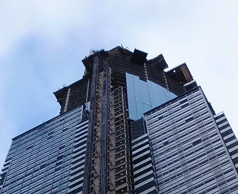
Today:


ChesterCopperpot
Senior Member
So that's 66th floor they are on now - 9 more residential floors and then the mechanical
BrianSolo
UT Member
No... I think they are on the 70th floor with 8 more to go before the mechanical. It will be 78 stories.
ChesterCopperpot
Senior Member
The mechanical rooms with the horrible spandrel that people are complaining about are on the 53rd and 54th floors. Counting up from there gives 66
innsertnamehere
Superstar
so the circular floors aren't even half way done yet... jeez this thing is going to be TALLLL
Larissa Doherty
New Member
The mechanical rooms with the horrible spandrel that people are complaining about are on the 53rd and 54th floors. Counting up from there gives 66
I know for a fact that the "first roof" where the two-storey mechanical room is on the north east side occupies the 57th and 58th floors. Counting up from that, we're actually on floor 70 right now. Also, in all of the horrible news reports from last week's fatality at the building, many mentions were made of the worker falling off the 70th floor.
BrianSolo
UT Member
The mechanical rooms were going to be on the 54rd & 55th floors before they added 3 floors in the 30's. Now they are on the 57th & 58th. They are finishing pouring floor 70 now.
kris
Senior Member
we are definitely on the 70th floor


