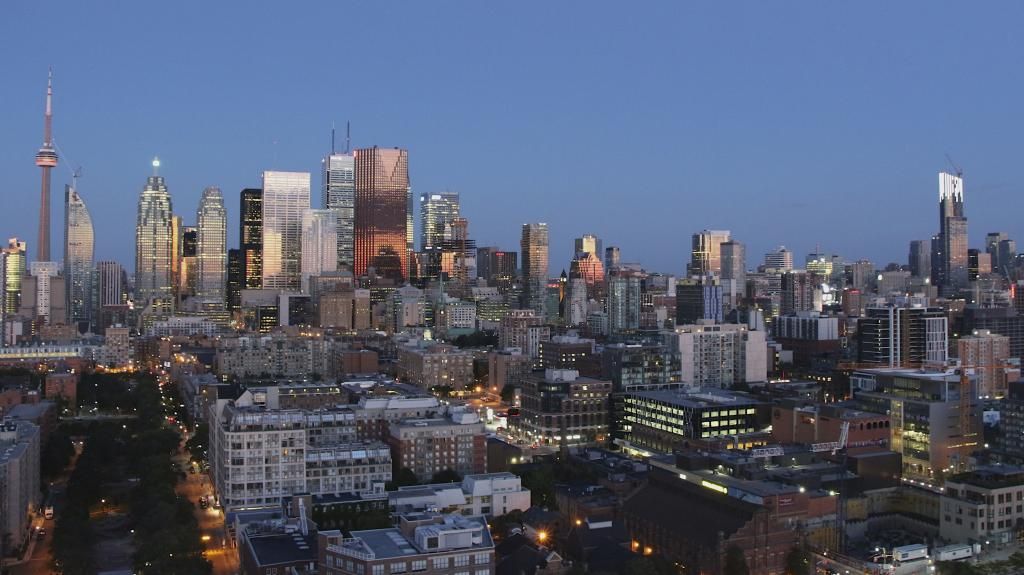
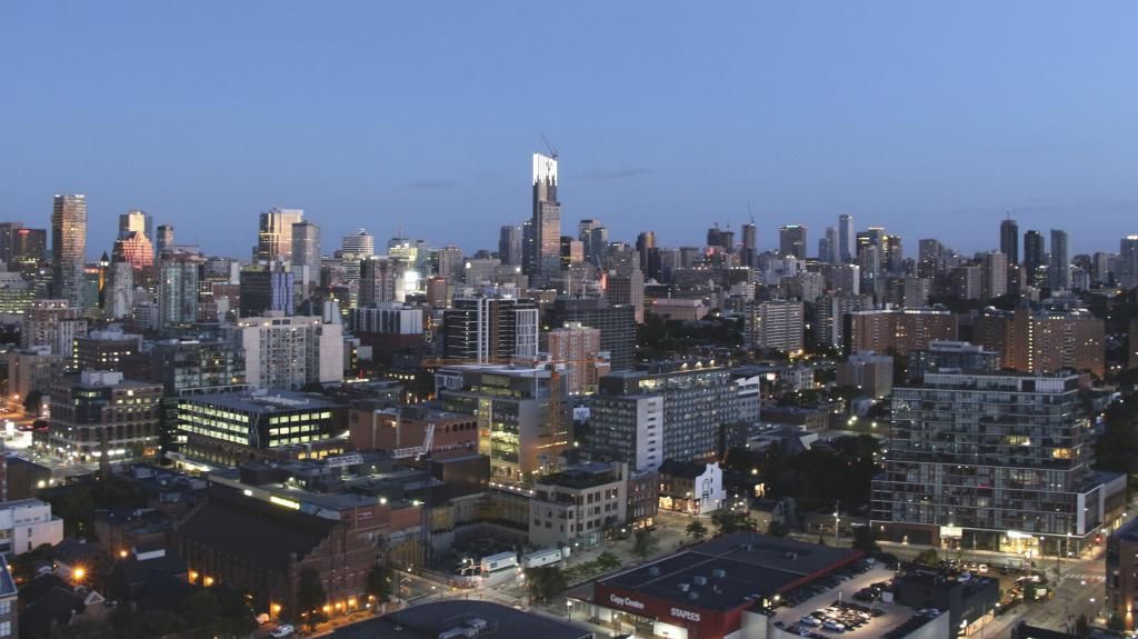
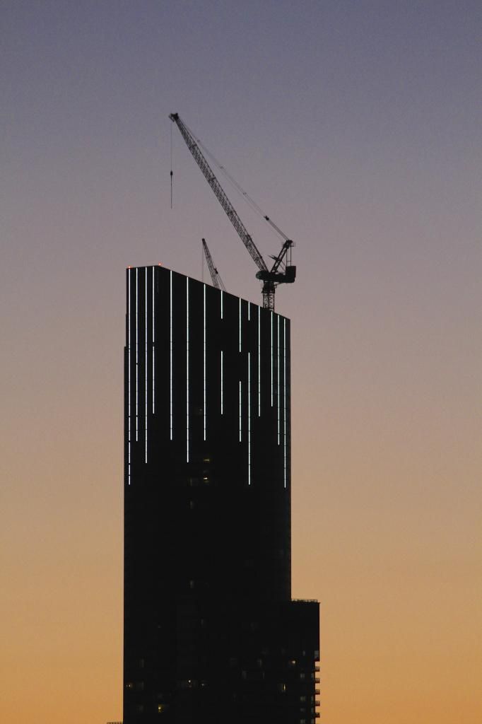
Aura is such a paradox...... by day, some parts are absolute dogshiat, and yet by night, and that's if they actually manage to maintain the lighting, it looks pretty amazing, and will probably end up being a postcard shot of Toronto.....:rolleyes:
 
Holy cow that lighting is freakin intense! Much much more prominent than I was expecting, I was already surprised when they started testing sections at a time. Hopefully this becomes a permanent addition to the skyline and not a temporary or occasional one. (I'm sure there will be complaints on the brightness)
 
wow, those look really great. i knew they word based on smaller tests from a few weeks ago but it's great to see it in larger scale through the pix. i was at the ex tonight and unfortunately missed seeing this in person. I think we can expect even more according to the render. all the columns should come down further when complete with the longest ones almost reaching the balconies
 
Hopefully not. White is fine, it adds just the right touch.

Please don't cheese it up with a Vegas-style parade of tacky colours. Not after just regaining some support for the project following a decent finish.


Is it tacky when the CN Tower is different colours?

I'm please with Aura's lighting so far. I would likely appreciate this clean white lighting for the long-term. Occasionally, though, would Aura being versatile with its lighting colours really be any tackier than when the CN Tower does it?
 

Back
Top