You can still have a heritage facade with a completely modern interior that meets the needs, functionality and codes of today... What is this point, besides ridiculous. Heritage does not = nonfunctional. Your bias clearly shows.

If you see every new building project/concept as some sort of identical cookie-cutter size/massing/program that we can just wrap a heritage facade around, then I'm afraid your bias is that you have no idea of how buildings are designed. Also, stop thinking of the exterior and interior as two separate entities. There are lots of things a "heritage facade" cannot achieve that a modern building envelope can.

I enjoy a nice, respectful discussion (as with the fellow above), but if you are going to display a lack of understanding of design process but call me out for my opinion/views/approach to design (as you call it, my "bias"), then I'm going to call you out on yours. Everyone has a bias. I'm not sure why my "bias" is so upsetting to you since I defend the retention of heritage facades time and time again. The inclusion of them makes for a more interesting building most of the time. But saving/integrating heritage where appropriate is a different matter altogether than a new build and tacking some faux-1800s-style visuals onto its exterior.

Everybody is biased one way or another at the end of the day, hopefully biased towards an informed view that looks for the best approach, while keeping an open mind. I like to think that my bias is based on education and practice, as well as discussion, debate, and critique, even if I have many years ahead to continue learning. Instead of inflammatory "YOU'RE BIASED! posts, why not attempt to have a discussion about why I hold a particular view or bias toward a certain type of design and explore that?
 
Last edited:
If you see every new building project/concept as some sort of identical cookie-cutter size/massing/program that we can just wrap a heritage facade around, then I'm afraid your bias is that you have no idea of how buildings are designed.

Also, stop thinking of the exterior and interior as two separate entities. There are lots of things a "heritage facade" cannot achieve that a modern building envelope can.

I enjoy a nice, respectful discussion (as with the fellow above), but if you are going to display a lack of understanding of design process but call me out for some apparent "bias", then I'm going to call you out on it.

I'm also unsure why my "bias" is so upsetting to you since I defend the retention of heritage facades time and time again. The inclusion of them makes for a more interesting building most of the time. But saving/integrating heritage where appropriate is a different matter altogether than a new build and tacking some faux-1800s-style visuals onto its exterior.

Everybody is biased one way or another at the end of the day. I like to think that my bias is based on education and practice, as well as discussion, debate, and critique, even if I have many years ahead to continue learning.

Yes, I have no idea...

Well, admittedly in another thread you expressed that you are partial to neo-modernism... even your screen handle suggests that.

Your comment that I quoted above also suggests that a heritage aesthetic is not functional usable space... that simply isn't true. FYI. I don't appreciate being told how to think: "show me, don't tell me"... On that note, I live in a neighbourhood where many homeowners (myself included) have completely modernized the interiors and mechanics of their 19th century homes... Obviously tastes change, people evolve and technology advances... we have different building codes now and needs (ie. the steepness of the original stairs do not meet today's codes; the separate rooms aren't trendy or don't speak to today's living where parents like to have sight lines on their children or people just like expansive rooms...).

My point is: the exterior can be completely separate from the interior and not relate at all.. This clearly veers off topic.

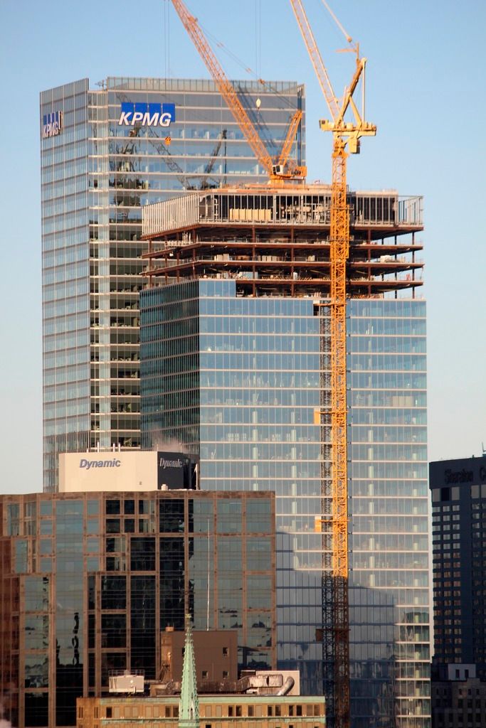
I still think this office building is a turd aesthetically. It might meet all sorts of environmental standards but I still think it's boring and forgettable and I bet other non-architects will probably pass it by everyday and not even look up once at it.
 
If you try to understand my entire argument by quoting one sentence from this thread and then calling me out, then you are not doing your homework.

Re: the fact that I am partial to modernism-- in the other thread where these issues are discussed, I also critiqued why neo-modernism is problematic, despite the fact that I do like the aesthetic, when it's done well (and that in school I find myself unlearning various aspects of neo-modernism to embrace new approaches, especially with regards to the environment). Furthermore, being partial to modernism/neo-modernism as my personal taste does not mean I think every building should be a neo-modernist design.

Re: homes in your neighbourhood. That's an entirely different context than 1) a new build, or 2) a large-scale project such as an office tower or condominium tower. So no, for large projects, the exterior and interior are not separate entities and a modern envelope can be used to accomplish many things that an older style of facade cannot. Once again, I didn't say that re-using old facades is wrong. I have been trying to explain why you don't see many new buildings where the exterior is treated separately from the rest of the design of the structure/interior/building at large and has the visuals of a classical building.

You also seem to have read into my posts above (or didn't read them at all, apparently) that I think this building is visually engaging, or some sort of architectural masterpiece or that architects everywhere love it. None of those things are true. (In fact, if you read my posts, you'd see that I'm not a big fan of the project.)

Moving on.
 
Last edited:
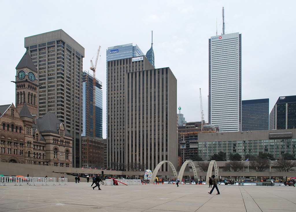
Nice photos ^

From yesterday:

16608967009_cfb42e2282_c.jpg
 
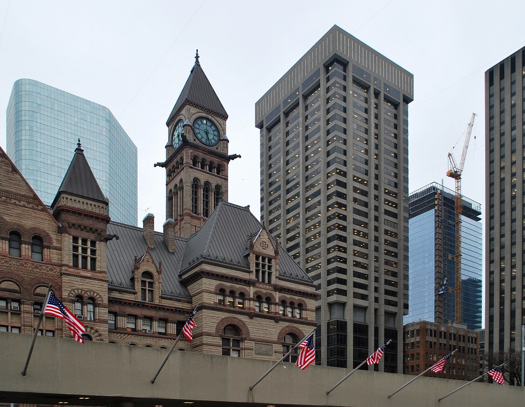
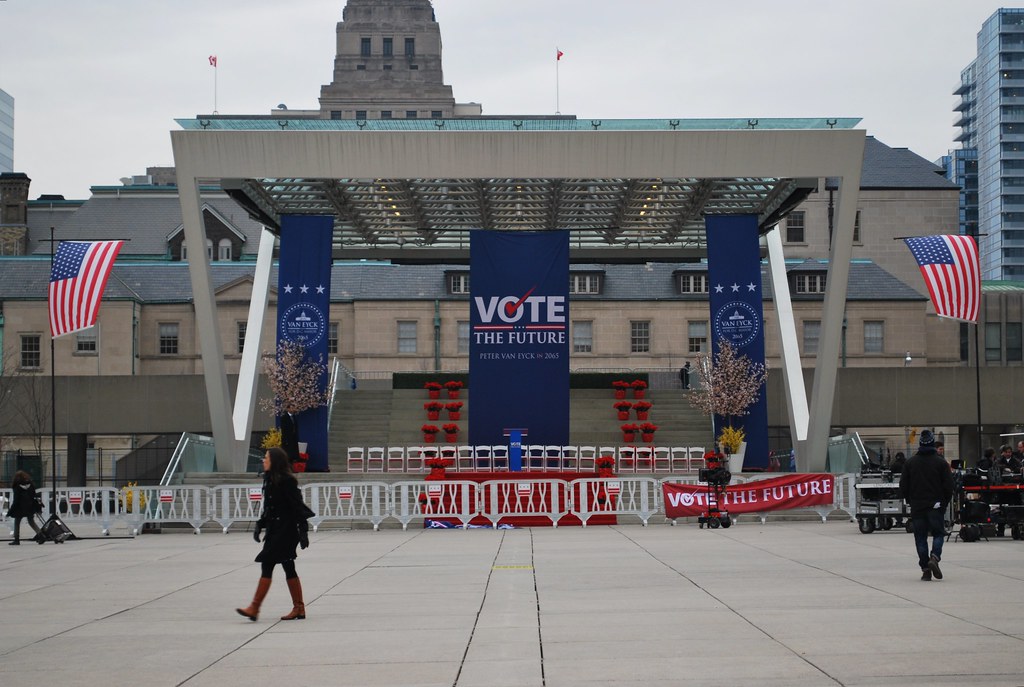
Just as a matter of interest, why is there a row of American flags in Nathan Phillips Square?
 
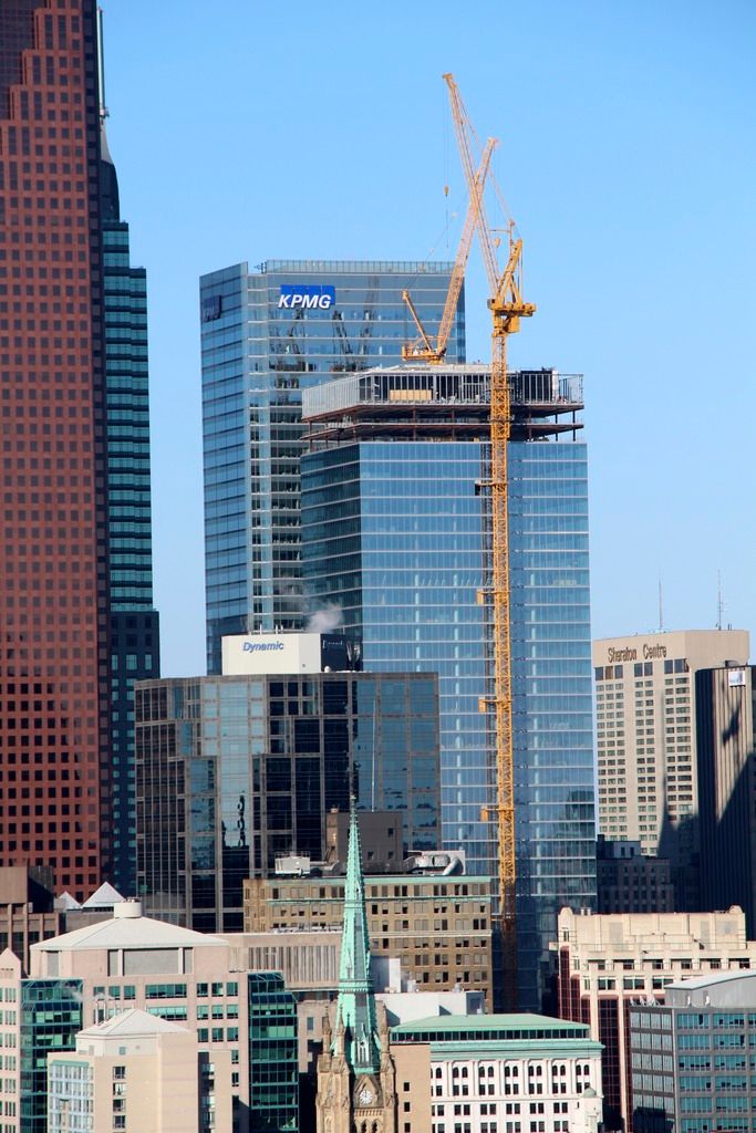
Pic taken Mar 19, 2015

Noticed I caught most of the MINT logos.

WFeLOyX.jpg
 
Last edited:

Back
Top