July 18, 2014


image.jpg


image.jpg


image.jpg


image.jpg


image.jpg


View attachment 30220

image.jpg
 

Attachments

  • image.jpg
    image.jpg
    94.8 KB · Views: 1,436
  • image.jpg
    image.jpg
    93 KB · Views: 1,434
  • image.jpg
    image.jpg
    84.7 KB · Views: 1,442
  • image.jpg
    image.jpg
    84.5 KB · Views: 1,435
  • image.jpg
    image.jpg
    92.7 KB · Views: 1,430
  • image.jpg
    image.jpg
    91.9 KB · Views: 1,436
Last edited by a moderator:
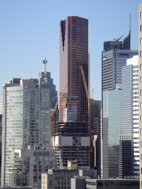
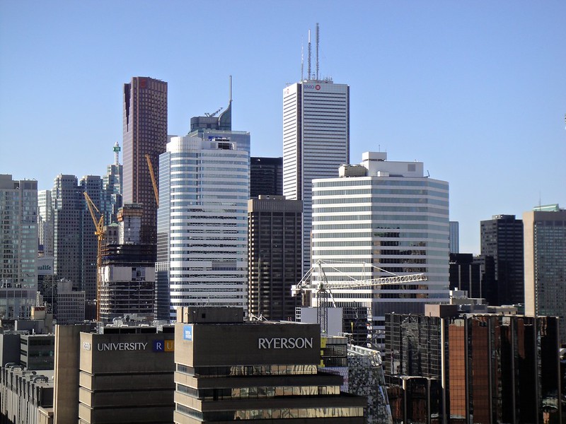
I prefer buildings with architecture.

Agreed. This is the soylent of architecture. It looks like it has been engineered to be completely bland, maximize efficiency (in this case, the use of space, not nutrients for the body), and only contain the basics of what is needed without any soul or emotion.
 
I'm actually liking this one better than the first phase ! Those indents make a big difference.
 
I agree with Taal, mostly, and simply Dan. I think it's better than the first phase owing to the windows looking right to me this time (no unnecessary frosted/fritted bit), and I do like the clean lines. The horizontal I-beam detail at each floor adds a little depth, shadow, and texture to the facade which the first one lacks. That this one is notchless at the corners doesn't hit me as a positive or negative.

That said, I didn't much like phase one at all, so there was nowhere to go but up, and while I think this will look fine, it certainly won't add any excitement to anyone's life.

42
 
While I'd agree generally with what's been said re: simplicity, I'd add that Mies was clean and minimal; Chipperfield is clean and minimal; Pfeifer is clean and minimal.

This is efficient, if lazy, corporatism.
 
It is starting to make an impact from the foot of Yonge Street. Here are a few shots from today:

pOVA6sU.jpg


d4u68fC.jpg
 

Back
Top