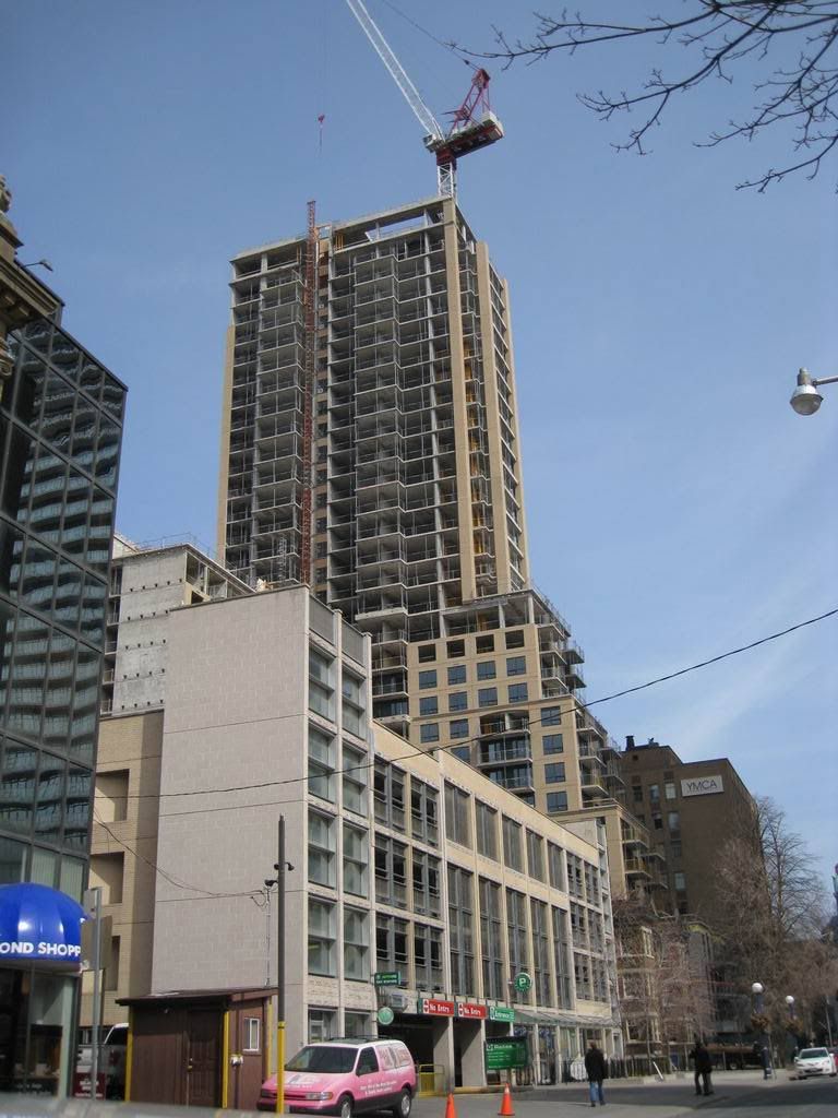
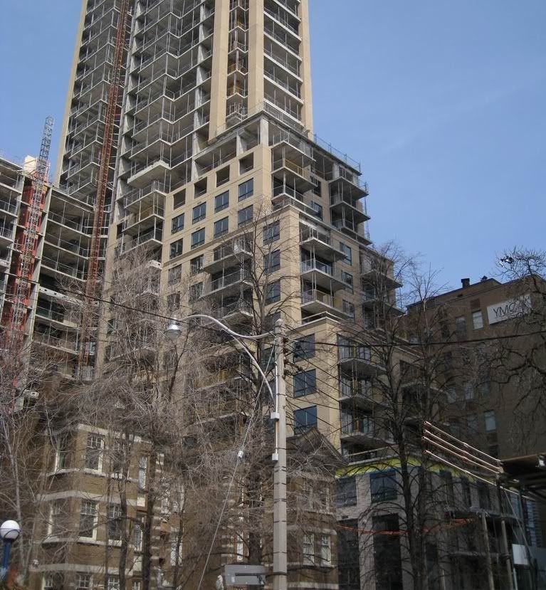
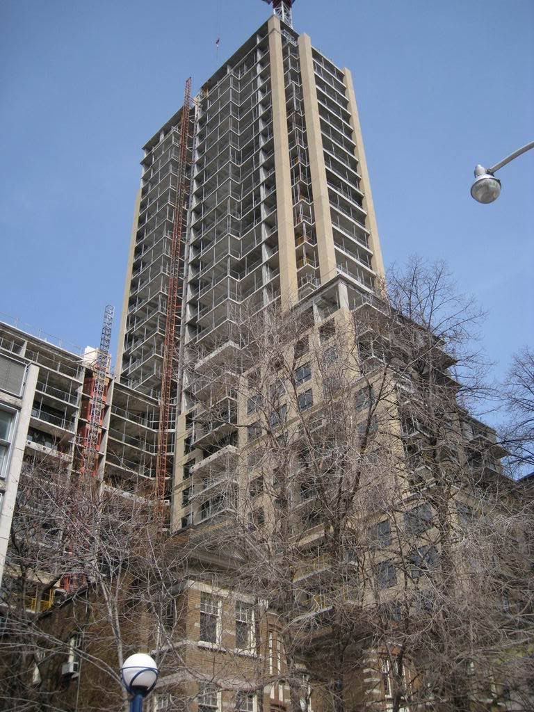
A few months old, but a good view nonetheless:

3150573043_5d43179f01_b.jpg
 
March 28 2009 update

everytime I'm in the Yonge/Bloor area ... BSN seems to jump out at me ~

IMG_3621.jpg


but I'm finding BSN more and more appealing, especially if I focus my attention on the lower 20 storeys of the building (where the structure terraces properly as per the original proposal)

IMG_3620.jpg


I just now try to block out the tower section above where it appears Cresford just plunked it on top

IMG_3619.jpg
 
Honestly if you squint or just don't look too closely you would think it was tower by the same developer behind a smaller one.
 
I am happy with the outcome of the building...I feel that if they didn't increase the height of the building by the 6 or 8 stories from the original design it would have looked too stumpy. Anyone have a unit in the podium section of the building? I am curious what date you have on your updated contract to get the keys to your unit...
 
From a distance, from most any vantage point I like the look of BSN peeking out from above.

From Church & Wellesley April 4th

Click on the thumbnail to enlarge, then click again on the image for full size.

 
The only impressive thing in this shot is the lack of plastic bag scraps in the trees. (That's a criticism of BSN, not the photo itself, for which I thank you, Solaris.)

That's pretty harsh. Let's wait for the building to finish before the critique starts, no?
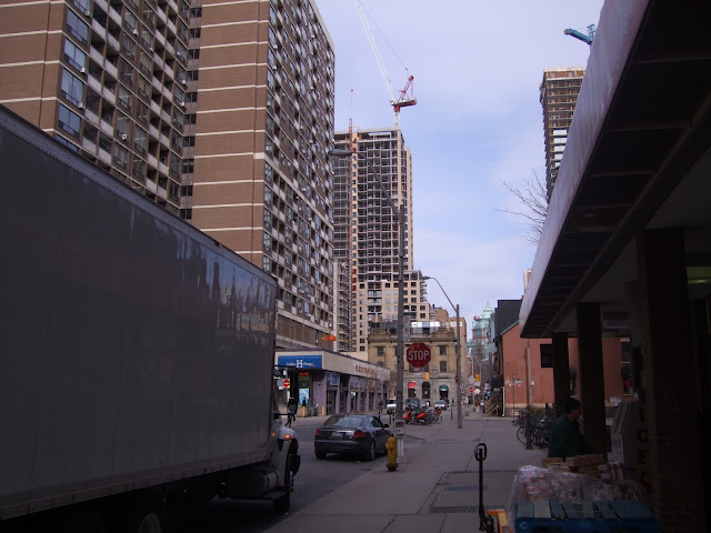
 
I'm warming up to BSN. The photo above best approximates the colour of the precast which, contrasted against dark green framed windows looks good. On a sunny day the precast, um, kind of sparkles.
Some of the fussy details on the first 3 or 4 floors try a bit too hard but otherwise this may just turn out fine.
 
Last edited:

Back
Top